The network for creativity
Join 1.25M professional creatives like you
Connect with clients, get discovered, and run your business 100% commission-free
Creatives on Contra have earned over $150M and we are just getting started
Back to feedPost


The network for creativity
Join 1.25M professional creatives like you
Connect with clients, get discovered, and run your business 100% commission-free
Creatives on Contra have earned over $150M and we are just getting started











Related posts


Approved logo for a mental health and daily habit app built for seafarers and offshore workers.
Can't wait to share more.




Clean and confident work! The green gradient with the mark feels very modern for fintech - trustworthy but not boring. The app screens look really polished. Curious how you landed on this mark, does it represent growth / movement?

Hey everyone! 👋
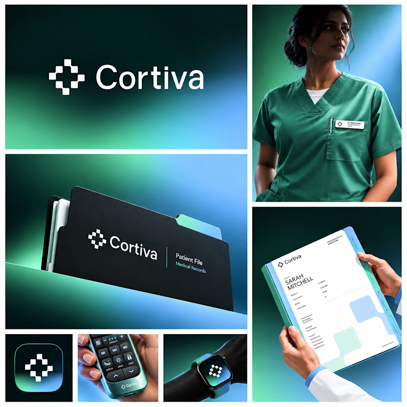
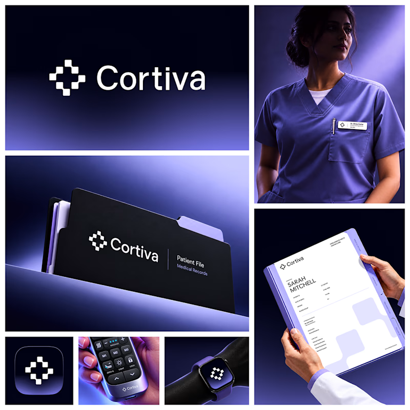
Working on Cortiva, an AI-first hospital branding project.
I've already finalized the color direction, but I thought it would be fun to explore two different moods.
Option 01💚 or Option 02? 💜
Both have their own personality, and I'm curious to see which one you prefer!
Let's see which one wins! 👀
5 voted
33%
10 voted
67%
15 votes
Closed

Option 01 for me. Green gets to "care" faster in a hospital setting, while the violet pulls the whole system toward a tech product. Since the identity is AI-first, I'd be curious whether you want patients to read it as clinical or as friendly first.