The network for creativity
Join 1.25M professional creatives like you
Connect with clients, get discovered, and run your business 100% commission-free
Creatives on Contra have earned over $150M and we are just getting started
Back to feedPost

Did you know you can now accept off-platform bank transfers on Contra?
Your Contra wallet now comes with its own unique bank account details, making it easy to get paid directly by clients via ACH or wire transfer. Simply share your account details with clients and receive payments straight into your Contra wallet.
This is especially useful if your clients pay through platforms like Bill.com, Ramp, Brex, Mercury, and other bank transfer tools.
Best part? You can keep your earnings on Contra, continue building your reputation, and for a limited time, you will get a $15 bonus on every new inbound transfer to your Contra wallet.


This is exciting
But I am more concerned about why your score is at -46, could you share your experience about it ?
This is my internal test account 😅 I love Contra
Oh I see😂
Thanks for the clarification, Matt. I am reassured!


Some designs look good. Some feel good. This one does both 👏

Wow, amazing!

Hi, is this option no longer available?...I can't find it on my profile
Hey @Tolulope Amao! Check now!
thanks
The network for creativity
Join 1.25M professional creatives like you
Connect with clients, get discovered, and run your business 100% commission-free
Creatives on Contra have earned over $150M and we are just getting started





Related posts


@contralabs Creative Intelligence Report shows AI adoption, workflows, and earnings, and the page itself is a masterpiece
The storytelling is unmatched.
Huge congrats to the big talent behind, @Mark Vassilevskiy, @Alex Karpodinis, @Stacy · Heed Collective, @Heed Collective , @Erin Horner, @Ben Huffman and the entire @Contra Labs team 👏

Folding the entire post-purchase flow into Kajabi — confirmations, order forms, the whole sequence — is where the brand actually earns trust, not just the landing page. Worth checking whether the confirmation and post-purchase pages read consistently when a customer hits them on a small phone after a sweaty match.

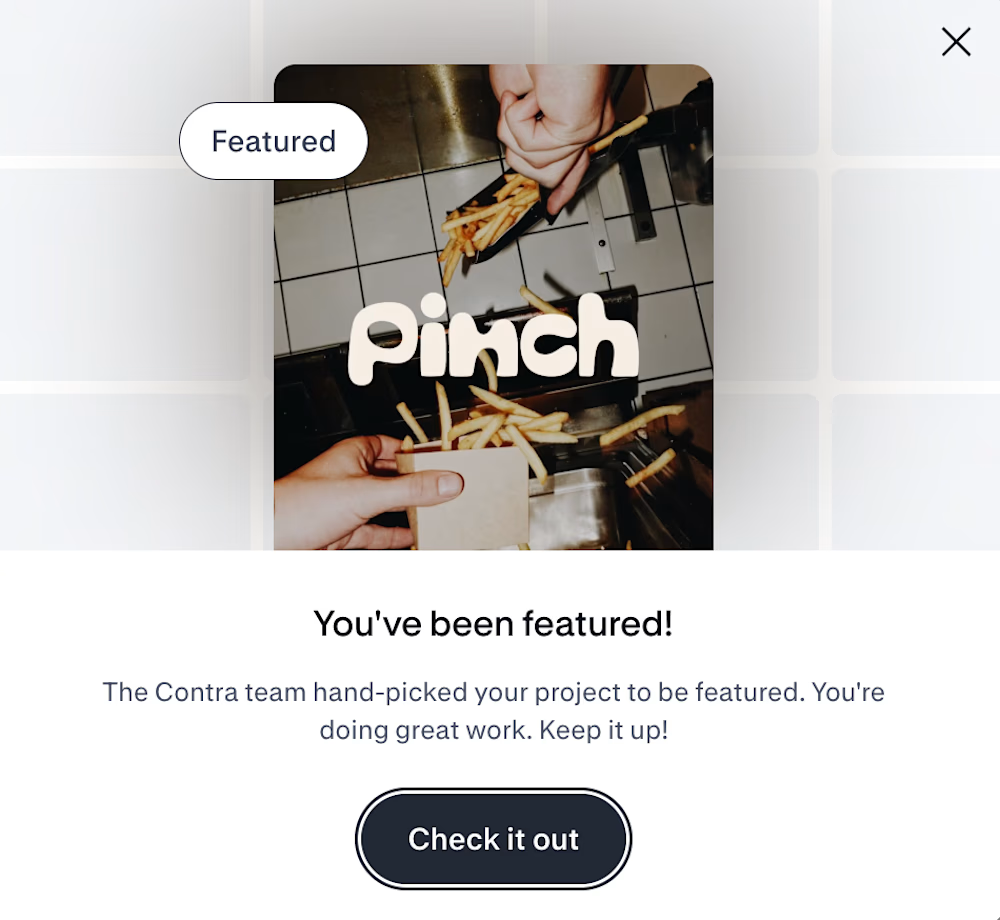
Pinch is featured on Contra! 🎉
It started as a free afternoon and a brief to myself: a salt brand you'd actually leave out on the counter. Five flavors, five tins, one very sassy voice.
Thank you Contra !!
Designers, do you make concept projects in between client work? How do you pick what to make?

It was really a unique salt brand 🎉🎉❤️❤️


Apparently, my Ambrosia post has been featured on Contra! Haven’t figured out where yet, but I’m taking the win 🙌
Thank you, Contra. A lovely little surprise today!
Beautiful!