The network for creativity
Join 1.25M professional creatives like you
Connect with clients, get discovered, and run your business 100% commission-free
Creatives on Contra have earned over $150M and we are just getting started
Back to feedPost


Top 3 Hero Section Mistakes on Course Websites
Those first three seconds decide everything – clarity is your biggest superpower.
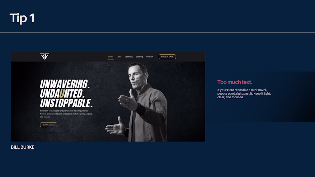
1️⃣ Too much text.
If your Hero reads like a mini-novel, people scroll right past it. Keep it light, clear, and focused.
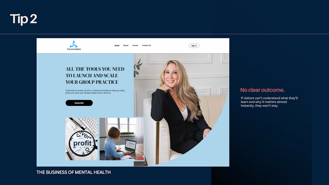
2️⃣ No clear outcome.
If visitors can’t understand what they’ll learn and why it matters almost instantly, they won’t stay.
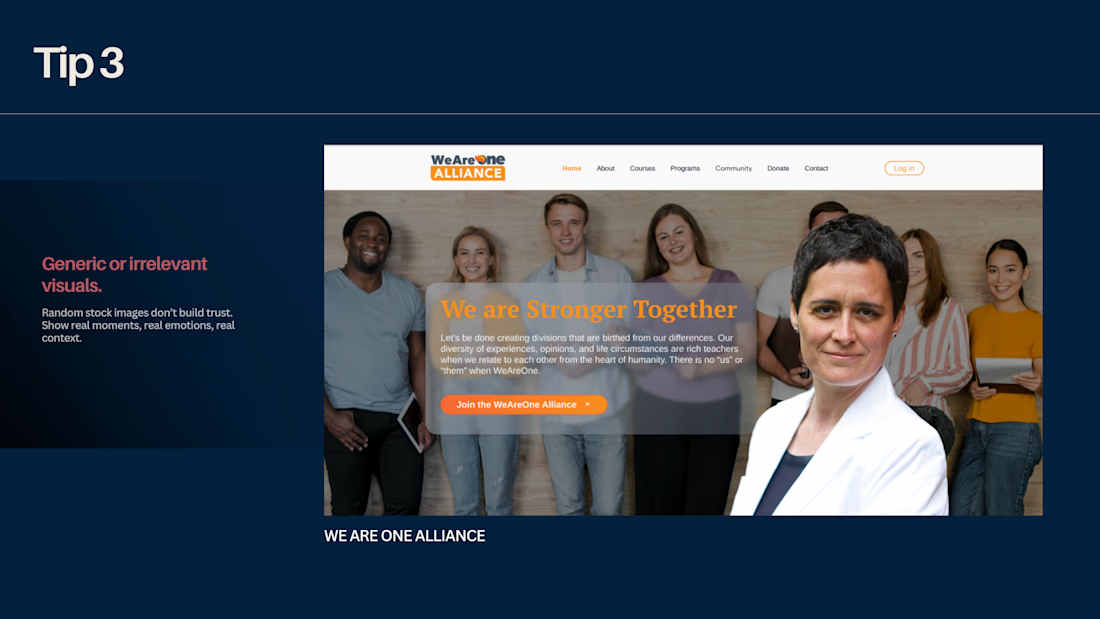
3️⃣ Generic or irrelevant visuals.
Random stock images don’t build trust. Show real moments, real emotions, real context.
✨ A strong Hero section is simple, honest, and instantly understandable.


Great breakdown. The hero section really sets the first impression, and clarity in those first few seconds makes a huge difference for conversions.
The network for creativity
Join 1.25M professional creatives like you
Connect with clients, get discovered, and run your business 100% commission-free
Creatives on Contra have earned over $150M and we are just getting started
Related posts

Hero section design for an upcoming vibe coding school called Mercury.
The goal was to create something the showed the interactivity of the lessons, the flexibility and the focus on reach and expansion.
The interactive part was built in Unicorn Studio, the layout and style was design in Figma and the final product was built in Lovable where the rest of the platform will also be built.
I created the expending expending ring animation to show the reach and expansion, while the cursor interaction represent the interactivity of the course and the effect that the student have on their future reach.

Strong concept! The expanding rings as a metaphor for growth and reach are such a smart visual choice 👏


Most “requirements” are not requirements.
They are assumptions.
That’s why I built Product Clarity Lab for the Figma x Contra Makeathon.
Paste a rough requirement.
Get an instant Clarity Score.
The tool highlights what’s missing across Core Clarity, Scope, and Project Risk, and generates focused questions you can answer or send directly to stakeholders.
As you add the missing information, the score increases and the requirement becomes structured, precise, and build-ready.
The result is simple:
Requirements everyone understands.
Less ambiguity. Less rework. More clarity.
https://spree-volume-44366657.figma.site
Trending
maxearnings
The next frontier of payments is live on Contra. How are you maximizing revenue?
freelancerlife
Freelancer life is wins, pivots, and everything in between. What’s yours right now?
aidesignflow
AI tools are redefining how designer work. What does your workflow look like?
micrographics
Micrographics started as utility - barcodes, packaging, instruction labels. How would you use them?
aivideo
AI video tools are moving at warp speed. What tools are you using?