The network for creativity
Join 1.25M professional creatives like you
Connect with clients, get discovered, and run your business 100% commission-free
Creatives on Contra have earned over $150M and we are just getting started
Back to feedPost

🚀 Full-Stack Developer Available for Long-Term Work
Hi everyone! I'm a Full-Stack Developer currently looking for long-term opportunities.
💻 Tech Stack:
• MERN Stack (React, Node.js,MongoDB, Express.js,)
• JavaScript / TypeScript
• REST APIs
• Frontend & Backend Development
My Portfolio Website :https://om-porfolio.vercel.app/
💼 Experience:
I have worked on multiple projects using the MERN stack, building scalable web applications, APIs, and modern user interfaces.
⏱ Hourly Rate: $15 – $20 / hour
I’m reliable, communicative, and focused on delivering high-quality code. I'm open to long-term collaborations with startups, agencies, or founders.
If you're looking for a dedicated developer, feel free to message me or invite me to your project.
Thanks!


The network for creativity
Join 1.25M professional creatives like you
Connect with clients, get discovered, and run your business 100% commission-free
Creatives on Contra have earned over $150M and we are just getting started







Related posts


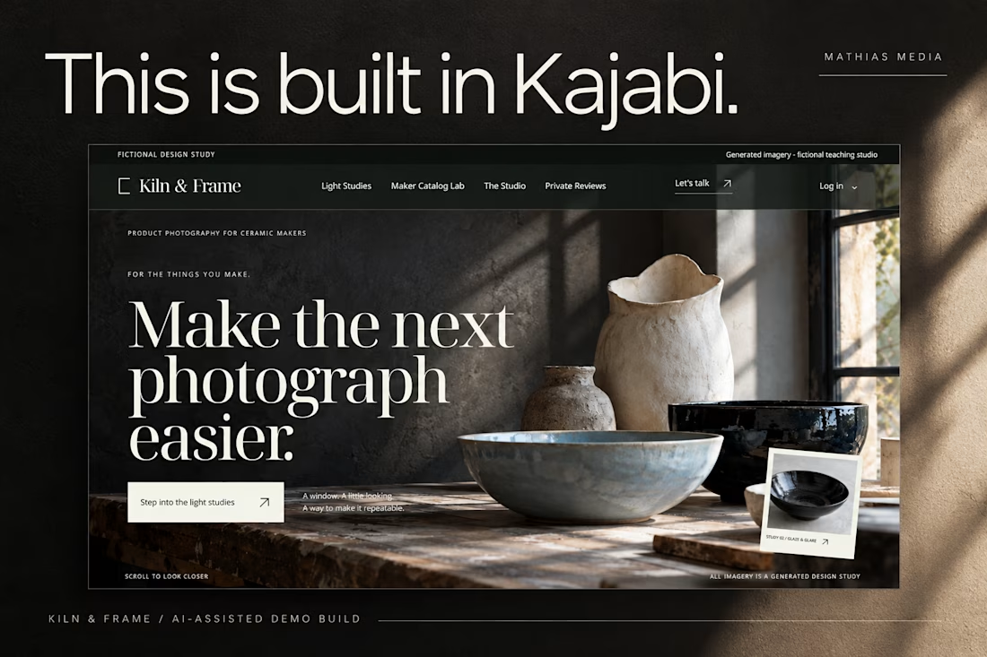
This is built in Kajabi.
Meet Kiln & Frame, a demo brand created to explore what a custom Kajabi website can look and feel like.
Editorial layouts. Rich imagery. Interactive details. And content that remains editable inside Kajabi.
Built through the AI-assisted process I’ve been developing and testing.
Pretty excited about this one.


love the editorial approach for kiln & frame. curious - how did you handle the image grids inside kajabi? i've struggled to make kajabi feel this custom without breaking the cms

Exploring hero sections for Nation e-commerce
Loving the direction

Solid layout, Miguel! The contrast between the clean typography and those interactive bento-style cards is crisp. Building this layout with smooth CSS grid transitions or GSAP pin scrolling would make the UX feel incredibly interactive.

The Good Times website is live 👀
Most app sites start with a phone mockup and a list of features. This one starts with the problem, so you can see yourself in it first. The app shows up after that, as the answer.
https://goodtimestimer.com/
Built with Astro.


Great concept