The network for creativity
Join 1.25M professional creatives like you
Connect with clients, get discovered, and run your business 100% commission-free
Creatives on Contra have earned over $150M and we are just getting started
Back to feedPost

Full-Stack Designer & System Architect
Developed a modular architecture for high-end newsletter landing pages. The core challenge was creating a system where each issue maintains a distinct, independent design while utilizing a shared, branded component library.
Key Features:
Zero-Overlap Design: Customizing one issue has no effect on previous or future issues.
Modular Sections: Reusable blocks for quotes, media, and long-form content.
Integrated Paywall UI: Seamless 'Gated Content' components designed to increase conversion for premium courses


The network for creativity
Join 1.25M professional creatives like you
Connect with clients, get discovered, and run your business 100% commission-free
Creatives on Contra have earned over $150M and we are just getting started







Related posts

Which Apple Vision Pro Landing Page Feels More Premium?
I'm exploring two visual directions for an Apple Vision Pro landing page concept and would love your feedback.
Option A: Dark cinematic interface with immersive spatial-computing vibes.
Option B: Soft lavender & light minimal interface with a premium Apple-inspired aesthetic.
Which version would you choose for a real product launch page, and why? Your feedback will help shape the final case study.

10 voted
59%
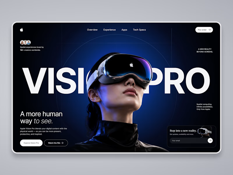
7 voted
41%
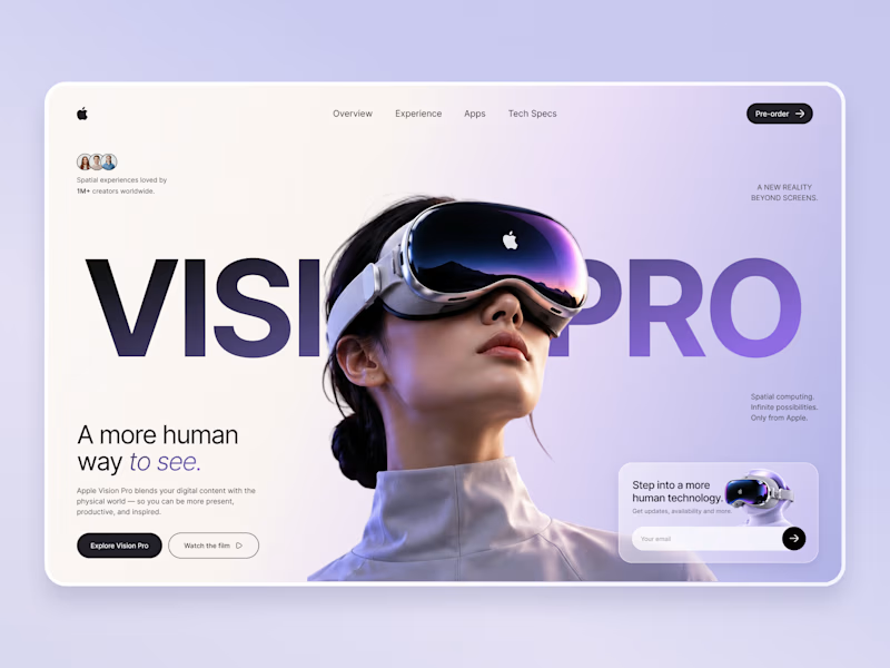
17 votes
Closed

Option A wins...Its visual appearance suddenly grad against Option B!!

First look at the Active website redesign — Version 02.
#WebDesign #CleanWebDesign #ArchitectureDesign


Parallax is literally the killing effect on websites ✅

Libra season is here, and so is spring (in my side of the world)!
🌸🍃 ☀️🌈
I'm using this blooming moment to rebuild my personal brand from the ground up: re-evaluating, brainstorming, and bringing my whole toolset to the table. 💻🧠⚡️
As a multipotential creator, making everything I do fit into one clear story isn't always easy. So I'm giving it the time it deserves, and I'm curious to see where it leads.
STAY TUNED! 😊

