The network for creativity
Join 1.25M professional creatives like you
Connect with clients, get discovered, and run your business 100% commission-free
Creatives on Contra have earned over $150M and we are just getting started
Back to feedPost

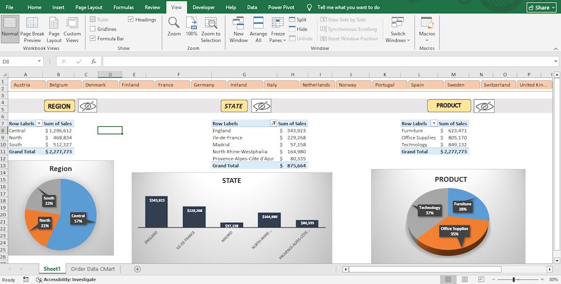
"This project demonstrates my proficiency in transforming raw business data into actionable visual insights using Microsoft Excel. I designed a fully dynamic, user-friendly Executive Sales Dashboard utilizing interconnected Pivot Tables and visual charts.

The network for creativity
Join 1.25M professional creatives like you
Connect with clients, get discovered, and run your business 100% commission-free
Creatives on Contra have earned over $150M and we are just getting started





Related posts

FNP Sales Analysis Dashboard – Excel
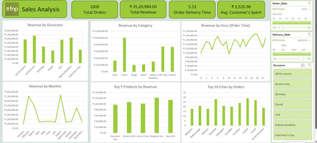
Developed an interactive Sales Analysis Dashboard in Microsoft Excel to analyze order performance, revenue trends, customer spending, product performance, and delivery efficiency. The dashboard provides a comprehensive view of sales data through dynamic KPIs, charts, filters, and time-based analysis.
Key Features & Analysis
Sales Performance KPIs: Tracked 1,000 total orders, ₹35.20 lakh total revenue, average customer spending of ₹3,520.98, and average order-delivery time of 5.53 days.
Revenue by Occasion: Analyzed revenue generated across occasions such as Anniversary, Birthday, Diwali, Holi, Raksha Bandhan, and Valentine's Day.
Revenue by Category: Compared sales performance across product categories including Cakes, Colors, Mugs, Plants, Raksha Bandhan products, Soft Toys, and Sweets.
Revenue by Hour: Examined order-time patterns to identify hours with higher revenue generation.
Monthly Revenue Analysis: Analyzed revenue trends across different months to identify seasonal fluctuations and peak-performing periods.
Top 5 Products: Identified the highest-revenue-generating products, including Deserunt Box, Dolores Gift, Harum Pack, Magnam Set, and Quia Gift.
Top 10 Cities: Compared order volumes across cities such as Bharara, Bidhanagar, Bilaspur, Dhanbad, Dibrugarh, Gujratkal, Haridwar, Imphal, Kavali, and North Dumdum.
Interactive Filters: Added filters for Order Date, Delivery Date, and Occasion, allowing users to dynamically explore specific periods and sales segments.
Dashboard Design: Created a user-friendly layout with KPI cards, charts, slicers/filters, and interactive visualizations for quick business insights. Tools & Skills Microsoft Excel | Data Analysis | Data Visualization | Dashboard Development | Pivot Tables/Charts | Interactive Filters Project Objective The primary objective of this project was to transform raw sales data into an interactive Excel dashboard that enables users to monitor sales performance, identify revenue trends, understand customer purchasing patterns, and evaluate product and geographical performance for better business decision-making.

"We can't afford a data analyst."
I've heard this from 3 different startups this year.
So I built one.
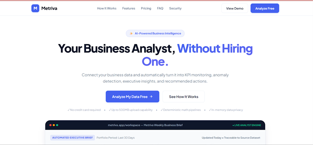
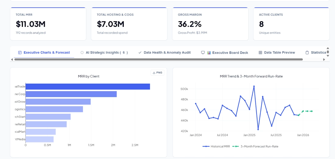
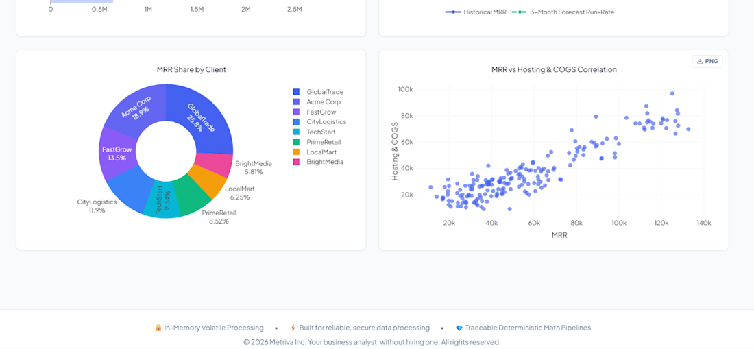
Metriva is an AI-powered business analyst that:
📊 Turns messy spreadsheets into executive dashboards
🧠 Writes C-level business briefs automatically
📈 Forecasts trends + detects anomalies
💬 Answers questions about your data in plain English
🎯 Finds your Pareto 80/20 — who drives 80% of your revenue?
No SQL. No Python. No data team.
Just upload your file and get answers.
Built with Flask, vanilla JS, and a lot of late nights.
🔗 Try it: metriva.ai1.vercel.app
#AI #BusinessIntelligence #Founder #IndieHacker #DataScience

The brief-writing piece is interesting — curious how you handle the validation step. AI-generated language tends to sound confident even when the underlying data is sparse or the trend is ambiguous. One pattern that helps: have the model output a confidence signal alongside the...

Hi, I’m an experienced Bookkeeper dedicated to keeping your business finances accurate, organized, and up to date.
If you hire me, I’ll take care of your day-to-day bookkeeping so you can focus on running and growing your business.
What I’ll do for you:
Categorize and record transactions accurately
Reconcile bank and credit card accounts
Manage Accounts Payable & Receivable
Record invoices, bills, payments, and deposits
Clean up and organize your books
Handle month-end closing
Prepare accurate financial reports
Maintain QuickBooks Online, QuickBooks Desktop, or Xero
My goal is simple: clean books, accurate numbers, and a clear picture of your business finances.🙌


Wishing you the best of luck 😊