The network for creativity
Join 1.25M professional creatives like you
Connect with clients, get discovered, and run your business 100% commission-free
Creatives on Contra have earned over $150M and we are just getting started
Back to feedPost


The network for creativity
Join 1.25M professional creatives like you
Connect with clients, get discovered, and run your business 100% commission-free
Creatives on Contra have earned over $150M and we are just getting started



Related posts

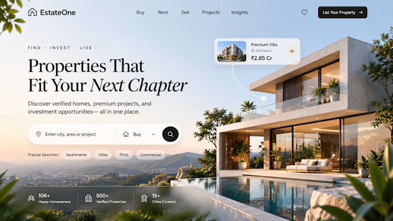
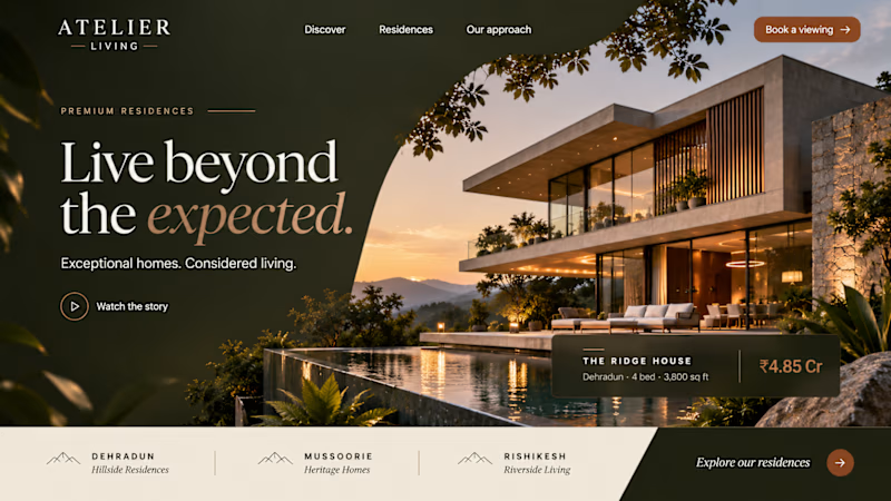
Two concepts. One vision. What makes a property worth coming home to?
A home is more than its walls. It’s the feeling of being exactly where you belong.
For this real estate concept, I explored a more considered approach to digital property experiences, combining strong visual storytelling with a clear, focused user journey.
The goal was simple: make discovering a home feel as meaningful as finding one.
Which direction would you choose for a premium real estate brand?
A or B?
6 voted
100%
0 voted
0%
6 votes
Closed

Second one feels more premium.

2D Motion Landing Page Design
An exploration of motion, visual storytelling, bold typography, and modern web aesthetics.
This landing page concept combines a striking red-and-black visual direction with dynamic elements and a carefully structured layout to create an engaging digital experience.
Design focus:
2D Motion Design
Visual Hierarchy
Typography & Composition
Color & Contrast
Landing Page Design
#2DMotion #LandingPage #WebDesign #UIDesign #MotionDesign


The helmeted figure on the red is a strong hook, and the Stop Waiting card is clear. One friendly catch: the cover title reads "Motoin" and "Sass", worth fixing before clients see it.

Designed a premium ecommerce hero banner for UrbanThreads, a modern fashion brand focused on style, quality, and everyday essentials.
The design features a sophisticated black and gold visual identity, elegant typography, high-impact messaging, and a carefully balanced layout to create a luxurious shopping experience.
Design Deliverables:
Ecommerce website hero banner
Premium brand visual direction
Typography and layout design
CTA button design
Brand-consistent color palette
Fashion-focused promotional graphics
Design Goal:
To create a visually engaging and professional ecommerce banner that communicates brand identity, attracts customers, and enhances the online shopping experience.

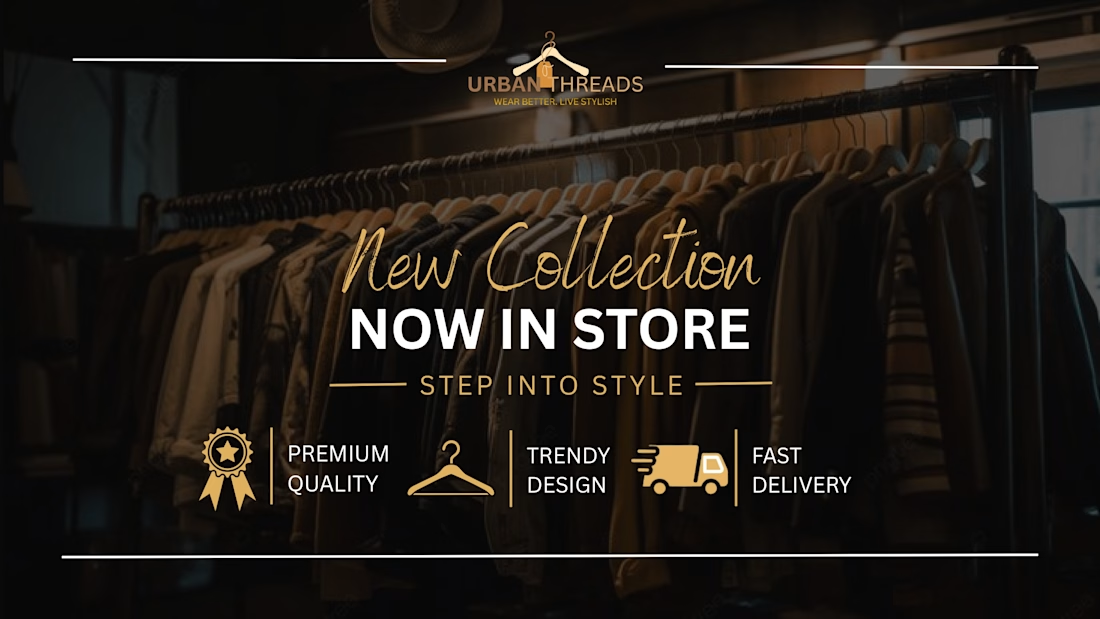
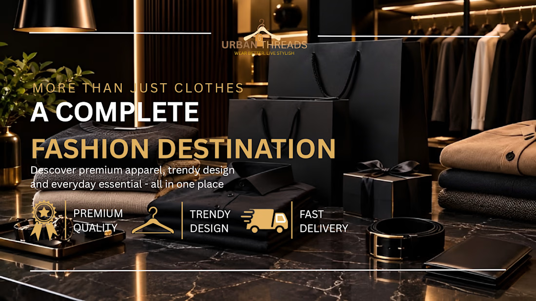
The gold script on "New Collection" over the dark rails does its job fast, and the three icon benefits add proof without crowding. For a story crop, would you keep all three or cut to one?