The network for creativity
Join 1.25M professional creatives like you
Connect with clients, get discovered, and run your business 100% commission-free
Creatives on Contra have earned over $150M and we are just getting started
Back to feedPost
The horizontal hero won.
Clear hierarchy + easy scanning made the difference.
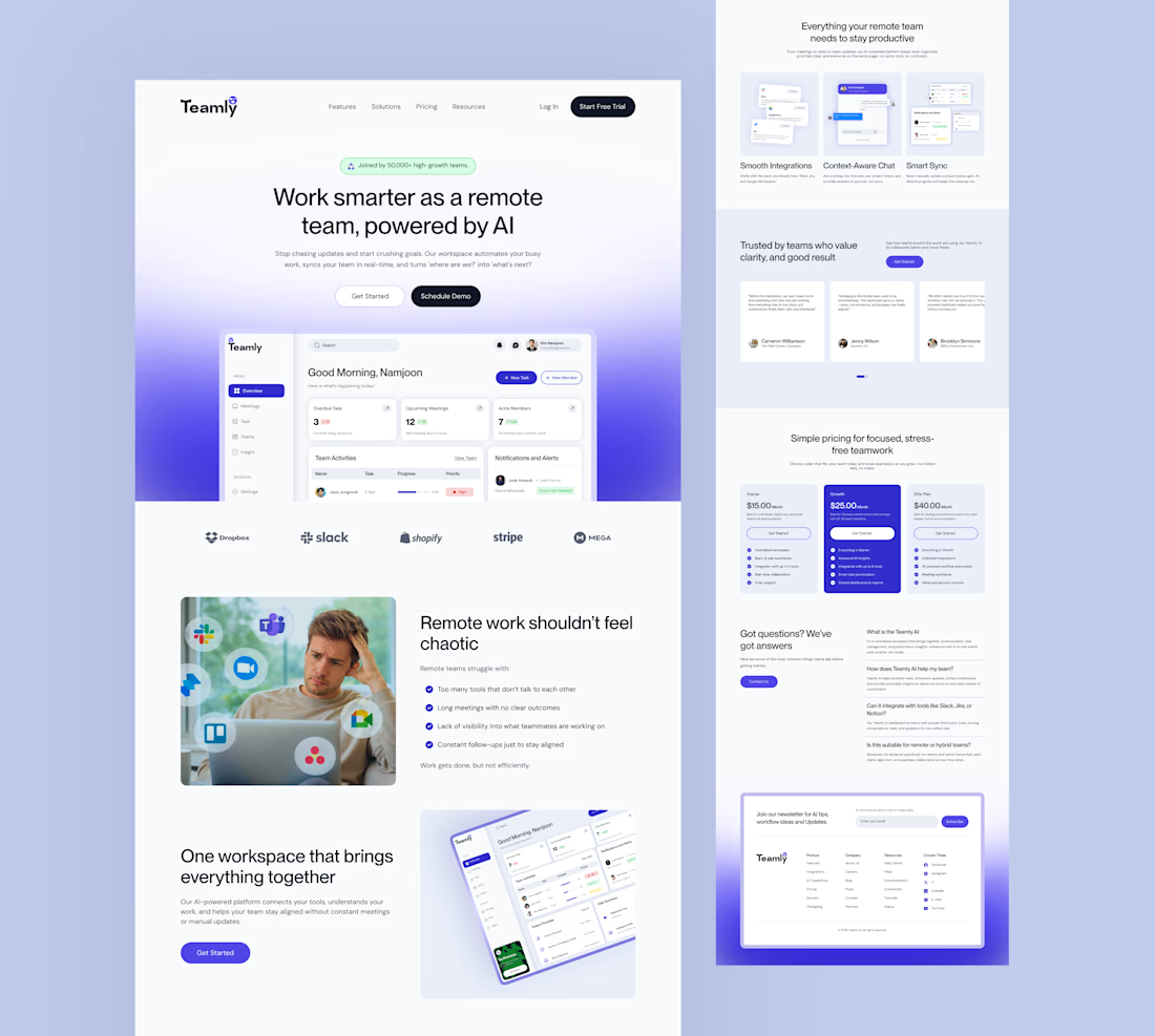

A good reminder that layout decisions are often about speed of understanding.
The network for creativity
Join 1.25M professional creatives like you
Connect with clients, get discovered, and run your business 100% commission-free
Creatives on Contra have earned over $150M and we are just getting started





Related posts

Made it to the top 1% of creatives on Contra.
My discovery points are still going up, with one more case study left to write.
Grateful for the people I’ve met through Contra, the projects we’ve worked on, and the opportunity to keep growing together. 🎉



Which hero visual feels right for this brand?
While working on the homepage for Halfspace, a website design and SEO agency, I explored two different hero visuals for the same headline and layout. Same message, same structure, just a different visual metaphor and mood.
Option 1 - Rocket Launch. Bold, literal, and energetic, visually reinforcing the "launch your business" message with motion and fire.
Option 2 - Glass Cube. Abstract, sleek, and premium, giving a more refined, tech-forward feel without relying on a literal metaphor.
Would love your honest UX/UI take, which direction feels more impactful, memorable, and aligned with a web design/SEO brand, and why?
2 votes
Ends in 1d

Great work


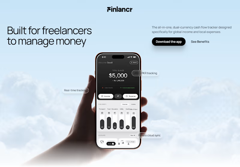
Designing the hero section for a freelance finance app.
Which hero design would make you download the app?
30 voted
64%
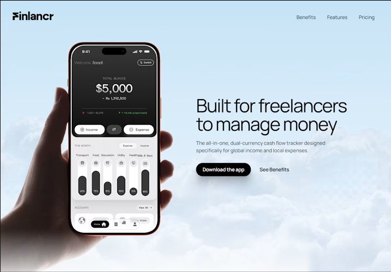
17 voted
36%
47 votes
Closed