The network for creativity
Join 1.25M professional creatives like you
Connect with clients, get discovered, and run your business 100% commission-free
Creatives on Contra have earned over $150M and we are just getting started
Back to feedPost

Hello Contra people.
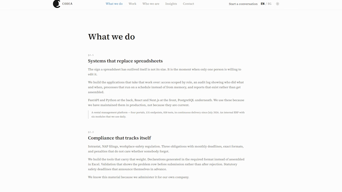
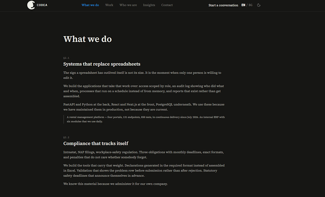
I am reaching for advice. We want to keep this paper design but make it not looking so plain. Any ideas how to improve it? The full site can be reached at codea.bg
The network for creativity
Join 1.25M professional creatives like you
Connect with clients, get discovered, and run your business 100% commission-free
Creatives on Contra have earned over $150M and we are just getting started



Related posts

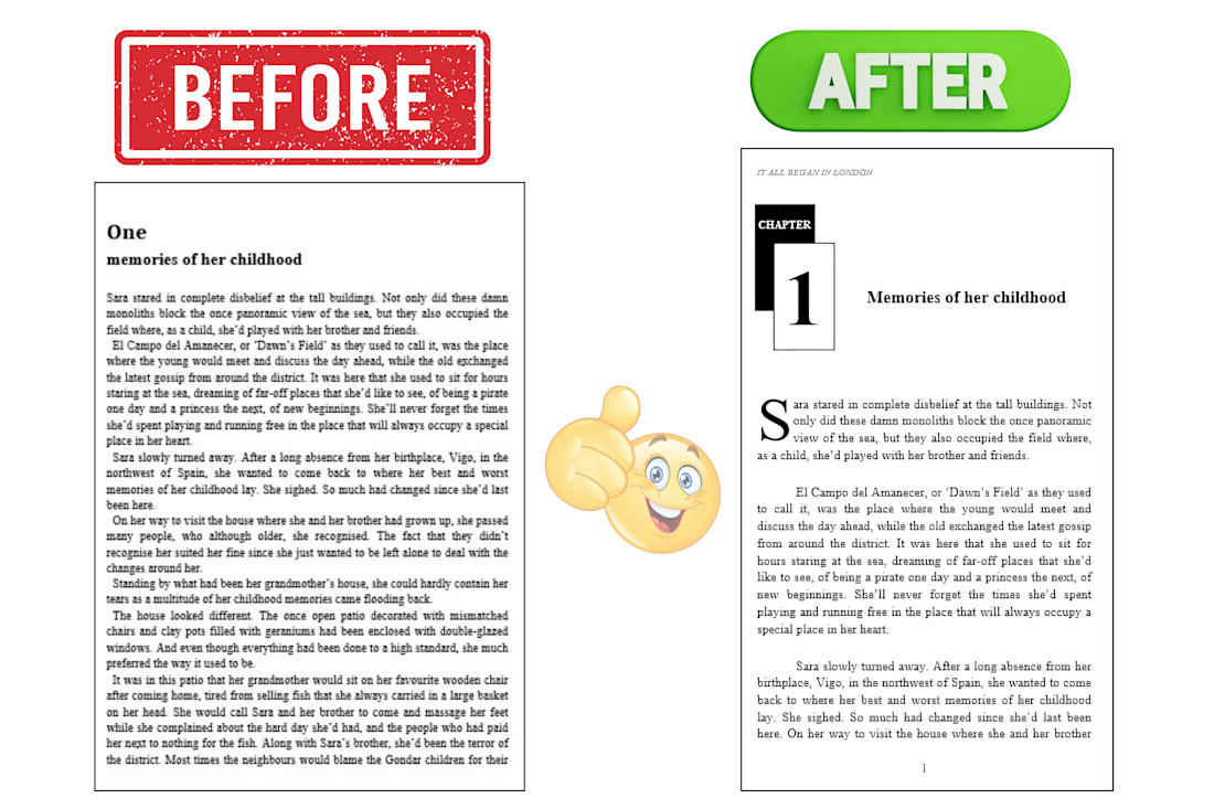
A before-and-after presentation showcasing the transformation of a book manuscript into a professionally formatted, publication-ready interior.
The project focused on improving page layout, typography, spacing, margins, chapter headings, and overall readability to create a clean, consistent, and professional reading experience.



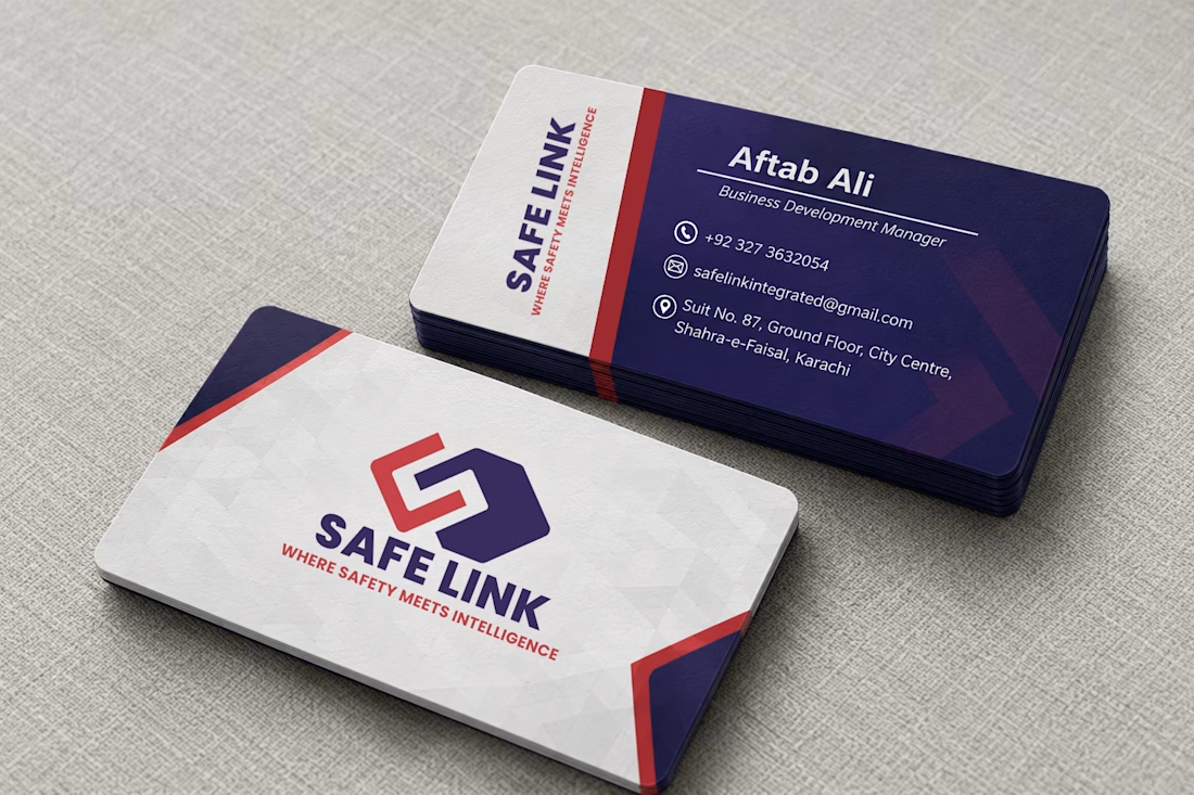
A professional first impression starts with a strong identity.
Presenting a business card design for SafeLink, created with a focus on brand consistency, clean typography, and a modern visual identity.
The combination of deep navy, red, and white creates a confident and professional look while keeping the layout clean, readable, and memorable.
From the logo placement to the contact details, every element is designed to maintain a consistent brand experience.
What do you think of this business card design? I'd love to hear your feedback!
#BusinessCardDesign #BrandIdentity #GraphicDesign #Branding #PrintDesign #MockupDesign

Working on a website concept to showcase my automation workflows and projects. Keeping the design simple, with smooth animations and a little personality.
What do you think? I'd love to hear your feedback and any suggestions for improvement!

