The network for creativity
Join 1.25M professional creatives like you
Connect with clients, get discovered, and run your business 100% commission-free
Creatives on Contra have earned over $150M and we are just getting started
Back to feedPost
If your product graphics look like a basic catalog photo, they won't stop the scroll. High-end jewelry needs dramatic visual storytelling to command luxury pricing.
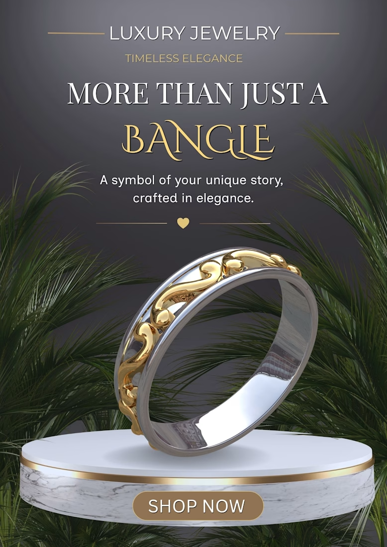
Look at my latest commercial jewelry poster layout. Every layer is engineered to elevate the product:
Editorial Typography: High-contrast serif text mixed with elegant script sets an instant premium tone.
The Marble Podium: Elevating the bangle on a gold-rimmed pedestal gives it a sense of luxury authority.
Organic Contrast: Surrounding metallic textures with dark palm leaves creates a high-fashion aesthetic.
📬 Ready to transform your product photos into high-converting commercial assets?
Send me a DM with the word "LUXURY" or comment below, and let's upgrade your brand's visuals!
#GraphicDesign #JewelryBranding #ProductAd #BrandIdentity #ProductAdvertisement #EcommerceMarketing #BrandIdentity #CanvaPro #LuxuryAesthetic



Thank you so much! I'm glad you noticed those details and liked the cinematic vibe.
The network for creativity
Join 1.25M professional creatives like you
Connect with clients, get discovered, and run your business 100% commission-free
Creatives on Contra have earned over $150M and we are just getting started

Challenges
View all


Related posts

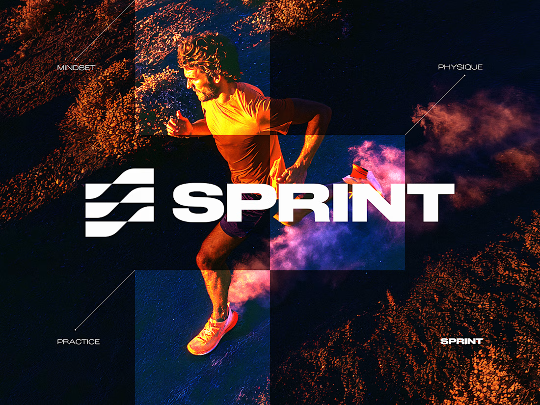
SPRINT — Experimental Brand Visual
A visual experiment built around an unused logo concept from a recent branding project.
The design was created manually, while exploring how AI-driven aesthetics are increasingly influencing contemporary visual language, even when AI itself isn’t part of the design process.
Logo design, art direction and visual exploration.



Good work

Luxury Lighting E-commerce Website Design for Modern Home Decor
A modern luxury lighting e-commerce website concept crafted to showcase premium statement pieces through a refined, immersive, and editorial-inspired digital experience. The design combines warm ambient lighting, bold typography, cinematic imagery, and clean minimalist layouts to create a sophisticated online presence for a high-end home decor brand. Every element is thoughtfully designed to enhance product storytelling, improve user engagement, and deliver a seamless shopping experience across all devices.


really nice design

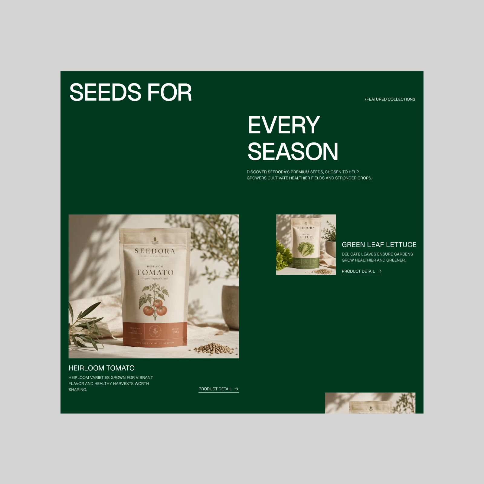
Seedora — Premium Seed Brand. Starting with the product side.
A less typical take on an agricultural product page — more editorial, considered, and lifestyle-driven. More from Seedora coming next.