The network for creativity
Join 1.25M professional creatives like you
Connect with clients, get discovered, and run your business 100% commission-free
Creatives on Contra have earned over $150M and we are just getting started
Back to feedPost

From graphite to gloss: the final reveal.
Yesterday I showed you where the concept started.
Today, watch it come alive.
When you build high-end editorial assets, the line between synthetic and premium is razor thin.
Yesterday, I walked you through the sketch phase.
Today is the proof of execution.
The biggest challenge in bringing this to life was absolute character and texture integrity.
Traditional video models love to distort shapes during motion transitions.
To fix that, I designed a specialized workflow utilizing advanced interpolation and spatial mapping that honors every detail of my original drawings.
Key technical wins in this piece:
📌 The Morph:
Watching hand-drawn pencil lines seamlessly transform into rich textile textures and physical depth.
📌 The Depth:
Pulling a flat 2D paper layout into a living, breathing 3D space without losing its structural soul.
📌 The Final Snap:
Locking the typography and layout into a pristine magazine cover composition.
😇 This isn't a random AI generation.
It's the result of human art direction commanding technology to execute a specific, intentional vision.
This is what modern creative direction looks like for luxury brands and digital publications.
How do you see human-led AI transforming the future of editorial design?
Let's discuss below. 👇
#FashionDesign #VogueCover #SketchToReality #DigitalTransformation #LinkedInCreative

The network for creativity
Join 1.25M professional creatives like you
Connect with clients, get discovered, and run your business 100% commission-free
Creatives on Contra have earned over $150M and we are just getting started



Related posts

A fashion storefront needs to show the outfit and make its individual pieces easy to find.
For FORM, I paired a warm, editorial lookbook with clearly grouped product names, prices, and size choices.
Cream surfaces, charcoal typography, and consistent product cards connect the homepage with the desktop and mobile screen concepts.
One useful design principle from this project: give campaign imagery and shopping details their own readable zones. The collection can have a strong visual presence while the next product decision stays clear.
Explore the complete design case study:
https://contra.com/p/rNPRqooQ-form-fashion-e-commerce-website-design
When exploring a clothing collection, what helps you most: a styled outfit or an individual product grid?

Adorable

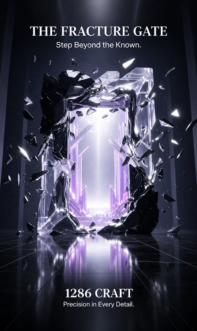
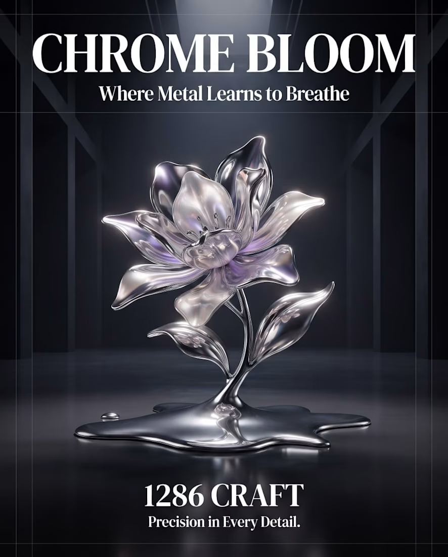
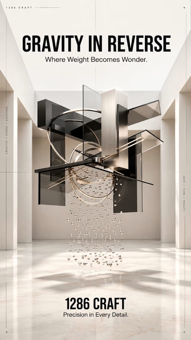
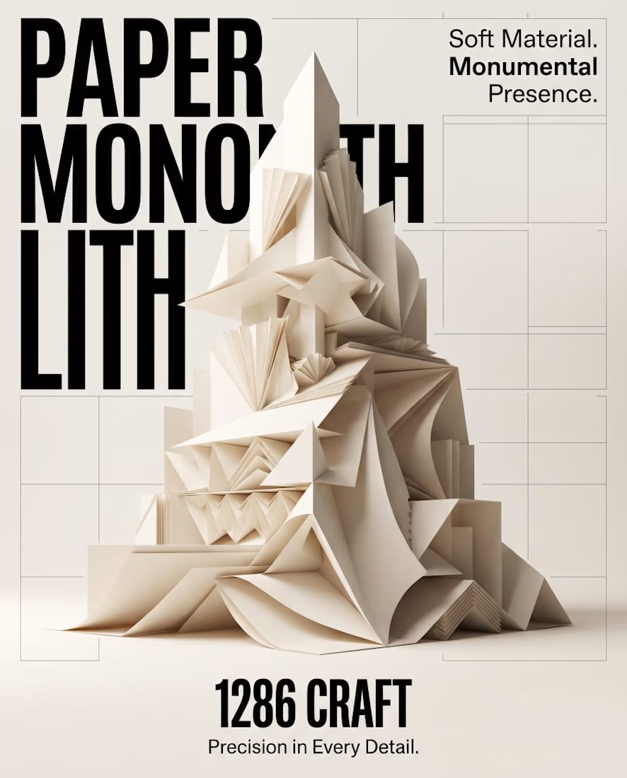
PAPER MONOLITH — Where Paper Becomes Architecture
An exploration of experimental graphic design, sculptural form, and architectural minimalism.
PAPER MONOLITH transforms the delicate nature of paper into a monumental visual statement. Inspired by origami geometry and contemporary architecture, this concept combines intricate folded structures, sophisticated typography, and refined editorial composition.
Created for 1286 CRAFT, the project explores the contrast between softness and strength through ivory-toned sculptural forms, realistic CGI aesthetics, precise geometric detailing, and a minimalist Swiss-inspired design approach.
The accompanying cinematic motion design brings the composition to life through subtle unfolding movements, atmospheric lighting, and elegant visual storytelling.
Creative Direction: Experimental Graphic Design, 3D Art Direction, Editorial Typography, Conceptual Design, Architectural Visualization, AI-Assisted Visual Design, and Cinematic Motion Design.
1286 CRAFT — Precision in Every Detail.
#1286CRAFT #GraphicDesign #ExperimentalDesign #EditorialDesign #Typography #3DArt #ArtDirection #MotionDesign #VisualIdentity #CreativePortfolio



Amazing work

Hey everyone! 👋🏼
Curious to know what AI tools you guys use for image generation in art direction and creative projects.
I'm particularly interested in tools that can produce realistic, cinematic imagery, with strong control over lighting, textures, composition, and overall visual consistency.
Which tools have given you the best results? Would love to hear your recommendations and experiences! ✨

For Image gen, using magnefic and gemini pro.
I hear Higgsfield is insanely good for image gen, but it's costly though.