The network for creativity
Join 1.25M professional creatives like you
Connect with clients, get discovered, and run your business 100% commission-free
Creatives on Contra have earned over $150M and we are just getting started
Back to feedPost


Rewind back to my first project at CLEAR in February: the newly designed Vault experience in the CLEAR mobile app.
The goal was simple — make it easier for members to manage the travel details that matter most, all in one place. We built a clearer, more actionable hub for things like CLEAR ID, passport details, and TSA PreCheck information, designed to help members quickly see what needs attention and what to do next, rather than treating these as static account details.
What I enjoyed most about this one was designing at the intersection of utility, clarity, and trust. The best product experiences remove stress before a user even notices it — that was the real challenge here.
Vault is live and iterating. Download the app and check it out: https://apple.co/4xdFy1K


The network for creativity
Join 1.25M professional creatives like you
Connect with clients, get discovered, and run your business 100% commission-free
Creatives on Contra have earned over $150M and we are just getting started

Challenges
View all


Related posts


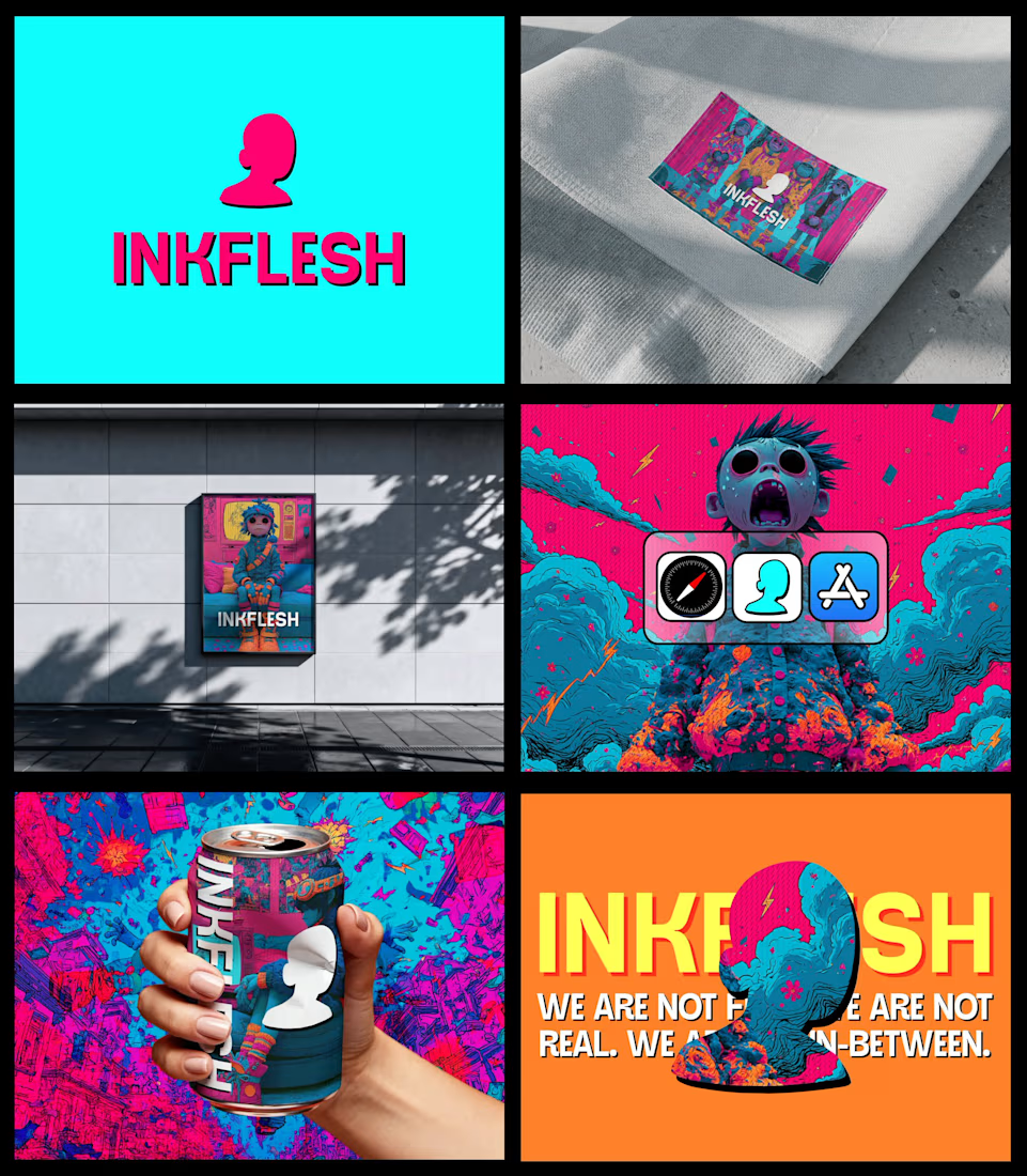
In my INKFLESH identity work, the wordmark runs off the can's curve and gets partly hidden behind artwork on posters. That crop asks the rest of the identity to carry more recognition. The mark has a job when the name is only partly there.


I can easily say this is a black diamond. wonderful execution

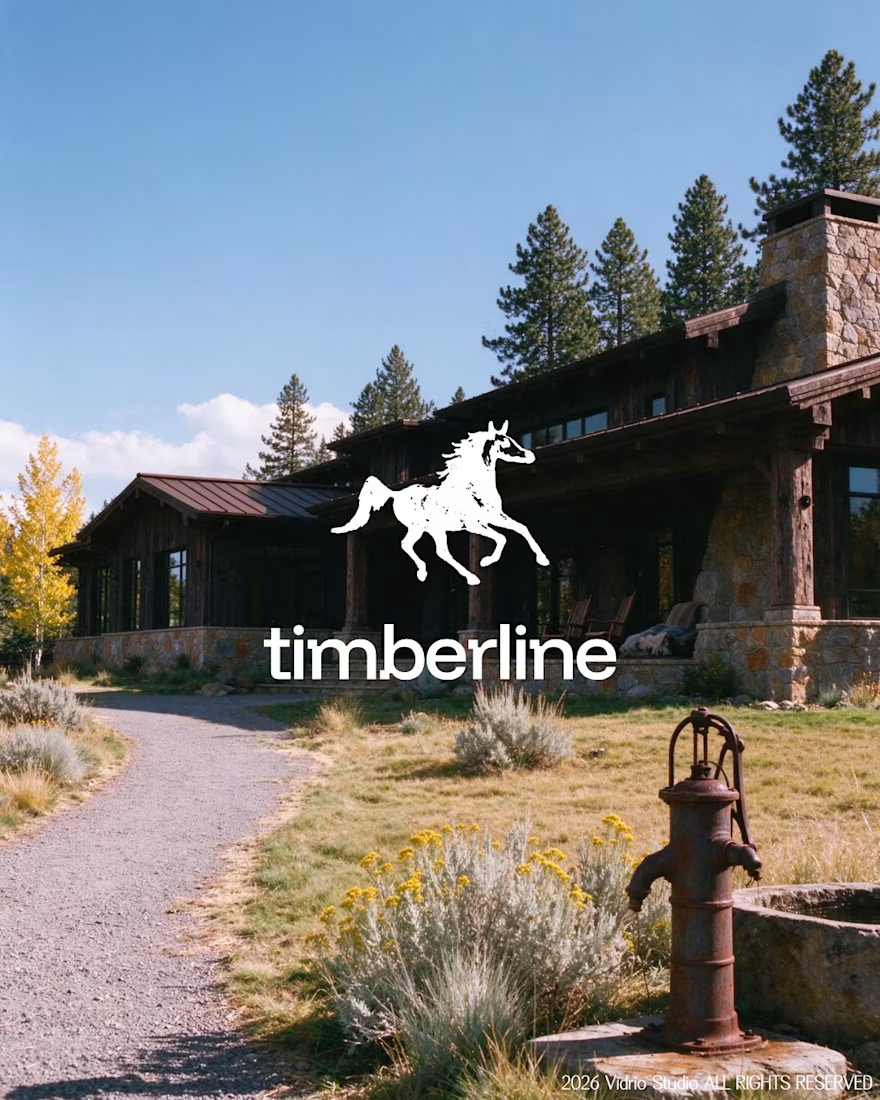
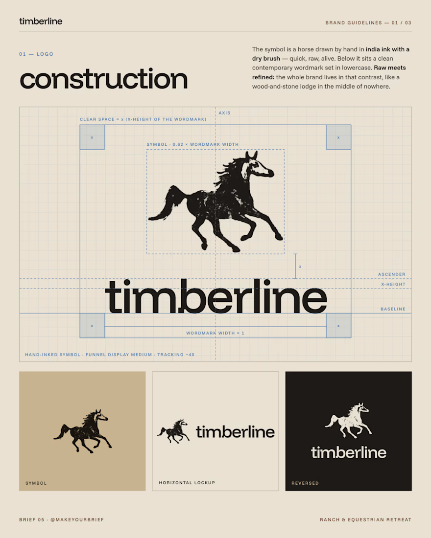
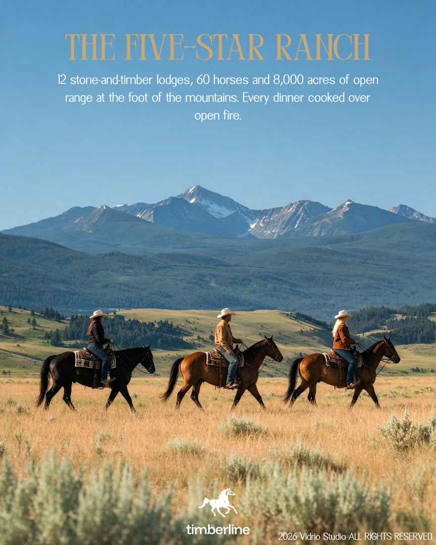
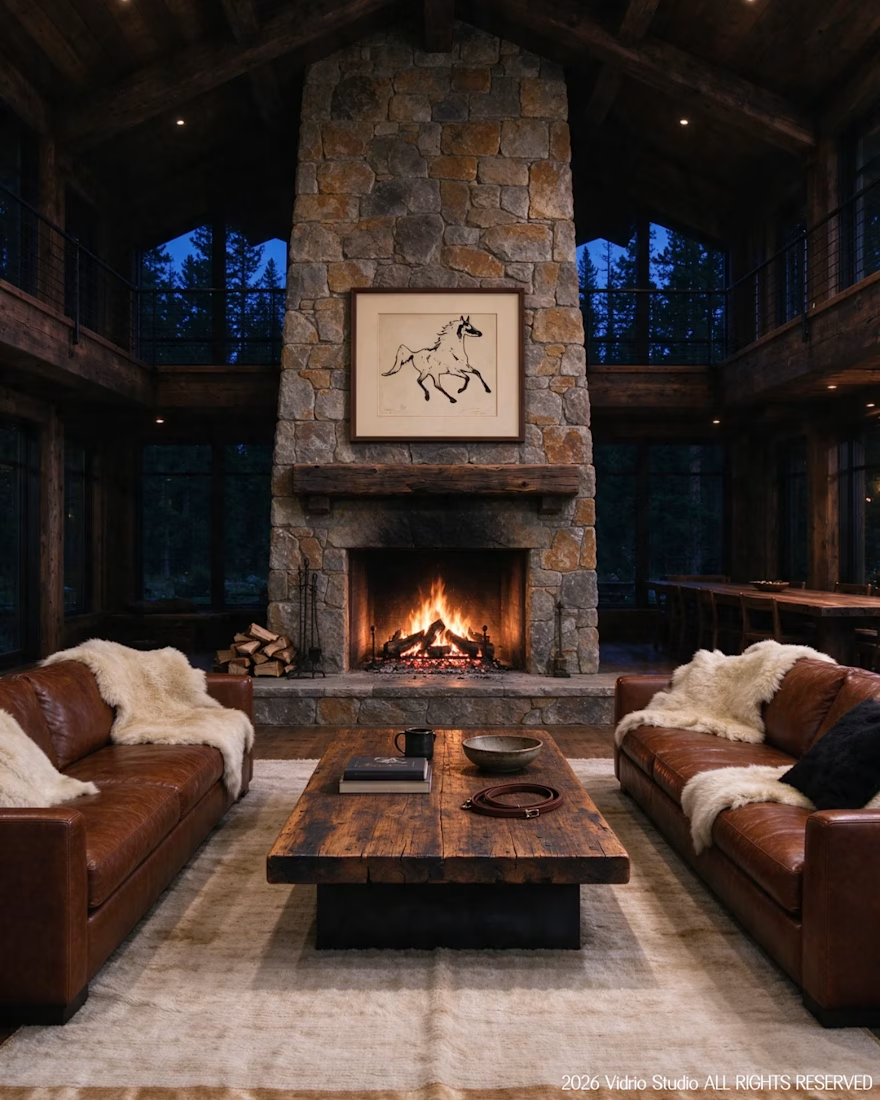
I worked on Brief 05 of the @makeyourbrief challenge: a brand identity for Timberline, a luxury ranch and equestrian retreat. I hand-drew the horse symbol with a marker, paired it with a clean modern wordmark and an earthy palette, and extended it into merch and lodge photography using AI under my own art direction, with retouching by hand.
Would you stay here? Tell me which image sold you.



That's really incredible great job Andreu❤️❤️