The network for creativity
Join 1.25M professional creatives like you
Connect with clients, get discovered, and run your business 100% commission-free
Creatives on Contra have earned over $150M and we are just getting started
Back to feedPost

Your content doesn't get a second chance at a first impression.
People may say they don't judge a book by its cover...
YouTube proves otherwise.
This is one thumbnail I saved from being overlooked with a complete redesign.
Share your thought on it 🗯
If your thumbnails aren't getting the attention- DM me

The network for creativity
Join 1.25M professional creatives like you
Connect with clients, get discovered, and run your business 100% commission-free
Creatives on Contra have earned over $150M and we are just getting started
Related posts

From $1 to $100M! 💰🔥
A dramatic MrBeast-inspired YouTube thumbnail showing the contrast between extreme poverty and unbelievable wealth.
🏚️ Left Side: A poor house with bold "$1" text.
💎 Center: MrBeast as the main focal point, grabbing attention.
🏰 Right Side: A luxurious rich house with bold "$100M" text.
The goal was to create a powerful visual contrast, strong storytelling, and an eye-catching composition that makes viewers curious enough to click.
Design Focus:
Strong visual hierarchy
Eye-catching colors and contrast
Clear, bold typography
Balanced composition
High-impact YouTube thumbnail design
What would you choose: $1 or $100M? 👇
#YouTubeThumbnail #ThumbnailDesign #MrBeast #CanvaDesign #GraphicDesign #YouTubeDesigner #ThumbnailArtist #VisualStorytelling #ContraPortfolio



Text on album covers is tacky? Whatever 🤌🏼 Vienna Starlight Boom 😒
Typography can ABSOLUTELY make an album cover.
During the pandemic, I got obsessed with album cover design. I'd spend hours looking at covers, researching the designers behind them, and trying to understand the decisions and creative processes that made them work.
It was one of those design rabbit holes I could never get tired of. 💀
I'm bringing that interest back with a new cover inspired by the music I love, including Neil Young's Harvest, Bandalos Chinos' Paranoia Pop and Uncle Acid & The Deadbeats' Vol. 1.
Looking at these alongside other great album covers, one thing stands out: typography CAN be the image!
I took inspiration and designed one as well!
What's an album cover where the typography is impossible to separate from the artwork? Show me your favorites.
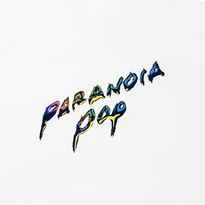
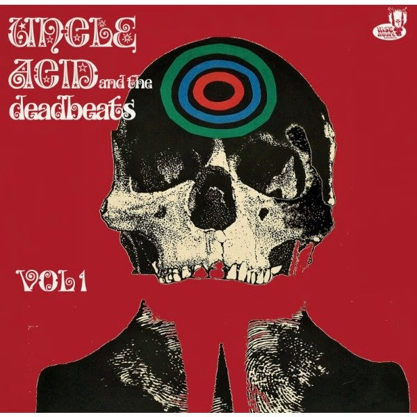
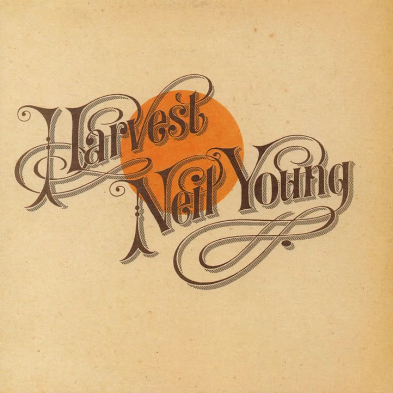
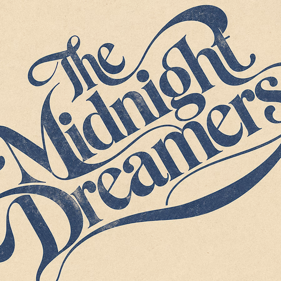

Reid Miles' Blue Note covers are my pick, where the cropped oversized lettering carries as much mood as any photo could. Your Paranoia Pop treatment has that quality too, the letterforms feel poured into the image rather than placed on it.

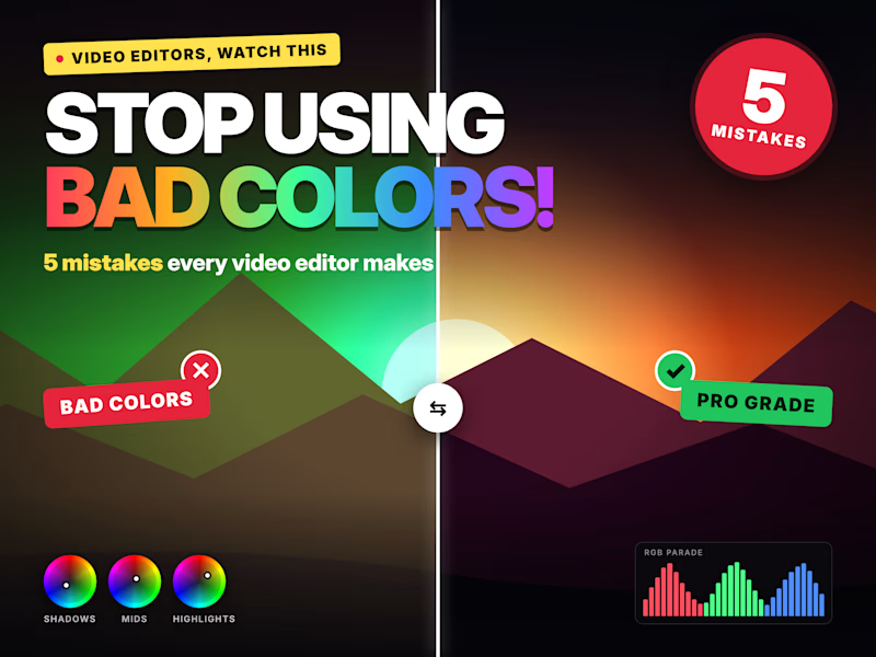
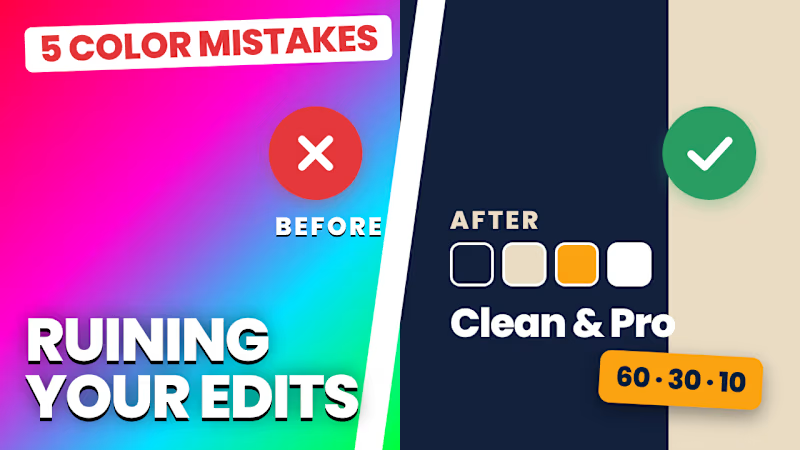
guys which thumbnail is best ??
1 voted
100%
0 voted
0%
1 vote
Closed