The network for creativity
Join 1.25M professional creatives like you
Connect with clients, get discovered, and run your business 100% commission-free
Creatives on Contra have earned over $150M and we are just getting started
Back to feedPost
This project showcases a fully responsive, dynamic website built for Zion Hill Outdoor Spaces, demonstrating how a single website can adapt seamlessly across desktop, tablet, and mobile devices.
The video walkthrough highlights how dynamic design allows layouts, imagery, and content to naturally reflow across screen sizes — maintaining clarity, balance, and visual impact on every device.
Real user-generated content from completed landscaping projects is blended with seasonal visuals throughout the site, during the day, at night, or across different seasons.
This approach removes the need for multiple site versions and ensures the business is represented professionally wherever and however potential customers choose to browse.
Focus: Responsive design • Cross-device experience • Visual storytelling • Dynamic layouts
Cool way to show the designs
The network for creativity
Join 1.25M professional creatives like you
Connect with clients, get discovered, and run your business 100% commission-free
Creatives on Contra have earned over $150M and we are just getting started
Related posts
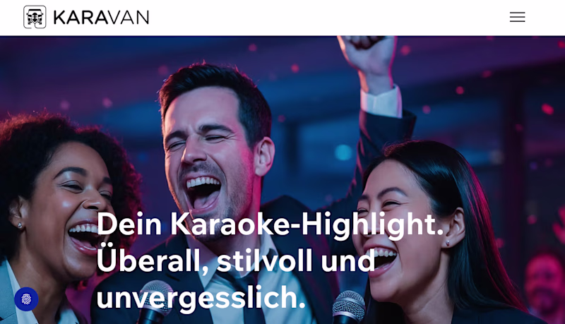
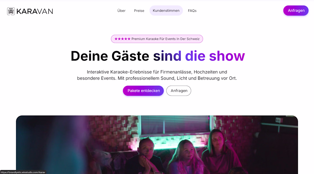
would you approve v1 concept vs. old one? if so, why? 💜🩷
1 voted
2%
49 voted
98%
50 votes
Closed
Most recent update in this hero section after client's feedback.
Any thoughts?
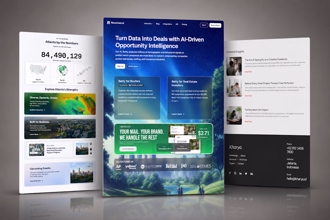
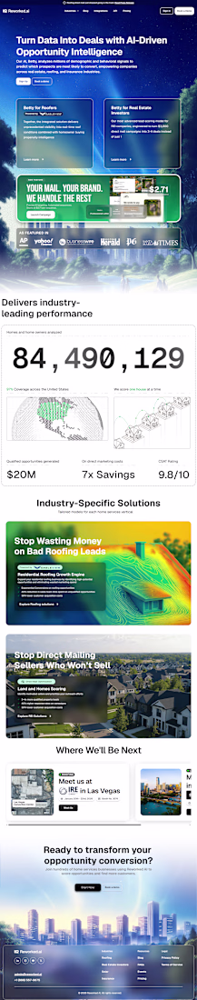
A professional and high-converting roofing website built on Webflow designed to help roofing contractors showcase their services, highlight completed projects, and generate quality leads.
The website features clean layouts, trust-building content, project galleries, and strategically placed calls-to-action that make it easy for homeowners and businesses to request inspections and quotes.
Built as a Webflow Expert, Webflow Designer, and Webflow Developer project, the site delivers responsive performance, modern UI, and a seamless user experience across all devices.
Designed to build credibility, increase customer inquiries, and provide roofing companies with a powerful online presence that drives long-term business growth.
What do you think about it?
Webflow DevelopmentWeb DesignWeb DevelopmentAdobe PhotoshopGitHubWebflowwebsitedesignerfreelancerlife
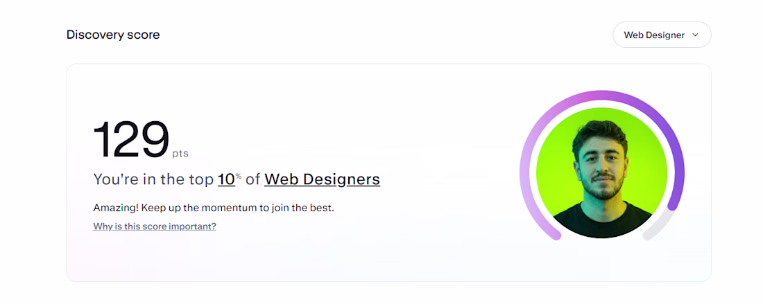
✨20 days on Contra.
Top 10% of Web Designers now...
Didn't expect this so soon, honestly.😍
I'm still new here. Still tweaking my profile, still learning how the platform works. But I wanted to share this because it's a good reminder that showing up daily actually adds up.
My real goal right now: land my first project that actually comes through Contra itself, not from outreach or other platforms. The score is a nice signal, but it means nothing until it turns into a real client from here.
If you've landed your first project through Contra, I'd genuinely like to know what worked for you.🚀
Congratulations 🎉
Trending
Claude
Claude has entered the design space. How are you using Claude Design?
Contra University
Learn from expert creatives how to earn more using next-gen AI tools.
fifaworldcup2026
The World Cup is here and the whole world's watching. How are you designing for the world stage?
creativeaiflow
Creative AI workflows are evolving. What tools do you use, and what are their strengths and weaknesses?
freelancerlife
Freelancer life is wins, pivots, and everything in between. What’s yours right now?