The network for creativity
Join 1.25M professional creatives like you
Connect with clients, get discovered, and run your business 100% commission-free
Creatives on Contra have earned over $150M and we are just getting started
Back to feedPost

What if a music website felt like a place instead of an app?
Recently, I designed and built Chai Tapri FM, an immersive web experience inspired by rainy evenings, roadside tea stalls, and the nostalgia of old Hindi music.
Instead of creating another playlist interface, I focused on storytelling and atmosphere.
☕ A cozy tea stall glowing under warm lights
🌧️ Rain falling across the entire experience
📻 Music playing through a vintage radio
🚖 Rickshaws arriving and leaving
💨 Steam rising from freshly brewed chai
👥 Interactive characters with their own stories and playlists
The goal was to create a digital space that feels alive, where users don't just listen to music, but experience a mood.
From cinematic scrolling and layered animations to hand-crafted Ghibli-inspired visuals, every detail was designed to evoke nostalgia and emotion.
As a developer, I love building products that go beyond functionality and create memorable experiences.
Always exploring the intersection of:
• Storytelling
• Design
• Animation
• Interactive Web Experiences
Would love to hear what emotion or memory this concept brings to mind.
#WebDesign #FrontendDevelopment #CreativeDevelopment #InteractiveDesign #UXDesign #Storytelling #WebExperience #PortfolioProject #ContraCreator #NextJS #CreativeCoding
The network for creativity
Join 1.25M professional creatives like you
Connect with clients, get discovered, and run your business 100% commission-free
Creatives on Contra have earned over $150M and we are just getting started











Related posts

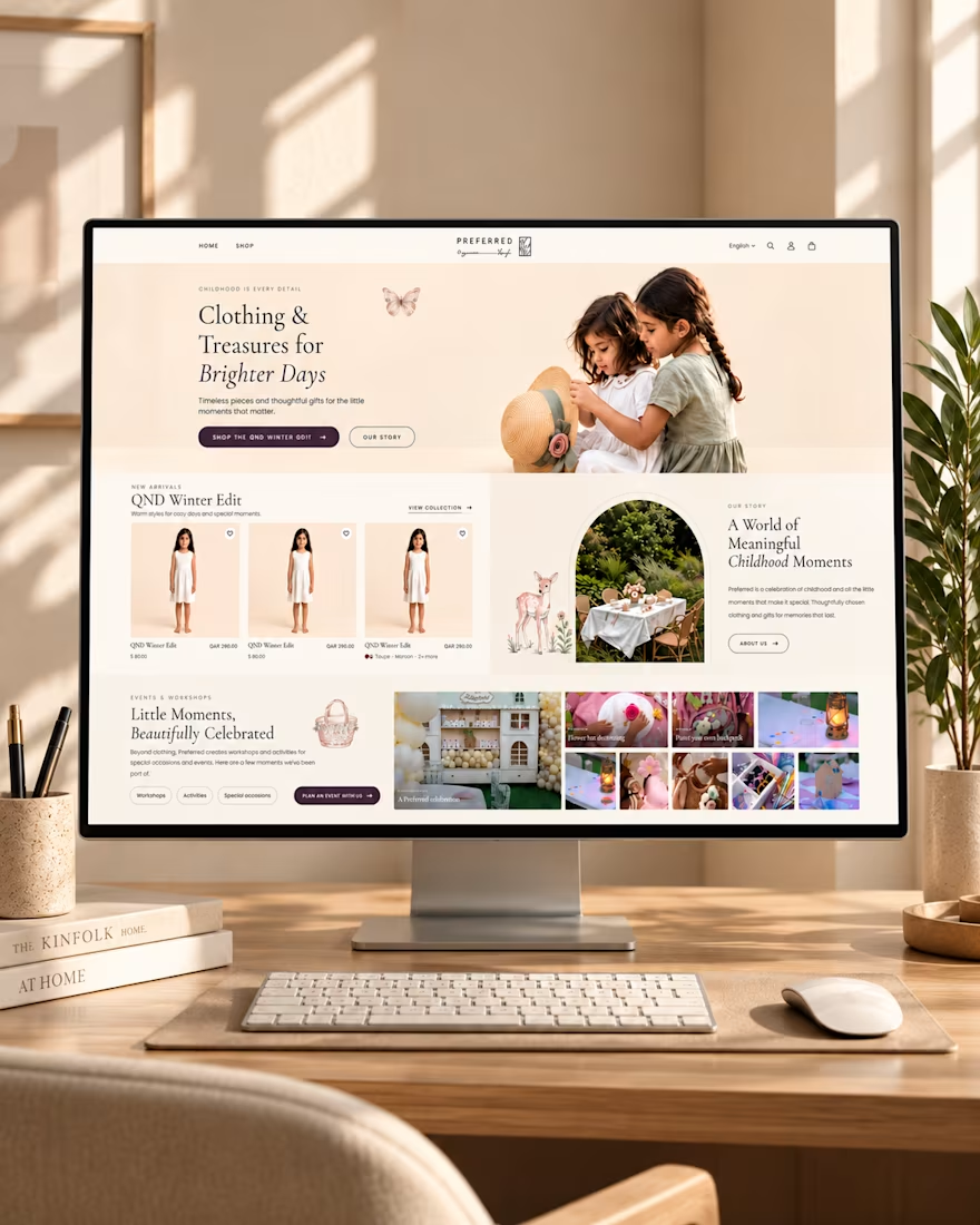
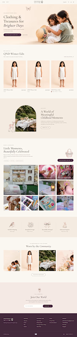
✨ Designing Digital Experiences That Feel Like Childhood.
Introducing my homepage design concept for Preferred — a children's clothing and lifestyle brand built around meaningful moments, thoughtful gifts, and timeless style.
From the warm color palette and elegant typography to the seasonal product collections and childhood event showcases, every section is designed to create a welcoming shopping experience that connects with parents and celebrates childhood.
The goal? Combine beautiful design with intuitive navigation to make discovering products feel effortless.
💻 What do you think of this design?
#WebDesign #UIDesign #UXDesign #EcommerceDesign #ShopifyDesign #WebDesigner

THIS IS LOOKING STUNNING

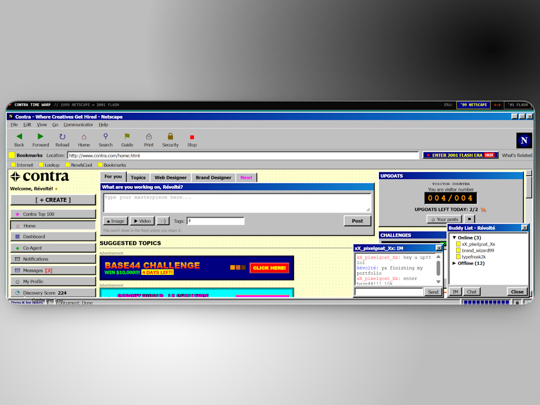
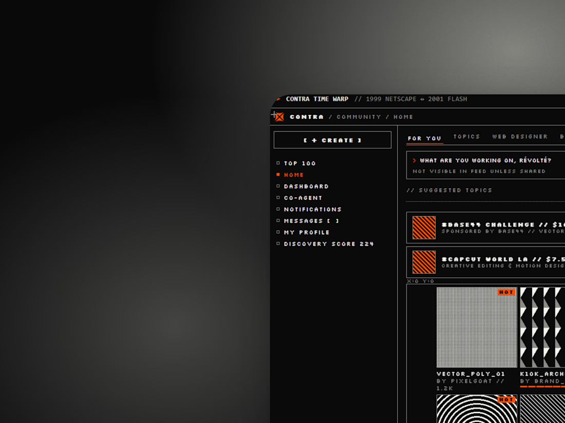
What if Contra had launched in 1999, and again in 2001? 🐐
I sent the community feed through two eras: a Netscape portal with banner-ad challenges, a visitor counter for upgoats and a buddy list instead of DMs, and a Flash-era collective with a thumbnail wall, a contests ticker and tiny pixel type.
Kept: the three-zone layout, the Create button, the goat. Changed: soft cards became bevels and hairlines, Trending became Hot Topics, DMs became an AIM window.
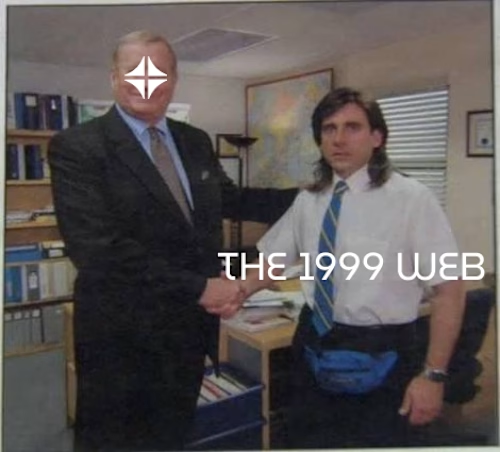
Both eras are live and switchable here: Website time machine . Also pictured: Contra meeting the early web.
Which site should I send back in time next?


This is insanely creative Révolté! Love the 1999 Netscape portal concept with the visitor counter and buddy list 😂 The Flash-era 2001 version is pure nostalgia. The website time machine idea is brilliant!

THE HANGER — Rethinking the Online Clothing Store
THE HANGER is a minimalist clothing brand built around a simple idea: online shopping should feel less like browsing a catalog and more like walking into a thoughtfully designed clothing store.
The experience begins with a cinematic landing page that introduces the brand through scroll-driven animations, editorial typography, and carefully composed visuals. As visitors move through the website, they discover the brand story, its approach to everyday essentials, and the details behind its clothing.
At the heart of the experience is an interactive virtual wardrobe. Instead of presenting products in a conventional grid, T-shirts are displayed on hangers in a carefully designed digital space. Visitors can explore the collection, hover over individual garments to discover their details, and select a piece to open an immersive 3D product view.
Each product has its own details, including color options, sizes, material information, and pricing. Customers can inspect the garment, choose their preferred variant, and add it to their shopping bag.
The visual direction combines minimalist fashion, architectural interiors, and smooth motion to create an experience that feels contemporary without distracting from the products themselves.
Built around Next.js, Three.js, React Three Fiber, and Framer Motion, the project explores how 3D interaction and motion design can make a familiar shopping experience more engaging.
THE HANGER is an exploration of what happens when a clothing store becomes a digital space rather than just a product catalog.
Less noise. Better basics.


Looks really minimal and soothing to eye