The network for creativity
Join 1.25M professional creatives like you
Connect with clients, get discovered, and run your business 100% commission-free
Creatives on Contra have earned over $150M and we are just getting started
Back to feedPost

NewFab Constructions: the logo, built one floor at a time.
THE IDEA
N + F + levels. The letter N for New, the letter F for Fab, and stacked slabs for the way every building actually rises: one floor at a time.
THE PROCESS
→ Started with a bold N
→ Drew it like a steel section on an isometric grid, every edge at 26.6°
→ Split it into two floors
→ Cut the faces to give it depth
→ Tested it from signage down to 40px
THE RESULT
A mark that reads as a name, a structure and a construction sequence, in red for the site and navy for trust.
Building something new, or rebranding a company that's outgrown its old logo? I'm one DM away.
The network for creativity
Join 1.25M professional creatives like you
Connect with clients, get discovered, and run your business 100% commission-free
Creatives on Contra have earned over $150M and we are just getting started







Related posts



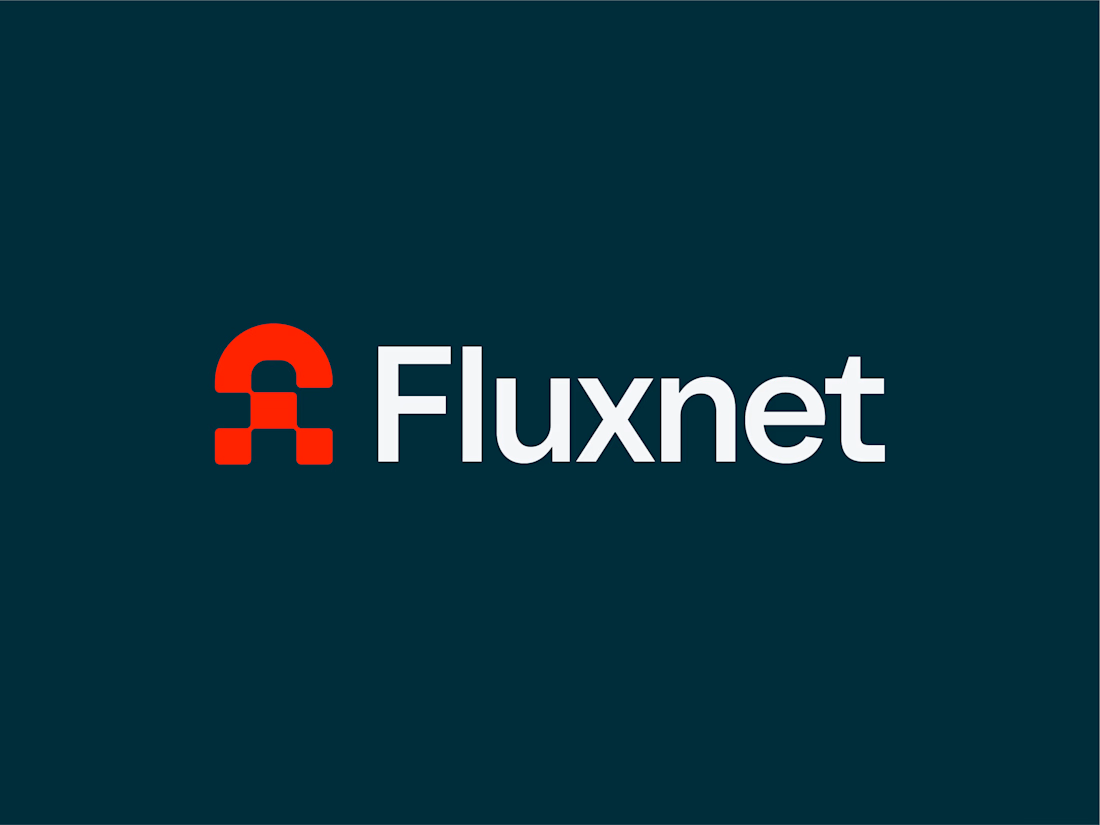
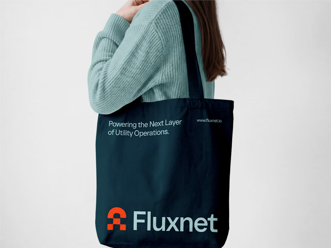
One of my favorite projects this year 👉 Fluxnet.
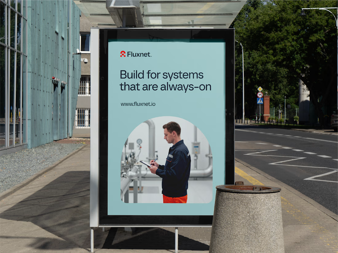
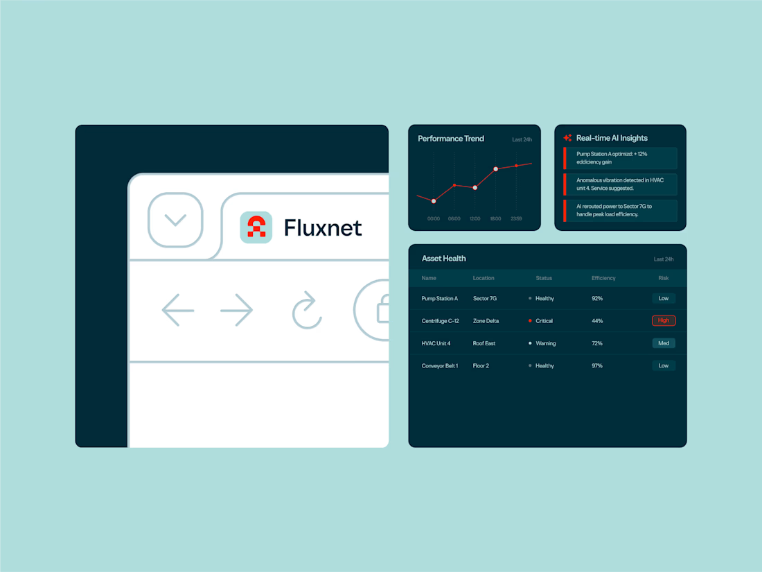
The challenge of this project was to create an identity for a company bringing AI into complex industrial environments, where trust and reliability matter just as much as innovation.
The direction was to balance these two worlds: a brand that feels grounded and dependable, but still looks ahead. The goal was to make complex technology feel clear and accessible without losing its technical edge.
Full project here
Curious to hear your thoughts. How do you approach branding in such a technical spaces?


how did you land on the balance between industrial and innovative?

One brand, very different variety products. 👀
BASYX is one of my favorite projects because the packaging had to work across categories, from skincare to food, while still feeling like one cohesive brand.
That’s the fun challenge of multi-product brands: creating a visual system flexible enough to grow without losing its identity.

wow amazing