The network for creativity
Join 1.25M professional creatives like you
Connect with clients, get discovered, and run your business 100% commission-free
Creatives on Contra have earned over $150M and we are just getting started
Back to feedPost

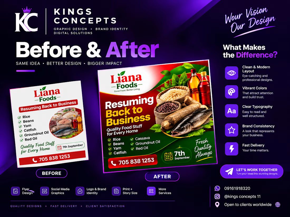

Love the before and after format. In the new version the food photo does the heavy lifting and the date is way easier to spot. Which change made the biggest difference in your view, the photo or the cleaner type?

Thank you! I'd say both played an important role, but the cleaner typography made the biggest difference. It improved readability, created better visual balance, and allowed the product images to stand out.
The network for creativity
Join 1.25M professional creatives like you
Connect with clients, get discovered, and run your business 100% commission-free
Creatives on Contra have earned over $150M and we are just getting started



Related posts

Purros is where you can live among endless churros, whenever and wherever you like. It offers a variety of unique churro flavors and unconventional donut fillings.
What makes Purros unique:
We specialize in crafting effortless, cat-shaped churros and donuts.
Where did the idea come from?
When I first opened Canva to design a stunning logo, churros were on my mind. I needed a name that fit, and Purros was the only natural choice, because a cat habitually purrs!
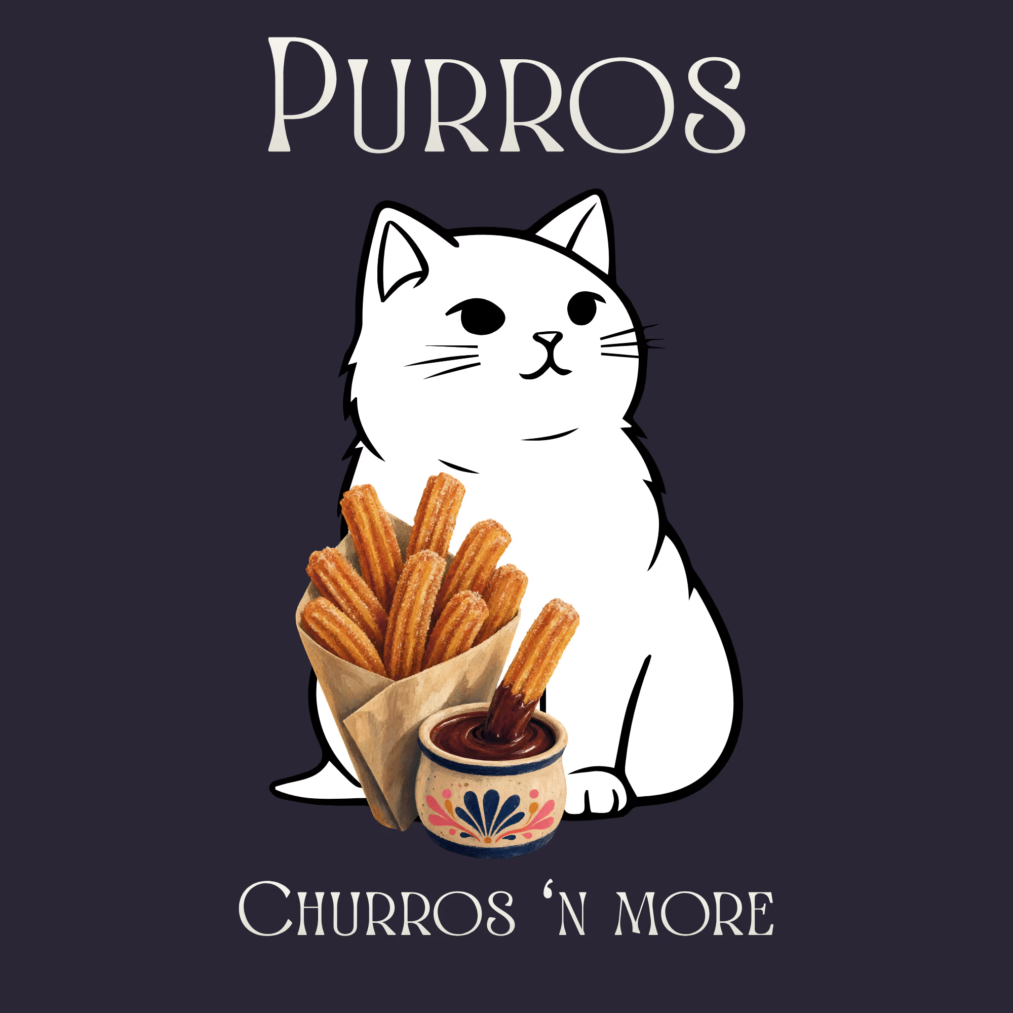

This PURROS concept is so adorable! 😍🐱 Cat-shaped churros is genius - love how you used Canva to make the logo purr-fect! The branding is super clean and playful.
I do video editing + posters for US brands, would love to collab on a food brand project together sometime - you do...


Bold Illustrations make an instant impact
See full case study here for the branding evolution and website redesign for a B2B SaaS startup!


I loved these colours. Looking Stunning 😍