The network for creativity
Join 1.25M professional creatives like you
Connect with clients, get discovered, and run your business 100% commission-free
Creatives on Contra have earned over $150M and we are just getting started
Back to feedPost

What a cool collection of 404 pages in Framer!
You can remix them and see how they’re made - https://page-not-found.framer.website/
Credits to @Abmankendrick (on X/twitter), I found it in his profile.

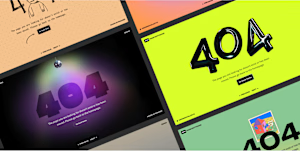
page-not-found.framer.website
404 Pages for Framer
Turn 404 errors into fun experiences with quirky Framer pages.
The network for creativity
Join 1.25M professional creatives like you
Connect with clients, get discovered, and run your business 100% commission-free
Creatives on Contra have earned over $150M and we are just getting started

Challenges
View all


Related posts


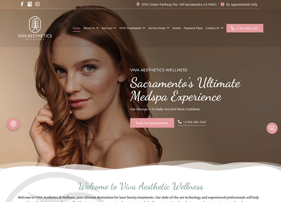
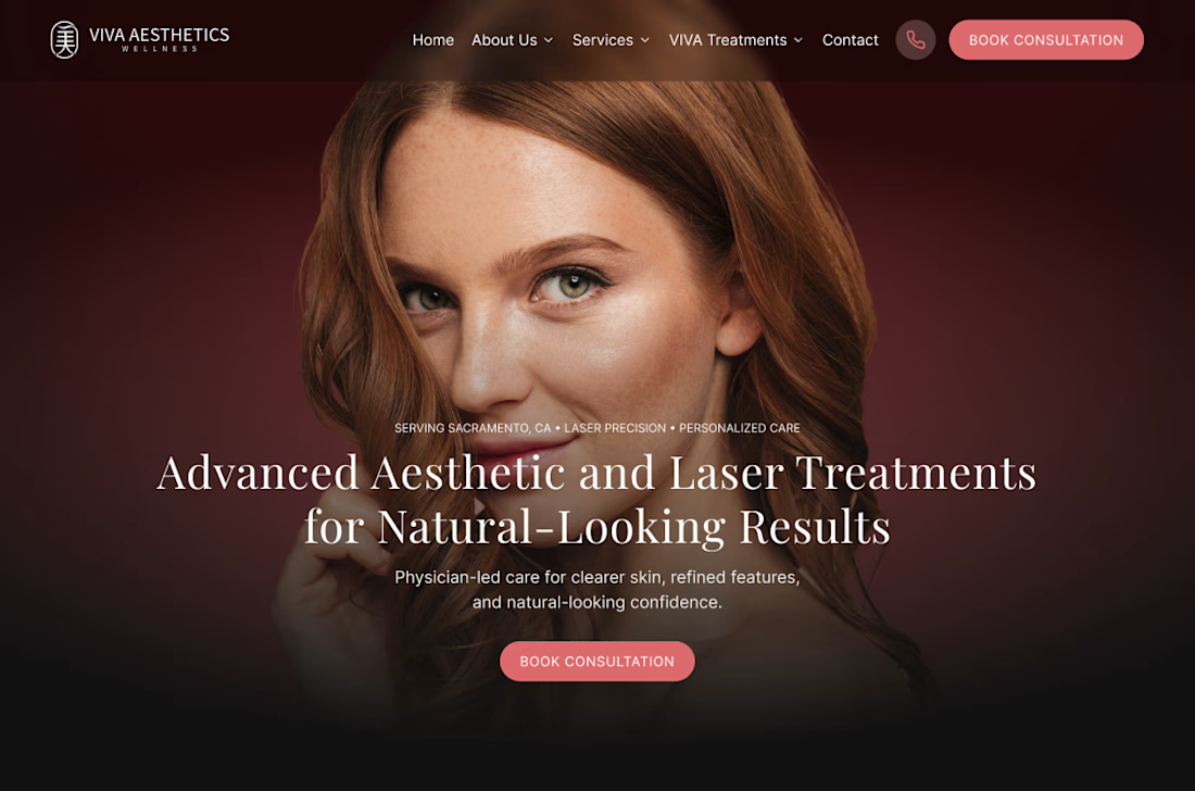
Viva Aesthetics Wellness — WordPress to Framer
A Sacramento medspa with real credentials, running on a site that asked too much of the person using it. Eight items in the navigation, treatments buried a few clicks down, and booking left to a phone number.
We moved them to Framer — not for the platform, but for what it let us do: rebuild the page structure instead of restyling it.
Eight nav items down to five. A hero that names the treatments and the physician-led care rather than promising an experience. Boulevard integrated as the booking platform, so there's one short, consistent path from landing on a page to holding an appointment. Sacramento named as the service area instead of spreading the menu thin.
The migration itself was the unglamorous half — a from/to redirect table built line by line before cutover so nothing already ranking got lost.
Full case study coming soon.




A SaaS website can explain every feature perfectly and still leave one question unanswered:
Why should I care?
That's why CORESPACE includes Stories.
Instead of only describing what the product does, Stories give those features context — showing how they're used and what they make possible.
Features explain the product.
Stories make it relatable.

The “why should I care?” framing is exactly the right antidote to feature tours. Turning real team stories into the connective tissue between the product and its impact makes the homepage feel human, not just informative.

Fintech templates usually sell adjectives. This one sells numbers.
NordTech is live on the Framer Marketplace — a ten-page template for payments companies, built for the technical buyer who asks about PCI scope and data residency before they ask about features.
Three decisions that shaped it:
The pricing page has a calculator, not a "contact sales" button. A code component with a logarithmic slider from 10k to 5M monthly transactions that estimates cost per plan and highlights the cheapest one for that volume. Seven colours editable in the panel, no code.
The case studies carry measured deltas, not testimonials: involuntary churn down 61% in five months, renewal approval up 9 points, month-end close from eleven days to two.
Security is a page, not a footer line — four layers of fund protection, data residency per region, and incidents published rather than buried.
Underneath: 35 components, 2 CMS collections driving the FAQs, three hand-tuned breakpoints across all ten pages, 17 colour styles and 33 text styles, so rebranding is one panel.
It's free. Preview and remix: nordtech.framer.website
This is a strong example of using measurable outcomes as the narrative spine—the calculator and plan-level cost comparison make the template feel like a decision tool, not just a visual shell.