The network for creativity
Join 1.25M professional creatives like you
Connect with clients, get discovered, and run your business 100% commission-free
Creatives on Contra have earned over $150M and we are just getting started
Back to feedPost

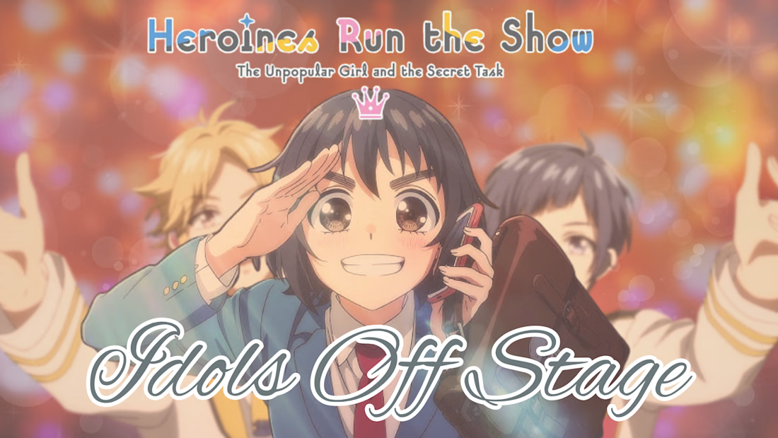
A close up of the banner visual from my new blog post!

The network for creativity
Join 1.25M professional creatives like you
Connect with clients, get discovered, and run your business 100% commission-free
Creatives on Contra have earned over $150M and we are just getting started







Related posts

1286 CRAFT | Design in Motion
From bold typography and experimental print textures to organic paper-cut compositions, this motion showcase explores how static graphic design transforms through movement.
Each animation brings a different visual language to life while preserving its original creative identity.
Three visual styles. One creative vision.
#1286CRAFT #MotionDesign #GraphicDesign #KineticTypography #VisualStorytelling #CreativeDirection


I designed a practice flyer for a farm market. I feel the wordings of the first and second circle are a bit off but I'm still working on my skills. What do you think?
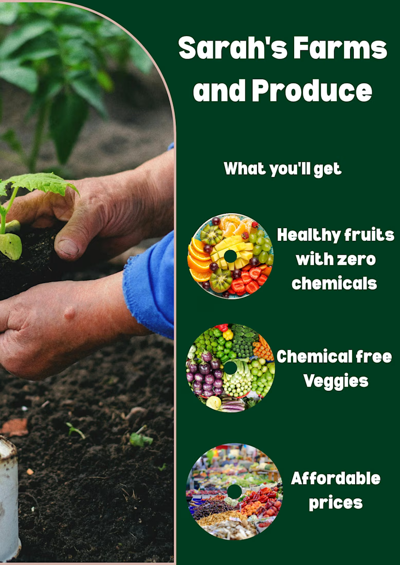

Since you asked: the three labels break into different line counts and sit at slightly different distances from their circles, which is probably the off feeling. Setting one line width and the same gap to every circle should tighten it up.

Designed this skincare and beauty thumbnail in Canva 💄✨
What do you think?
DM for Thumbnail Design".
Visit my profile for more
designs. "
Follow my page for daily
thumbnail designs.
Available for YouTube Thumbnail Design
#YouTubeThumbnail #GraphicDesigner
#ThumbnailDesign #CanvaDesigner #YouTubeCreator #Freelancer #GraphicDesign
#ContentCreator #SocialMediaDesign
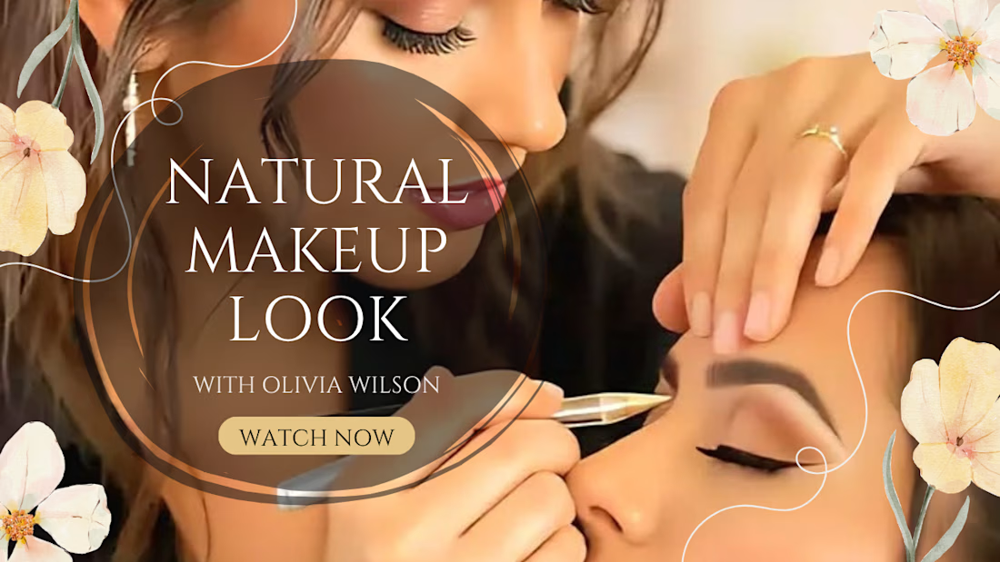

Relying on Canva for beauty thumbnails can be a double edged sword. The templates are fast, but they often lead to a generic look that struggles to stand out in a crowded feed.