The network for creativity
Join 1.25M professional creatives like you
Connect with clients, get discovered, and run your business 100% commission-free
Creatives on Contra have earned over $150M and we are just getting started
Back to feedPost

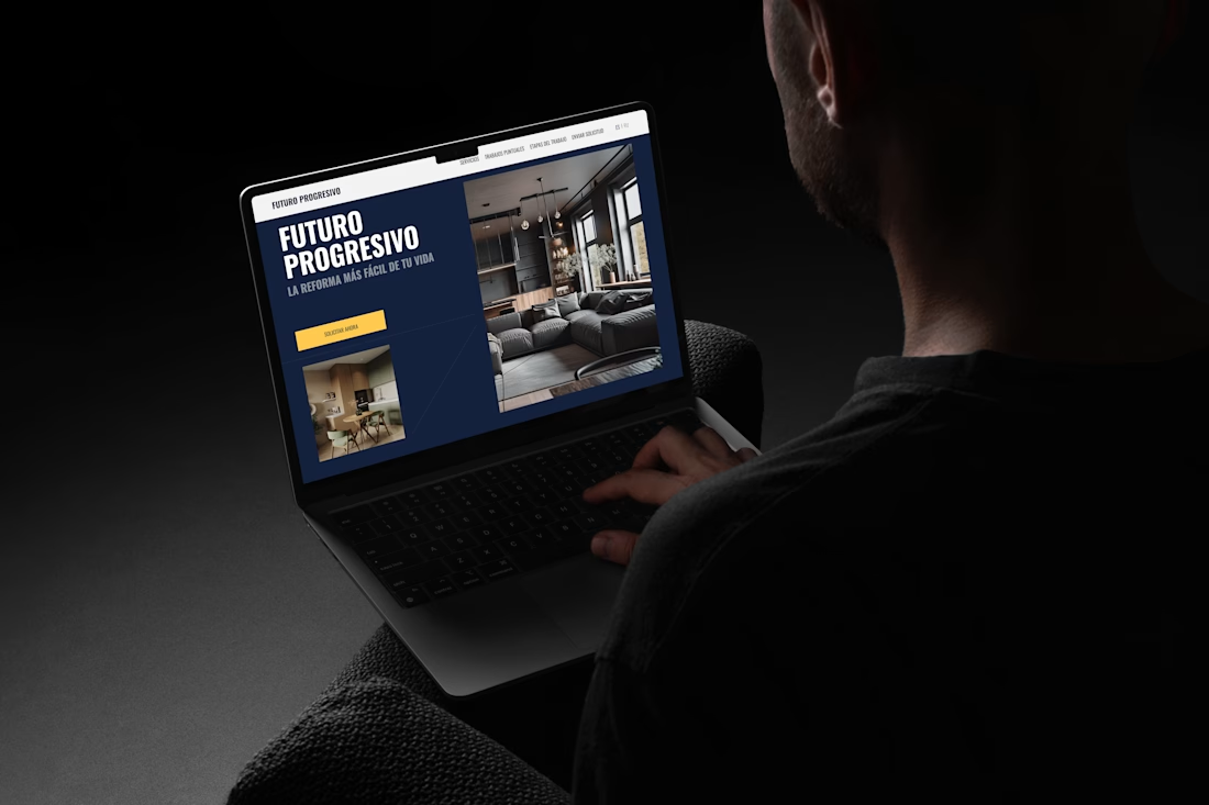
A website shouldn't just look good it should help users find what they need and take action with minimal effort.
For this renovation company in Spain, my focus was on simplifying the customer journey:
• Clear service categorization
• Easy navigation between renovation types
• Strong visual hierarchy
• Strategic CTA placement
• Trust-building through project showcases and company metrics
The goal was to make it easy for potential clients to understand the services, explore past work, and request a quote.
What's the first thing you look for when visiting a service company's website?



I guess that the first thing I look for is trust, clear services, real projects, and an easy way to get in touch

Personally, I always look for a solid portfolio and a straightforward way to reach out!
Your design handles this brilliantly. The contrast between the deep blue layout and the bright yellow CTA is perfect for driving action, and the clean structure screams professionalism. It's...

Great execution 🚀

Clarity is the first thing I look for. If I can quickly understand the services, see real project examples, and easily request a quote, the website already feels trustworthy.

Great 🔥
The network for creativity
Join 1.25M professional creatives like you
Connect with clients, get discovered, and run your business 100% commission-free
Creatives on Contra have earned over $150M and we are just getting started






Related posts

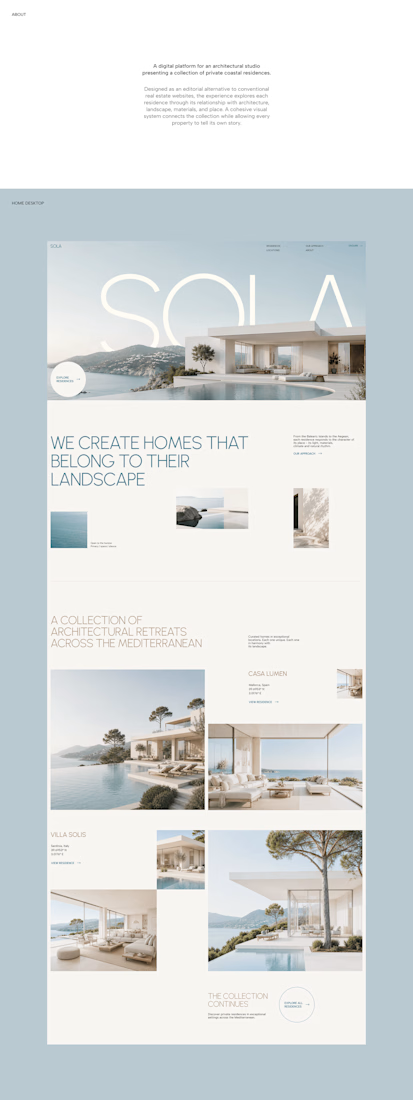

A luxury property deserves a presentation that does it justice.
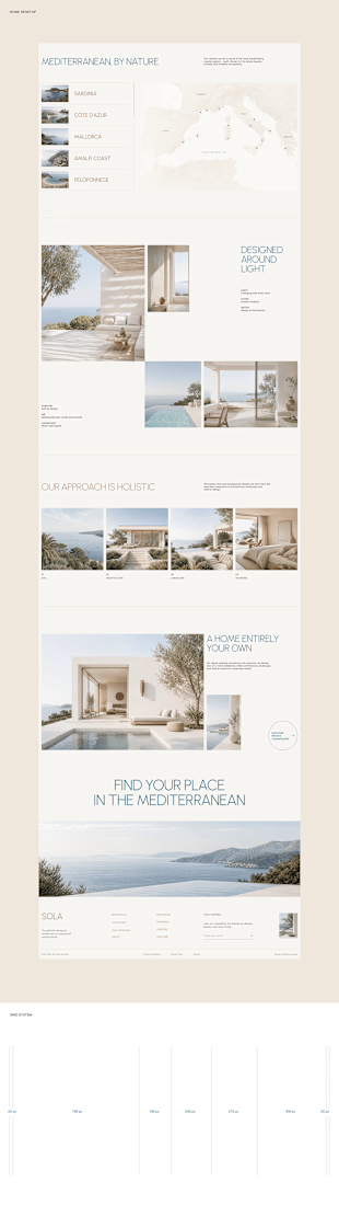
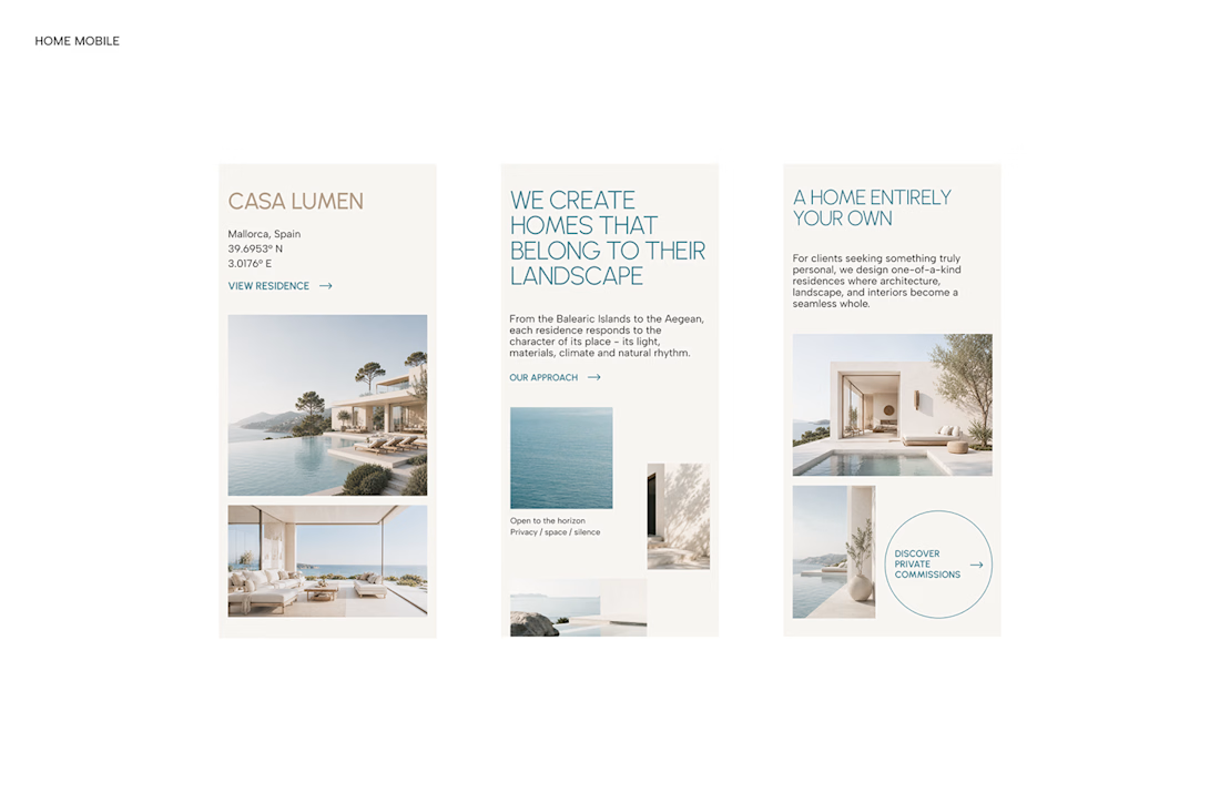
With SOLA – Architecture Studio & Luxury Real Estate, I wanted to bring the beauty of modern coastal architecture into the website itself.
From the large property images and soft blue tones to the clean layout across desktop and mobile, every part of the design helps create a calm, premium feel while making the homes the centre of attention.
I like how the website brings architecture and digital design together, giving visitors a chance to explore the properties before making an enquiry.
If you were looking for a luxury home, would a website like this make you more interested in the property?
#WebDesign #Architecture #LuxuryRealEstate

Incredible work, you transformed SOLA into a premium property brand.


Every element feels perfectly placed! 👏

Designed a clean, modern, and responsive business website concept to showcase services, build trust, and help businesses attract potential customers.

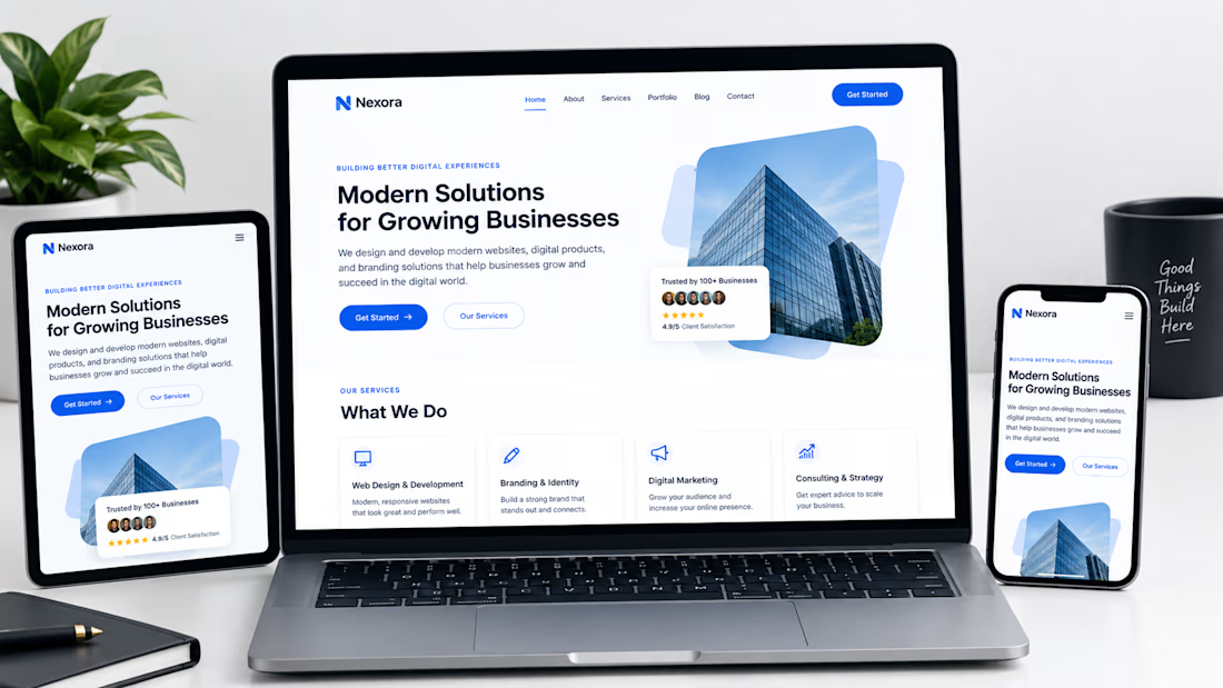

Not only is the design clean, but you also did a great job making sure it works well across different devices with a responsive design.