The network for creativity
Join 1.25M professional creatives like you
Connect with clients, get discovered, and run your business 100% commission-free
Creatives on Contra have earned over $150M and we are just getting started
Back to feedPost

Interaction inspired from Site of the Day winner in Awwwards.
The network for creativity
Join 1.25M professional creatives like you
Connect with clients, get discovered, and run your business 100% commission-free
Creatives on Contra have earned over $150M and we are just getting started



Related posts

From wireframe to Framer Rank #60 in just 7 days!!
When building Substance, I wanted clean minimalism paired with high-impact interaction, led by a custom interactive photo tunnel designed to showcase visuals with depth without slowing down load times.
Quick 1-week milestone:
- #60 Trending in Framer marketplace (and still climbing)
- Smooth, responsive micro-interactions out of the box
- Fully modular & easy to customize
Always open to feedback, suggestions, or any questions about the setup

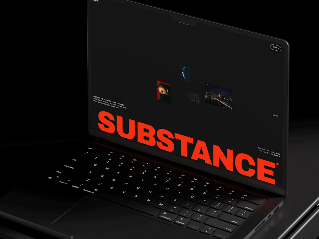

Placing the red SUBSTANCE wordmark so low lets the photo tunnel float above it, so the hero stays calm even with all that motion. How did you keep the tunnel light on load, lazy-loaded images or something custom?


what are you using for the glass blur, figma or something like rive?

I've spent years obsessing over the stuff nobody notices on a website. Until it's missing.
AI can now build a whole site in an afternoon. I think that's great.
But it still can't decide what feels right.
I don't think AI is the problem. It just stops at "it works". The last part, the spacing, the type, the way things move when you scroll, still needs someone who cares about it.
That's the part I've always loved doing. So I made a small thing around it: you bring the site AI built, I finish it in Webflow.
It's called Verdikt https://verdikt.studio


Agreed. AI gets you a working layout fast, but spacing and type rhythm are where it still feels off. I'd add forms and mobile checks to that list too. What's the most common fix people bring you?