The network for creativity
Join 1.25M professional creatives like you
Connect with clients, get discovered, and run your business 100% commission-free
Creatives on Contra have earned over $150M and we are just getting started
Back to feedPost

Good content deserves good presentation. 👀
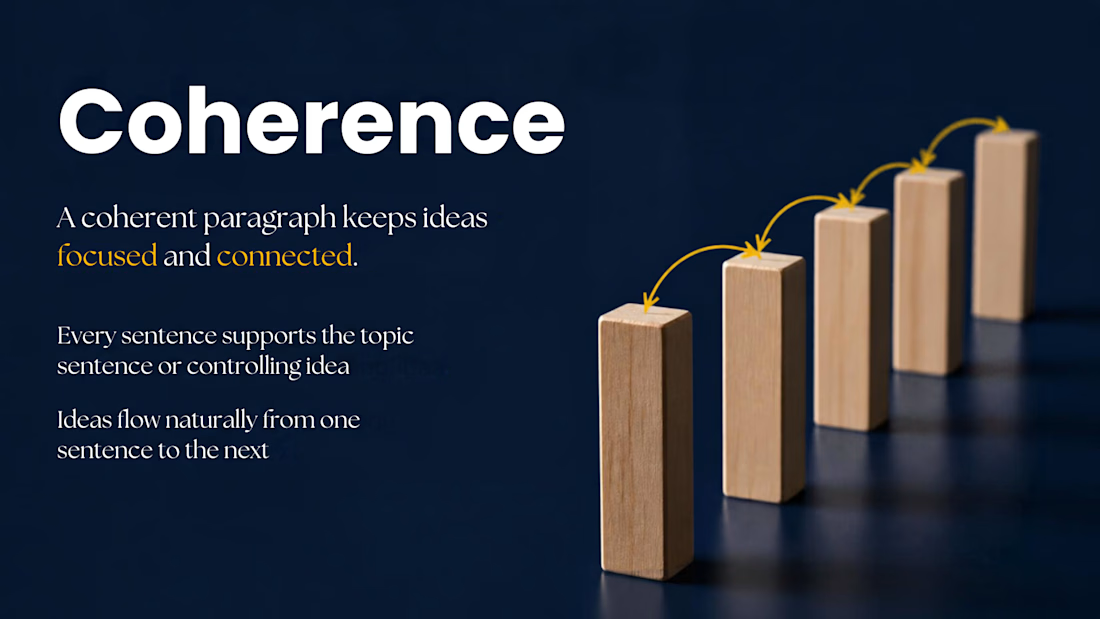
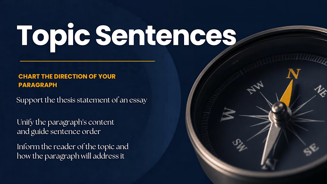
A recent presentation design project where I turned educational content into clean, engaging, and easy-to-follow slides.
I help businesses, students, professionals, and creators turn their ideas, notes, and raw content into presentations that look professional and communicate clearly.
Need help with:
📊 Business presentations
🚀 Pitch decks
🎓 Educational presentations
💼 Client proposals
📑 Company decks
You bring the content. I’ll take care of the slides.
DM me if you have a presentation that needs a design upgrade.


The network for creativity
Join 1.25M professional creatives like you
Connect with clients, get discovered, and run your business 100% commission-free
Creatives on Contra have earned over $150M and we are just getting started






Related posts

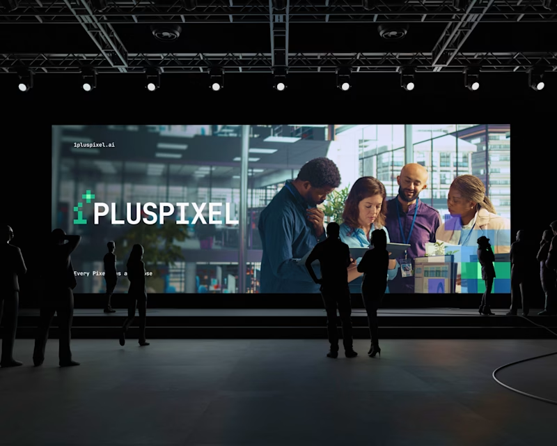
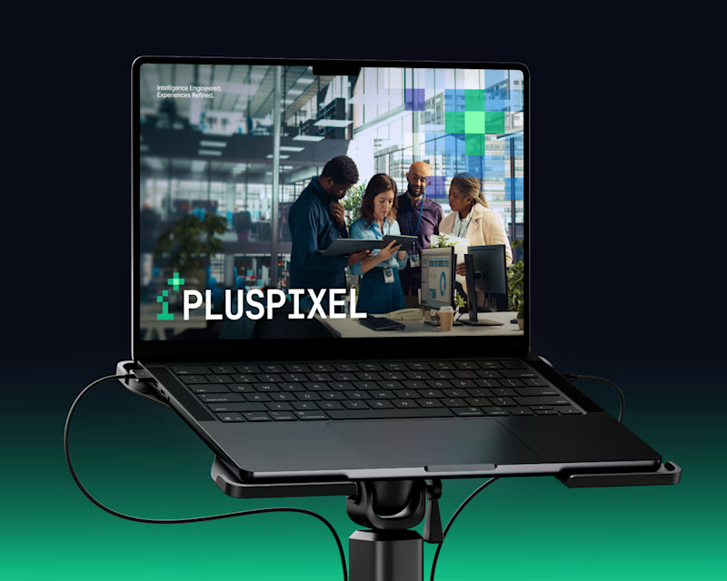
Same content, two different settings.
One designed to be seen on a big conference screen, the other experienced through a compact device. It's interesting how the same visuals can feel different depending on where they show up.
Which setting do you think brings the content to life better?
4 voted
57%
3 voted
43%
7 votes
Closed

Big screen 🔥

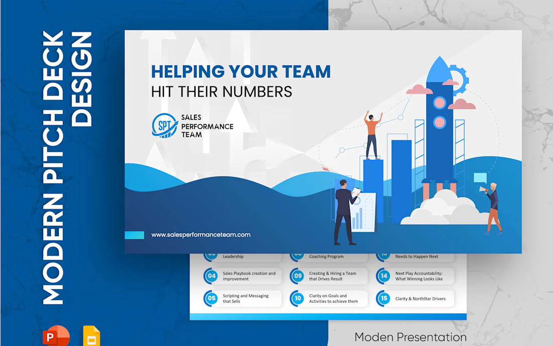
Sales Performance Team: a sales deck that gets to the point 📈
Service decks often try to explain everything. Buyers only want to know one thing: will this help my team?
How I designed it:
→ The cover answers that right away: Helping your team hit their numbers
→ All 15 services on one clean grid of numbered cards, easy to scan
→ Bright blue and white for a confident, energetic feel
→ A target visual on the proof slide, with results as short stat lines
A sales deck should feel like a conversation, not a brochure.



Luxury jewelry deserves a presentation that stands out. ✨
I created this cinematic AI jewelry commercial using elegant visuals, lighting, and smooth transitions.
What catches your attention first: the product visuals, lighting, or storytelling?
#AIVideoEditing #AICommercial #JewelryAdvertising #CinematicVideo #LuxuryBranding #ProductVideoAds #Contra

The lighting really makes the jewelry stand out! Love how the cinematic visuals give it that premium feel. Beautiful work! ✨👏