The network for creativity
Join 1.25M professional creatives like you
Connect with clients, get discovered, and run your business 100% commission-free
Creatives on Contra have earned over $150M and we are just getting started
Back to feedPost
Taste Test
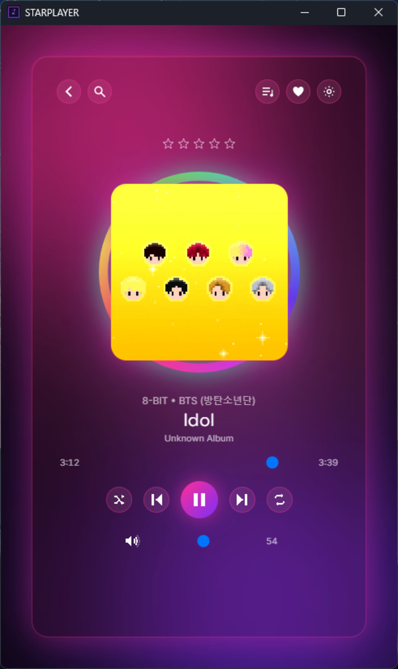
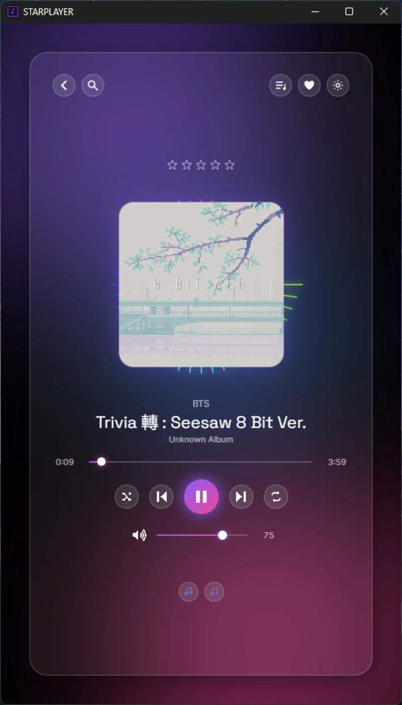
I recently built Starplayer, a music player for Windows, Linux, and Mac. Basically it lets you save a playlist and rate your own music, so you can play it when you are in the mood, not just in shuffle mode like the majority of the music players. And all of that with a very pretty UI.
I create a lot of skins for the app, but I want the default design to be the best one. I like the glass effect a lot, so I create two versions of this but with different colors. Which one do you think is better?

5 voted
45%
6 voted
55%
11 votes
Closed

Voted V2. The glass effect works in both, but V2 is calmer, so the album art and track title stay readable. V1 has more personality, though the bright cube competes with the controls. A mood-based player deserves a default that disappears behind the music.

Good analysis, I agree with that!

V1 is more attractive it feels alive great job 🎉🎉🔥🔥
thank you sm!
Pardon ❤️


I think V2 is more settled; which one do you personally like?
I like both a lot
The network for creativity
Join 1.25M professional creatives like you
Connect with clients, get discovered, and run your business 100% commission-free
Creatives on Contra have earned over $150M and we are just getting started
Related posts

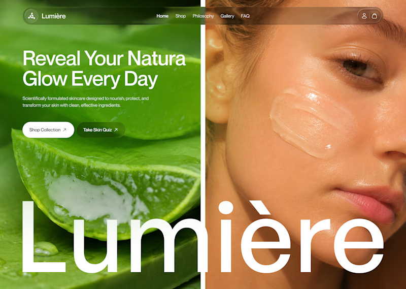
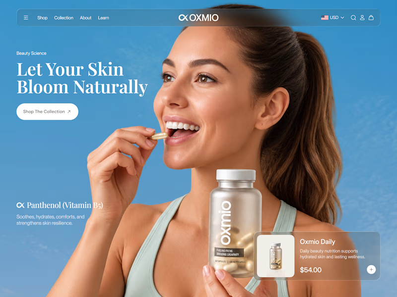
Your design has 3 seconds to earn attention. Which skincare brand wins?
A leads with confidence, energy, and aspiration. B builds trust through nature, freshness, and simplicity.
Great design doesn’t just look good. It makes people feel the brand before they read a word.
A or B? Which would make you stop scrolling?


30 voted
52%
28 voted
48%
58 votes
Closed


B without questions

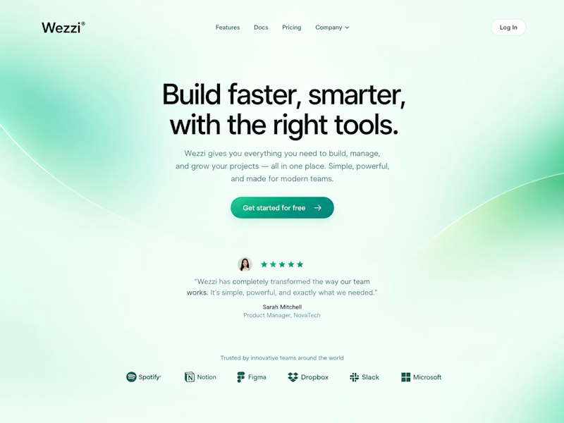
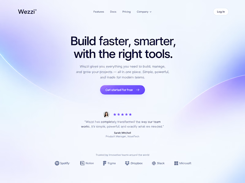
Same layout. Same copy. Completely different feel.
Swapping just the color palette and gradient glow changed the whole personality of this Wezzi hero section.
Which one fits a SaaS brand better? 👇

10 voted
50%
10 voted
50%
20 votes
Closed

Such a great demonstration Amina! It's amazing how just changing the color palette and gradient glow completely shifts the personality — same layout, same copy but totally different vibe. This Dreamy Haze version feels so soft, modern and perfect for a SaaS brand, very...


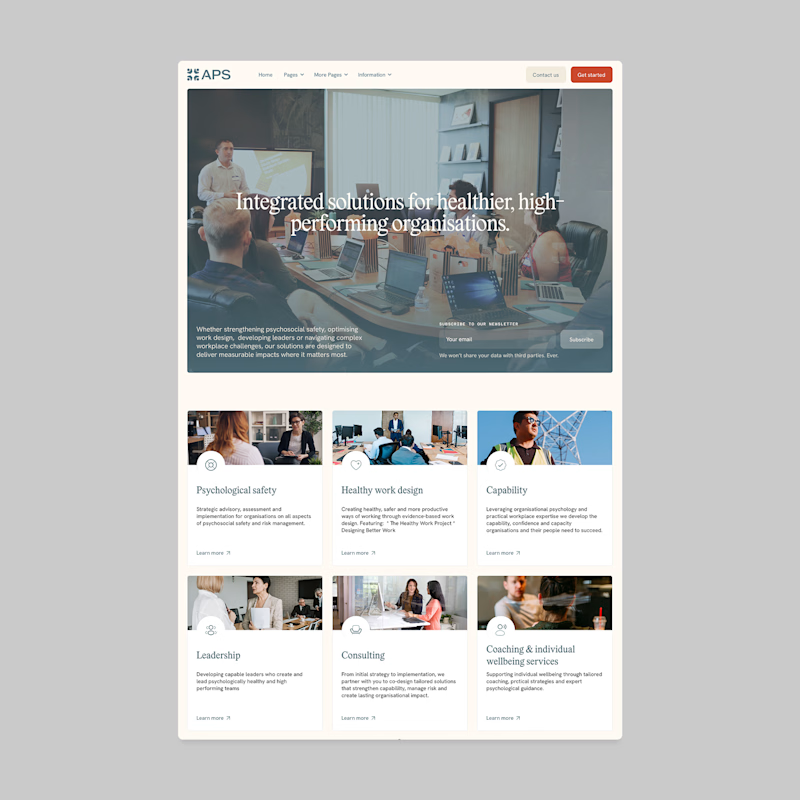
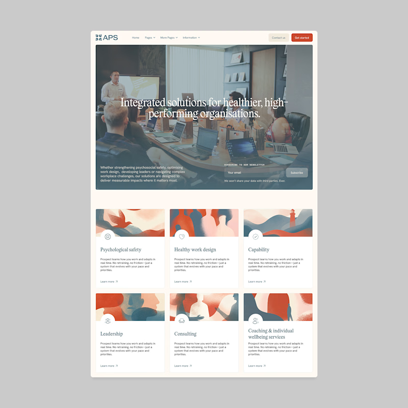
Designers, which direction would you go with: photography or illustration?
83 voted
69%
37 voted
31%
120 votes
Closed

I'll prefer photos, specially talking about organizations in your page, human faces and real scenarios can have a better effect in this case.