The network for creativity
Join 1.25M professional creatives like you
Connect with clients, get discovered, and run your business 100% commission-free
Creatives on Contra have earned over $150M and we are just getting started
Back to feedPost


Did you think and write this by yourself or you just asked AI to rephrase what Paul N. wrote down below? Same subjects, same advice, same structure.

@Philippe Côté Neat approach to the problem from a visual paradigm perspective. Another idea could be showing a regular scrollbar and gradually expanding the scrollbar handle until it fills the entire track.
Unfortunately, it’s unlikely that major platforms would adopt something like this. It...
The network for creativity
Join 1.25M professional creatives like you
Connect with clients, get discovered, and run your business 100% commission-free
Creatives on Contra have earned over $150M and we are just getting started





Related posts

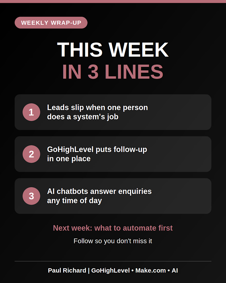
This week in 3 lines:
📌 Leads slip when one person does the job of a system
📌 GoHighLevel puts leads, follow-up and booking in one place
📌 AI chatbots answer real estate enquiries any time of day
I'm Paul Richard, and I build these systems for real estate agents, coaches and local businesses.
If you want to stop chasing leads, DM "AUTOMATE" for a free automation audit.
Next week: what to automate first if you're just starting. Follow so you don't miss it. 🔔

Post 1 — Problem awareness
Topic: You’re posting, but are people understanding your offer?
You can post consistently and still struggle to attract the right clients.
Not because you’re bad at what you do.
Sometimes, people simply don’t understand what you do well enough to see why they need you.
They visit your page.
They read your posts.
They might even like your content.
But when it comes to hiring you, they’re unsure.
Start by making three things clear:
Who do you help?
What problem do you help them solve?
What changes when they work with you?
Your content shouldn’t just keep you visible.
It should help the right person understand why your work matters.
CTA: Which of these three things is hardest for you to communicate?
Post 2 — Educational content
Topic: A simple way to make your offer clearer
Try completing this sentence:
“I help [specific audience] achieve [specific outcome] by [how you help them].”
For example:
“I help early stage service providers clarify their offers so potential clients can understand their value and take the next step.”
Is this sentence your entire marketing strategy? No.
But it’s a useful starting point.
When you can explain your offer clearly, you have a stronger foundation for your bio, website, social media content, and sales conversations.
Before creating another post, check whether your audience can understand what you’re actually offering.
Clarity gives your content somewhere to lead.
CTA: Try writing your own version.
Post 3 — Myth busting
Topic: More content isn’t always the answer
When engagement or enquiries are low, it’s tempting to post more.
Another carousel.
Another tip.
Another motivational caption.
But more content won’t automatically fix a message that people don’t understand.
Before increasing your posting frequency, ask:
Does my content speak to a problem my audience actually has?
Is my offer clear?
Can people see why my service is relevant to them?
Do they know what to do next?
Sometimes, the best improvement isn’t publishing more.
It’s making what you already say more useful and specific.
CTA: Save these questions for your next content review.
Post 4 — Trust building
Topic: Your audience needs more than a list of services
Imagine two business profiles.
The first says:
“I offer coaching, strategy, and consulting.”
The second explains who the service is for, what problem it addresses, and what the customer can expect from working with the coach.
Which one helps you make a more informed decision?
The second.
Your audience doesn’t just need to know what you sell.
They need enough context to understand whether it’s relevant to them.
Explain your process.
Address common concerns.
Show how you think about the problems you solve.
Help people understand what working with you involves.
Trust grows when your communication makes decisions easier.
CTA: What question do potential clients frequently ask you before working with you?
Post 5 — Service focused content
Topic: Is your offer clear enough to sell?
Your service might be valuable.
But if potential clients can’t understand what it does, who it’s for, or why it matters, they may struggle to see its value.
That is why offer clarity matters.
When reviewing your offer, check:
The audience: Who is this specifically for?
The problem: What are they struggling with?
The outcome: What are they working towards?
The next step: What should an interested person do?
You don’t need exaggerated promises or complicated language.
You need to communicate the value of your service in a way your audience can understand.
If your offer has become difficult to explain, start by simplifying the message.
CTA: If you’re a service provider, which part of your offer needs more clarity?
Contra Project Description:
Project overview
This speculative project explores how a business coach could use social media content to communicate their offer more clearly and connect with early stage service providers.
Objective
Develop a five post content package covering problem awareness, education, myth busting, trust building, and service focused messaging.
Approach
Each post addresses a different stage of audience understanding, from recognizing a problem to evaluating a service. The content uses practical explanations, relatable examples, and relevant calls to action rather than relying on generic motivational messaging.
Deliverables:
— Five social media post drafts.
— Five content angles.
— Calls to action tailored to each post.
— Content suitable for adaptation to Instagram and LinkedIn.
Project note
This is a speculative practice project created to demonstrate my social media copywriting and content strategy approach. The business is fictional, and no client performance results are being claimed.