The network for creativity
Join 1.25M professional creatives like you
Connect with clients, get discovered, and run your business 100% commission-free
Creatives on Contra have earned over $150M and we are just getting started
Back to feedPost


The network for creativity
Join 1.25M professional creatives like you
Connect with clients, get discovered, and run your business 100% commission-free
Creatives on Contra have earned over $150M and we are just getting started

Challenges
View all


Related posts


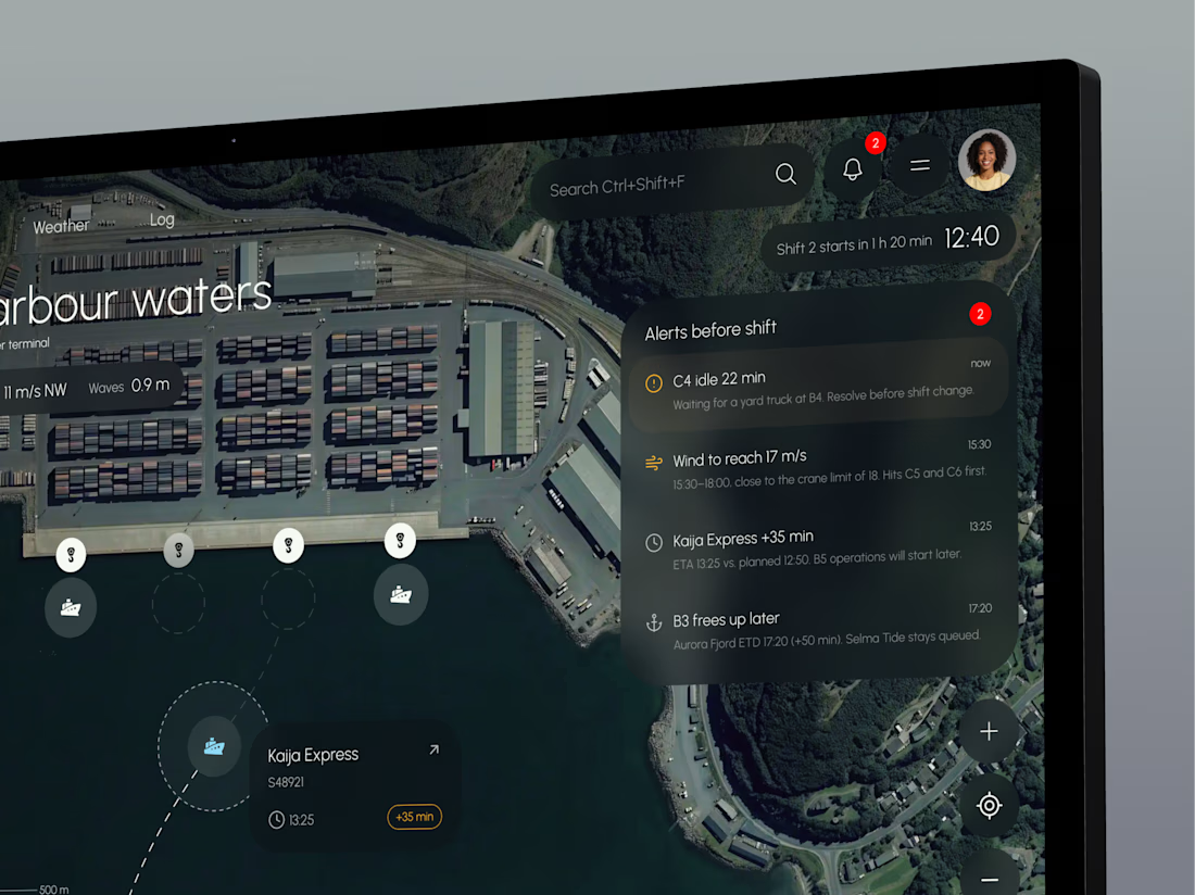
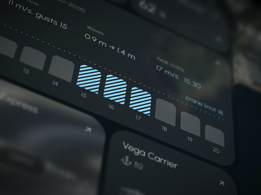
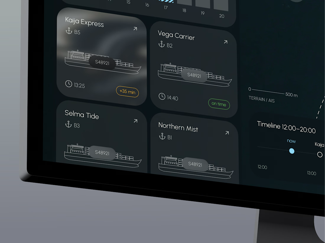
TideGrid – one view of the whole port
Port teams track berths, cranes, vessel ETAs and weather in separate systems, so delays and idle time are often spotted too late.
TideGrid brings everything onto one map. Each vessel shows its ETA, each crane its load, and each berth its occupancy, with wind and waves right beside them. Alerts appear before the shift starts. It runs on existing AIS, crane and sensor data, with a desktop console for operators and a mobile app for foremen on the quay.




Working on apple watch experience. How else do I keep myself from getting bored when there’s interaction design involved? That’s honestly one of my top priorities.
Can’t wait to share the full case study for this project. For now, here’s a little sneak peek at some of the animated screens I’ve been working on for the fitness experience. ⌚️

This deserves only praise. wonderful execution


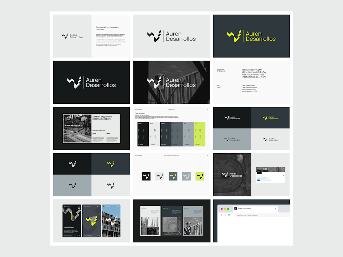
Not every direction makes it to the final brand.. this was one of the directions we explored for Auren Desarrollos, a new construction and development company we’re currently working with on its branding and website.
I’ll be sharing the final result soon, and I think the difference will be interesting to see.
What do you think?


Great!