The network for creativity
Join 1.25M professional creatives like you
Connect with clients, get discovered, and run your business 100% commission-free
Creatives on Contra have earned over $150M and we are just getting started
Back to feedPost

A Shopify homepage has a few seconds to answer one important question:
“Am I in the right place?”
A beautiful design helps, but the homepage also needs to guide the visitor toward the next step.
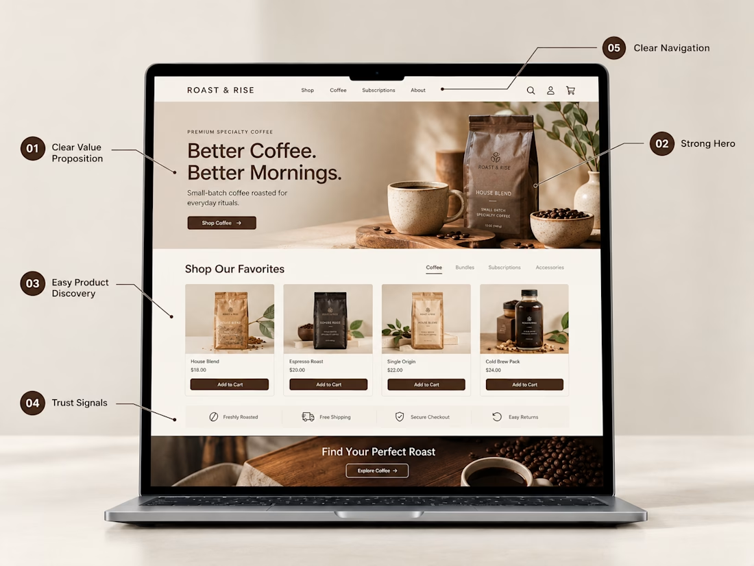
Here are 5 things I think every Shopify homepage should have:
1. A clear value proposition
Visitors should quickly understand what the brand sells and what makes it relevant to them.
2. A strong hero section
Use compelling imagery, a focused message, and a clear CTA instead of overwhelming visitors with too much information.
3. Easy product discovery
Featured products and collections should help shoppers find what they're looking for without having to search through the entire store.
4. Trust signals
Reviews, shipping information, return policies, guarantees, and secure checkout indicators can answer important questions before someone buys.
5. Clear navigation
Your navigation should make the store easy to explore. Customers shouldn't have to figure out where products or collections are hidden.
The goal isn't to put everything on the homepage.
It's to put the right things in the right order.
Good Shopify design isn't only about how the store looks. It's also about how easily someone can understand it and move through it.


Exactly. A good homepage should look great and make the buying journey feel easy.

Great points. Good Shopify design is really about making the customer journey simple.

Absolutely agree. A Shopify homepage should do more than look attractive—it should instantly communicate the brand’s value and guide visitors toward the next action. Clear navigation, strong trust signals, and easy product discovery can make a huge difference in conversions.

100% agree! A great Shopify homepage is not just about design—it’s about clarity, trust, and guiding customers to the right next step. 👏

Trust signals is the one we see skipped most on new stores, no shipping timeline or return policy anywhere above the fold, so people bounce before they even get to the product. Good list.
Good list. One thing we've seen bite stores on mobile specifically: trust signals and nav often get pushed below the fold when the hero image is tall, so the "am I in the right place" test fails before anyone scrolls. Worth checking your own homepage on an actual phone, not just a resized browser window.
Good list. One thing we've seen move the number more than any of these: making trust signals specific instead of generic. "Free shipping over $50" and "Ships in 24h" convert better than a plain truck icon, and "Secure checkout" lands harder next to the actual card/PayPal logos than as text alone. Vague badges get scrolled past.
The network for creativity
Join 1.25M professional creatives like you
Connect with clients, get discovered, and run your business 100% commission-free
Creatives on Contra have earned over $150M and we are just getting started











Related posts

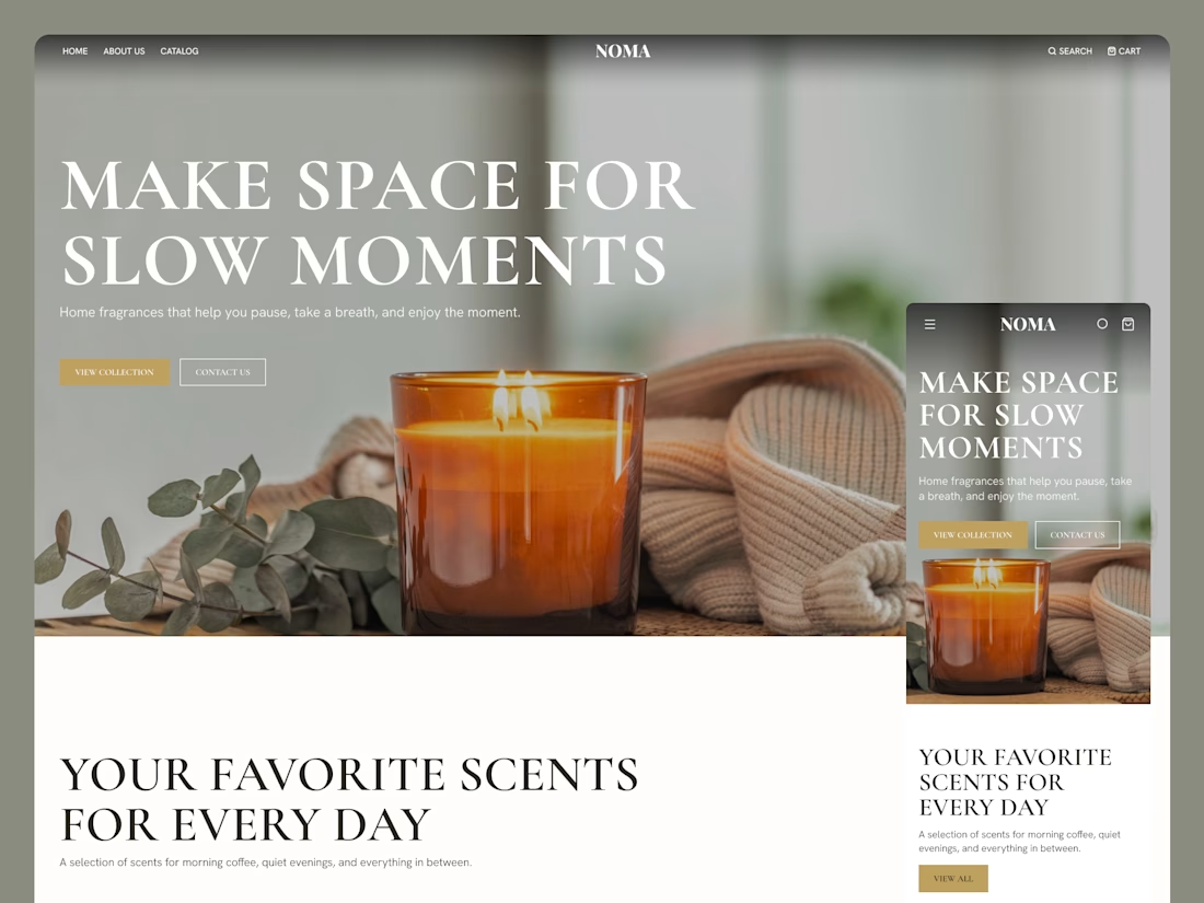
I designed the site in Figma and built it as a headless Shopify storefront with Hydrogen. I created a custom bundle creator with a live counter that unlocks the add-to-cart button only when the box is exactly full, and a custom cart that lists each box's flavour mix alongside order notes and ship and arrival dates. On mobile, the box summary stays pinned to the bottom of the screen.


Nice temple Saad it's really modern and minimalistic that's really great 🎉🎉🎉
Great job Saad❤️

✨ 2 spots open for new website projects!
Looking to launch a new website or give your existing one a fresh look? Let’s make it happen!
I help businesses and startups create modern, user-friendly websites that combine thoughtful UX with polished visuals.
Here’s what I offer:
🎨 UI/UX design in Figma - from wireframes to complete design systems and developer-ready specs.
💻 Framer websites - design, responsive development, animations, and launch.
🛍️ Shopify stores - modern e-commerce experiences tailored to your brand.
Whether you need a landing page, a multi-page website, or an online store, I’d love to help bring your vision to life.
🎁 Use code TKACH10 for 10% off your project.
Have a project in mind? Send me a message, let’s talk!
#WebDesign #Framer #Shopify #UIDesign


Looks great! 👌

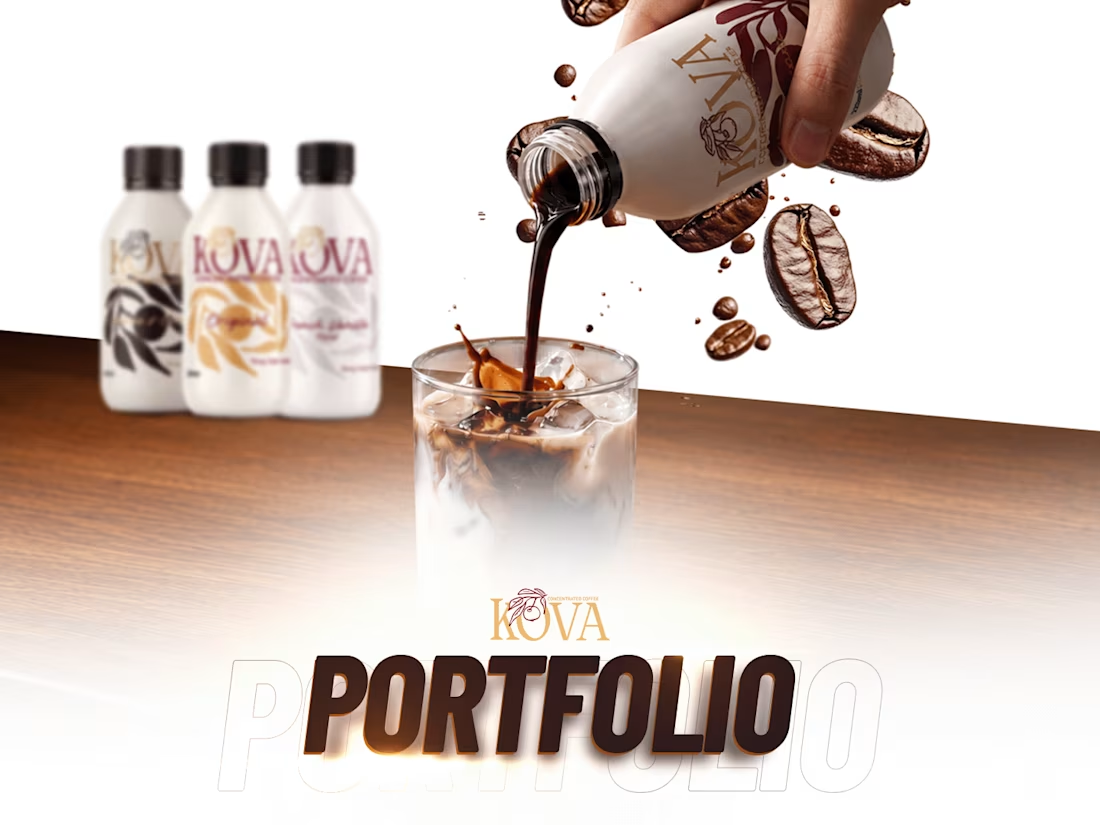
KOVA is a coffee concentrate made for busy mornings and long workdays: rich, smooth coffee that's quick to make and easy to enjoy.
I brought KOVA to life online, with one consistent look across every channel:
Website: designed and managed on Shopify, built around the product and easy to buy from
Social media: content and reels that keep the feed fresh and on brand
Ads: campaigns that put KOVA in front of the people it's made for
Need a website, content and ads that work together? Message me here on Contra. Which part of this project would you like to see in more detail?

Oh that's unique great job Awais 🎉🎉🎉
The visuals and motion effects are great ❤️❤️