The network for creativity
Join 1.25M professional creatives like you
Connect with clients, get discovered, and run your business 100% commission-free
Creatives on Contra have earned over $150M and we are just getting started
Back to feedPost

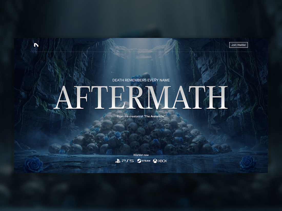
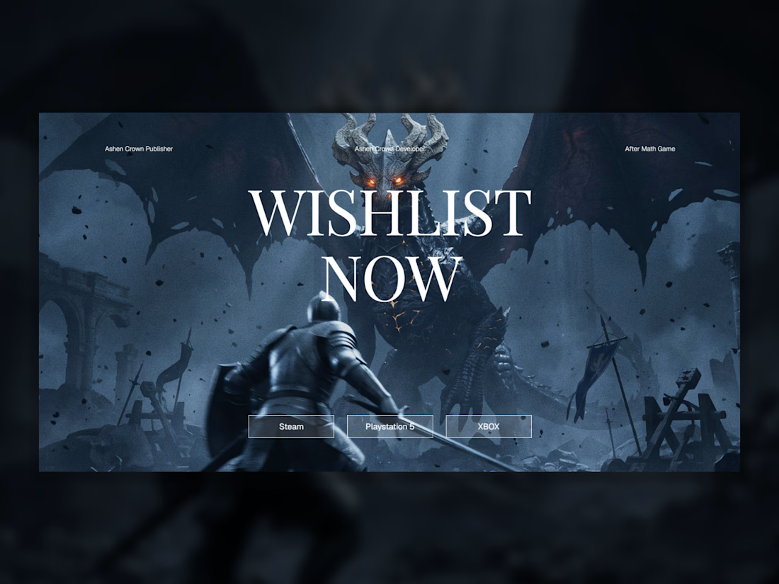
AFTERMATH, a Dark Fantasy Game Landing Page That Feels Like the Real Thing 🗡️ (Built using @Squarespace)
The concept: build a fictional video game landing page so cinematically convincing it could pass as an actual AAA title announcement. AFTERMATH is a dark fantasy action RPG where a fallen kingdom's last survivor faces what shouldn't still be breathing.
The challenge wasn't just aesthetic. It was about designing a site that feels like a product that exists, with the tension, atmosphere, and commercial weight of a real game launch.
🎮 Bringing the vision to life
AFTERMATH needed to function like a real game marketing site: a cinematic hero, a lore hook, gameplay feature showcases, multiple edition tiers, and a wishlist CTA, all within Squarespace's native tools. Every design decision was made in service of world-building, not just visual polish.
The blue rose became the site's visual thread, appearing in the key art, scattered across the story section, and animated on scroll to feel alive within the world.
🛠️ Built with Squarespace + Finish Layer
Block Animations : Text in the story section reveals line by line on scroll, building tension the way a game trailer would. Each line hits with its own weight before the next appears.
Block Transforms : The blue roses rotate from 365° to 0° as the user scrolls through the lore section. It's subtle, but it makes the roses feel like they're responding to the world, not just sitting on the page. Asymmetric positioning of the rose elements was also handled through Transforms to build the editorial, off-grid feel.
Image Effects (Grain) : Applied to the edition section background to add texture and cinematic grit, reinforcing the dark fantasy tone without relying on external assets.
Mobile Overrides : The desktop layout uses intentional image size variation for editorial impact. On mobile, overrides were applied to rebalance spacing and content flow so the experience holds up without the widescreen canvas.
🎨 Key design decisions
The typographic pairing, large serif display against sparse uppercase labels, was chosen to evoke game box art and epic fantasy without feeling generic. The color palette stays locked to deep navy and near-black with blue as the sole accent, keeping the atmosphere consistent across every section.
The edition cards (Collector's, Deluxe, Standard) use custom box art designed specifically for each tier, grounding the fictional product in something that feels commercially real.
Live site: https://aftermath.squarespace.com/
Password: hananda_squarespace


The network for creativity
Join 1.25M professional creatives like you
Connect with clients, get discovered, and run your business 100% commission-free
Creatives on Contra have earned over $150M and we are just getting started

Challenges
View all


Related posts

Which brand style fits Yicora?
I'm crafting a brand book for an AI platform targeting for creators.
16 voted
53%

14 voted
47%

30 votes
Closed

A feels more professional great job 🎉🎉

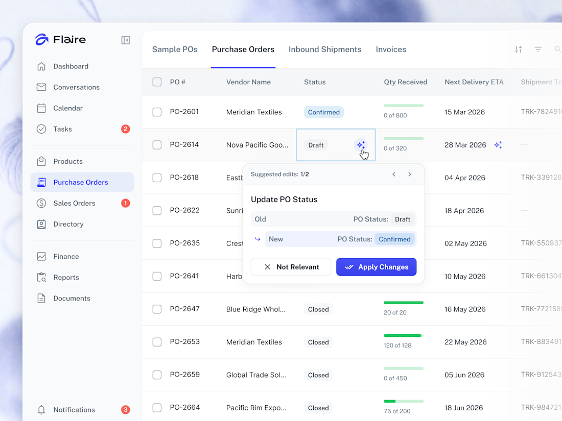
✨ AI Suggestions on the Purchase Orders list. Proposed record edits surface inline for the user to apply or dismiss in one tap.



Great work

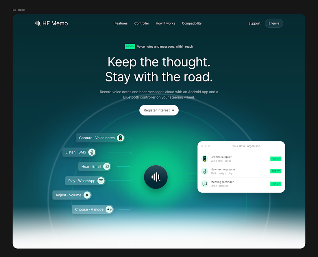
A website should make the product easy to understand.
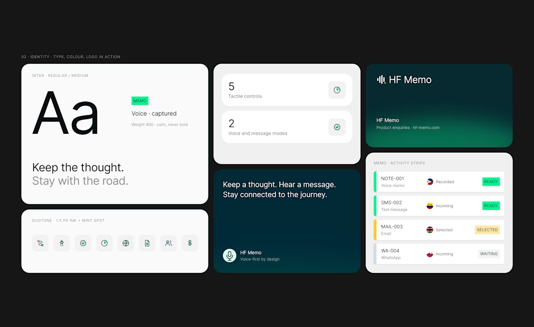
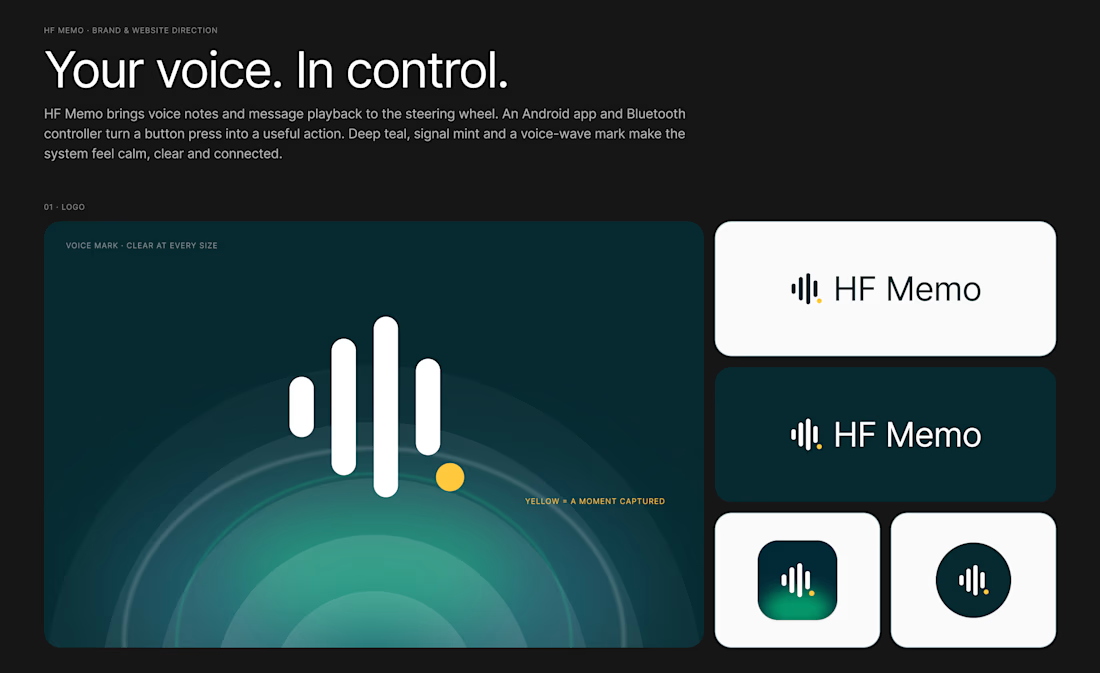
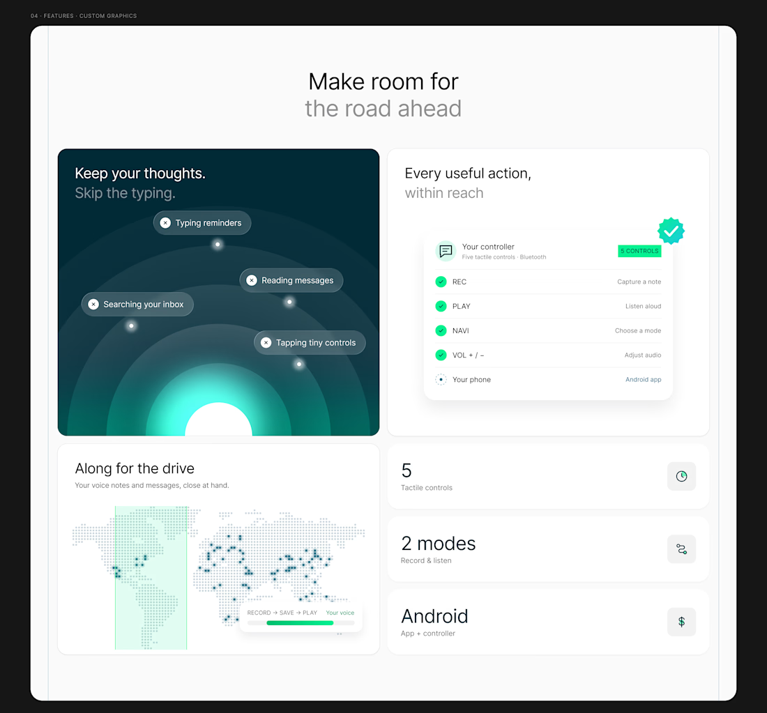
My latest redesign concept explores a new direction for HF Memo—an Android app and Bluetooth controller for recording voice notes and hearing messages aloud.
I focused on showing the experience: capture a thought, replay a recording, and understand what each controller button does.
Clean typography, light backgrounds, and lime accents give the product room to tell its story.
Designed in Figma, with editable layouts and custom graphics.
Have a product that needs a clearer website? Let’s connect.
#webdesign #uidesign #figma #productdesign