The network for creativity
Join 1.25M professional creatives like you
Connect with clients, get discovered, and run your business 100% commission-free
Creatives on Contra have earned over $150M and we are just getting started
Back to feedPost
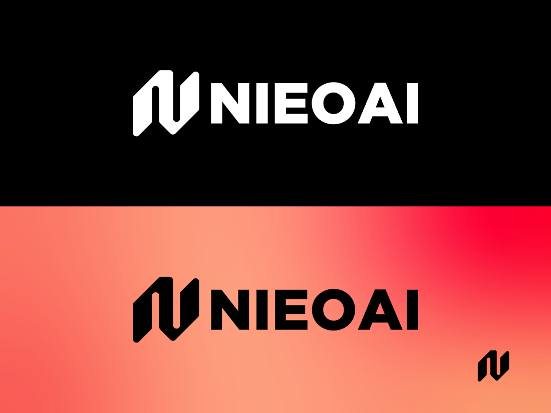
NIEOAI, a conceptual identity for a next-gen AI system. Inspired by the elegance of Gemini and the precision of Copilot, this logo blends geometric abstraction with bold typography to evoke intelligence, symmetry, and trust. The stylized "N" symbol reflects modular thinking and neural connectivity, while the dual-tone layout showcases versatility across light and dark modes. Designed for scalability, clarity, and emotional resonance — from startup pitch decks to enterprise dashboards.
#AILogo #BrandDesign #LogoExploration #MinimalDesign #TechBranding #FuturisticLogo #DesignConcept #NIEOAI #LogoInspiration #CreativeDirection
Brand DesignGraphic DesignLogo DesignAdobe PhotoshopAdobe IllustratorAdobe XDbrandlogodesigningailogonieoai
nice design
thanks
The kerning between the 'O' and the 'A', is that intentional to make the AI part clearer? If not it looks really off with that space between the letters. Also I didn't actually realise the mark was a stylized 'N' at first just thought it was a mark, but maybe thats just me.
The network for creativity
Join 1.25M professional creatives like you
Connect with clients, get discovered, and run your business 100% commission-free
Creatives on Contra have earned over $150M and we are just getting started
Trending
Claude
Claude has entered the design space. How are you using Claude Design?
Contra University
Learn from expert creatives how to earn more using next-gen AI tools.
creativeaiflow
Creative AI workflows are evolving. What tools do you use, and what are their strengths and weaknesses?
portfolioreview
The best portfolios tell a story, not just show a grid. Share yours for feedback.
freelancerlife
Freelancer life is wins, pivots, and everything in between. What’s yours right now?