The network for creativity
Join 1.25M professional creatives like you
Connect with clients, get discovered, and run your business 100% commission-free
Creatives on Contra have earned over $150M and we are just getting started
Back to feedPost

ARK² Construction → ARK Simplify
Rebrand for a team that handles construction estimating and bookkeeping for contractors in the US and UK.
The old mark was busy, and the name said "construction" while half the business was finance.
The new symbol started from two ideas, a ship's wheel (steering) and a rising sun (a clear path forward). I reduced both into one geometric form that also reads as an A. Signal orange and deep navy replaced the black and red, so the brand feels calmer and more established next to the US firms they pitch to.
Which one would you trust with your project bids?
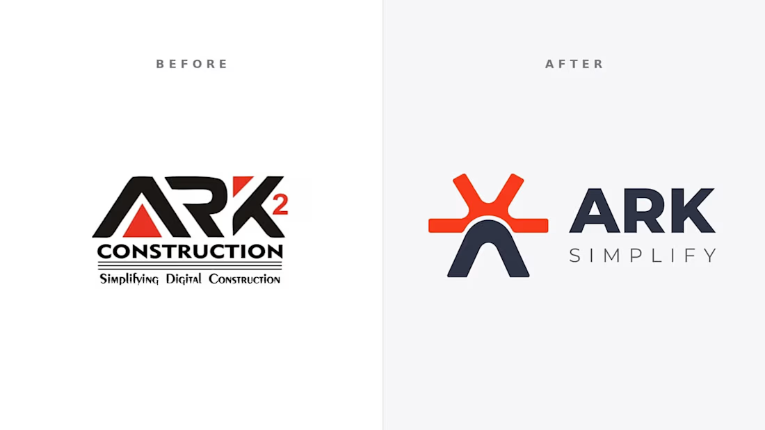


half construction half finance in the old name, the simplification does a lot of work here
The network for creativity
Join 1.25M professional creatives like you
Connect with clients, get discovered, and run your business 100% commission-free
Creatives on Contra have earned over $150M and we are just getting started







Related posts


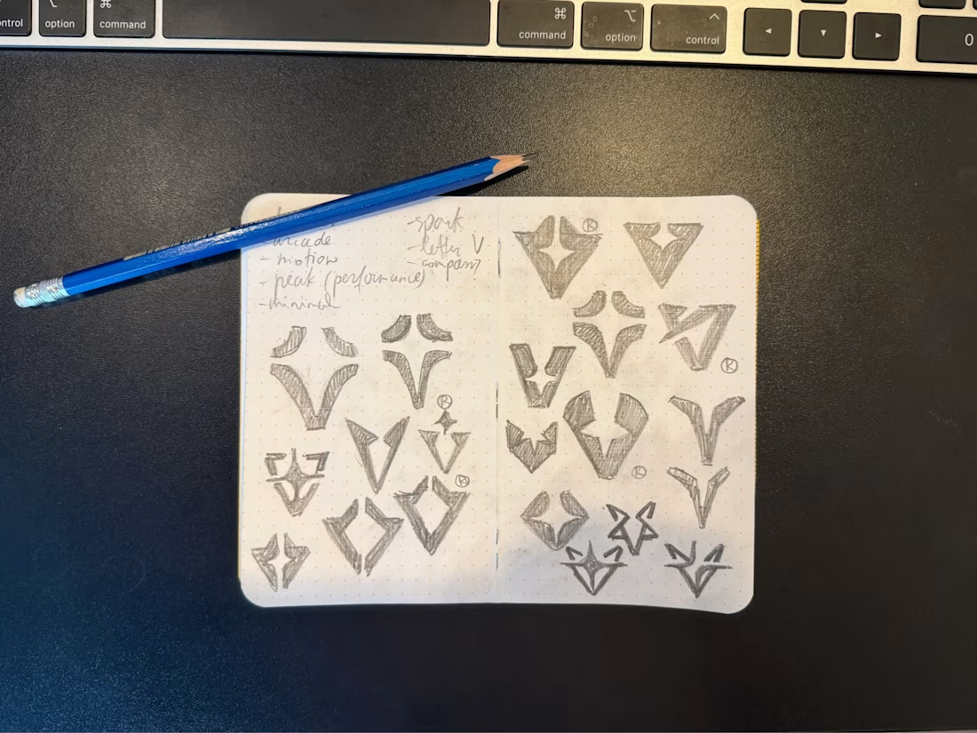

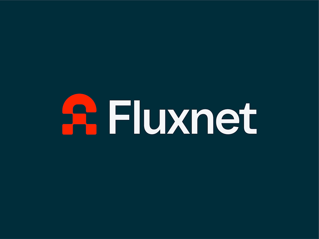
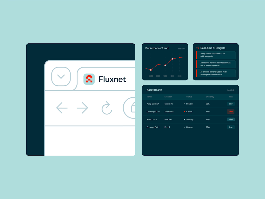
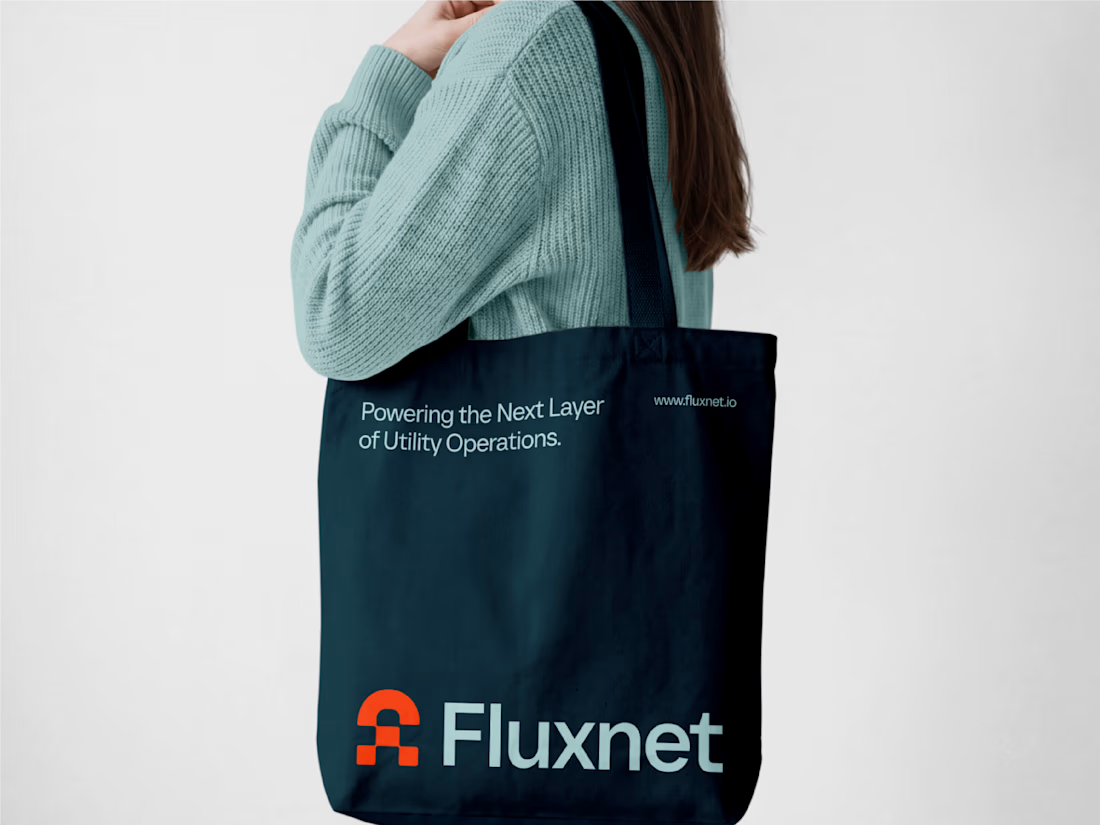
One of my favorite projects this year 👉 Fluxnet.
The challenge of this project was to create an identity for a company bringing AI into complex industrial environments, where trust and reliability matter just as much as innovation.
The direction was to balance these two worlds: a brand that feels grounded and dependable, but still looks ahead. The goal was to make complex technology feel clear and accessible without losing its technical edge.
Full project here
Curious to hear your thoughts. How do you approach branding in such a technical spaces?
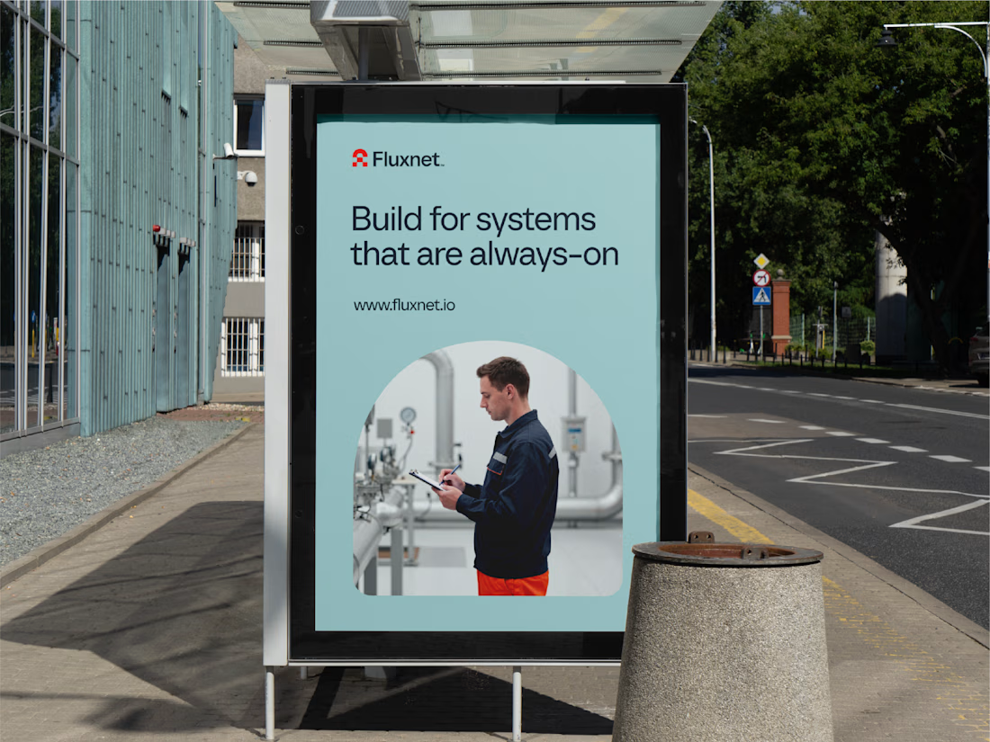
how did you land on the balance between industrial and innovative?

One brand, very different variety products. 👀
BASYX is one of my favorite projects because the packaging had to work across categories, from skincare to food, while still feeling like one cohesive brand.
That’s the fun challenge of multi-product brands: creating a visual system flexible enough to grow without losing its identity.

wow amazing