The network for creativity
Join 1.25M professional creatives like you
Connect with clients, get discovered, and run your business 100% commission-free
Creatives on Contra have earned over $150M and we are just getting started
Back to feedPost
Taste Test
Building the landing page for LumaDisk (a disk space analyzer for Mac & Windows).
I'm testing two directions for the "cloud drives" section:
Left: Horizontal icons row
Cloud provider icons in a centered horizontal row, each in a 72px rounded card. Subtle lift + glow on hover. Paragraph copy above, "Read more" CTA below.
Right: Orbit with motion
Cloud provider icons arranged on a ring, each gently floating around its position. Purple-tinted hub at the center. Mouse parallax on hover. Animated particles scattered around the ring.
Context: This section sits between the speed benchmark and the interactive demo.
Which layout sells the feature better: Left or Right
1 voted
20%

4 voted
80%

5 votes
Closed
Orbit with motion wins for me. 🔥 From a CRO perspective, the visual hierarchy of everything feeding into a central 'hub' sells the value proposition of 'all-in-one view' much faster than a row of cards. Both look great though 🙌
Thanks! That's the direction I am leaning too.
Orbit with motion is a win
The network for creativity
Join 1.25M professional creatives like you
Connect with clients, get discovered, and run your business 100% commission-free
Creatives on Contra have earned over $150M and we are just getting started
Related posts
The first one gives less cognitive overload 🔥
Interface cards for a recent product design project, what would be the best direction? Dark Mode or Light Mode? ⚡️
69 voted
68%
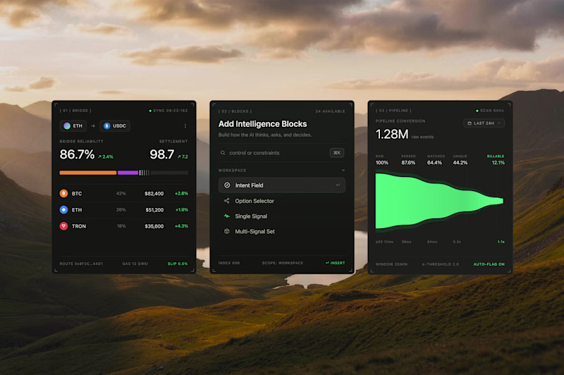
32 voted
32%
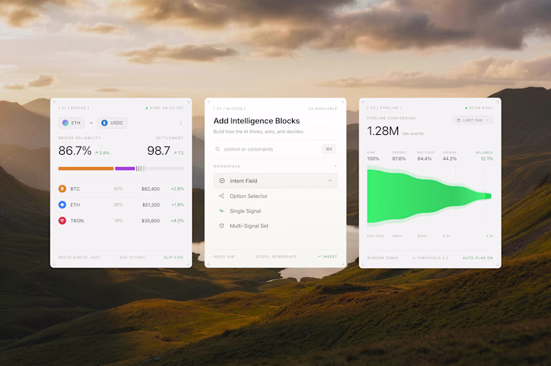
101 votes
Closed
Both look great, but i will go for the dark mode
Can you help settle this please?
Left (Work showreel) or Right (abstract wave animation)?
effekt.design's new home :)
4 voted
31%
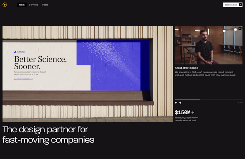
9 voted
69%
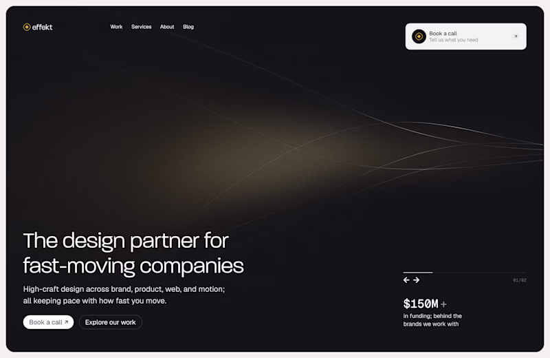
13 votes
Closed
Cool
Challenges
View allTrending
Claude
Claude has entered the design space. How are you using Claude Design?
Contra University
Learn from expert creatives how to earn more using next-gen AI tools.
fifaworldcup2026
The World Cup is here and the whole world's watching. How are you designing for the world stage?
creativeaiflow
Creative AI workflows are evolving. What tools do you use, and what are their strengths and weaknesses?
freelancerlife
Freelancer life is wins, pivots, and everything in between. What’s yours right now?