The network for creativity
Join 1.25M professional creatives like you
Connect with clients, get discovered, and run your business 100% commission-free
Creatives on Contra have earned over $150M and we are just getting started
Back to feedPost
Proof that my obsession is paying off 🥲
Also proof that my first Framer sites last year were… humbling, to say the least, and the progress since then has been very real.
I don’t know who else feels this way, but Framer has given me more than just a tool to design, it’s given real and meaningful direction to my career. Forever grateful.


Framer expert
Sara Gonz • The Yoga Designer


$36M in Framer opportunities

congrats @Sara Light

Thank you Naveen! I’m chuffed!
The network for creativity
Join 1.25M professional creatives like you
Connect with clients, get discovered, and run your business 100% commission-free
Creatives on Contra have earned over $150M and we are just getting started











Related posts


this is really nice 100%. nice job

The Liquid Framer Component ✨🫧
Make your website a little less square. All flow, no rough edges.


Make your website a little less square is such a perfect pitch line. The liquid distortion over the cityscape footage feels organic rather than gimmicky, which is surprisingly hard to pull off.

Onboarding section for a website i am working on
Six simple steps from first call to home-based sessions, with playful illustrated icons.
Need a sales-focused landing page, site, branding?
Book an intro call 👇🏻
https://calendly.com/book-a-15mins-call/theframerdude

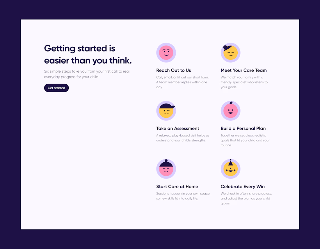
Getting started is easier than you think is such a warm headline for an onboarding section, Olayanju. Six illustrated steps from first call to home-based sessions makes the whole journey feel approachable instead of clinical.