The network for creativity
Join 1.25M professional creatives like you
Connect with clients, get discovered, and run your business 100% commission-free
Creatives on Contra have earned over $150M and we are just getting started
Back to feedPost

Ah, yes—those sepia-tinted years when I could luxuriate for months over designing an icon collection as a medieval illuminator, blissfully unconcerned with whatever AI marvel was about to drop next week. Design then was unhurried, almost monastic. The output was artisanal, soulful, unmistakably human.
I count myself fortunate to have sold my icon business a year ago—just before AI began colonising the collective imagination of customers who now happily generate icons and, heaven help us, logos.
There’s no call to action here. No inspirational crescendo. Just your nostalgic Zlatko, with half-sipped espresso, quietly mourning the good ol‘ days. But perhaps Contra needs the occasional pauses like this to balance out those superficial A/B posts, where one needs to make a creative choice without any context whatsoever. 🙂
The network for creativity
Join 1.25M professional creatives like you
Connect with clients, get discovered, and run your business 100% commission-free
Creatives on Contra have earned over $150M and we are just getting started





Related posts

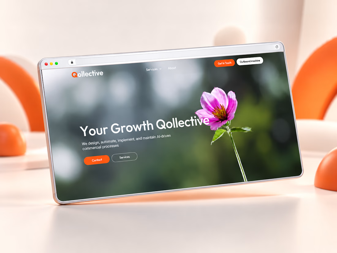
From Figma to Framer: I designed and built Qollective’s B2B website from scratch, with a focus on clear service navigation, responsive layouts and custom interactions.
A nature-led hero brings a human touch to an AI-focused consultancy.


The nature-led hero is a nice counterweight to the AI positioning. Did you build the custom interactions natively in Framer or with code components?

I built my site like it’s 2005 and I regret nothing.
There’s a snake game on the 404 page that actually moves. A terminal that types itself out. And somewhere underneath all that — 14 years of UI/UX work and a design subscription, if you’re into that sort of thing. Vibe-coded, made with love.
anfalova.art. Go press buttons.


Wow , you got one of my goats 🐐

Woke up to a nice surprise: Ceya Logo & Visual Identity is now featured on Contra. 🤘
Thank you, Contra team, for the love.

congrats man. featured feels so good when you wake up to it lol. ceya logo looks sick btw, well deserved