The network for creativity
Join 1.25M professional creatives like you
Connect with clients, get discovered, and run your business 100% commission-free
Creatives on Contra have earned over $150M and we are just getting started
Back to feedPost


The network for creativity
Join 1.25M professional creatives like you
Connect with clients, get discovered, and run your business 100% commission-free
Creatives on Contra have earned over $150M and we are just getting started











Related posts


Always wonder at your perfect work

Year 4 of this Annual Summit brand and presentation design wrapped up.
Sadly can't show you all the photos, but here's a little peak.
It's so nice to see designs out in the wild and SO big! 😃
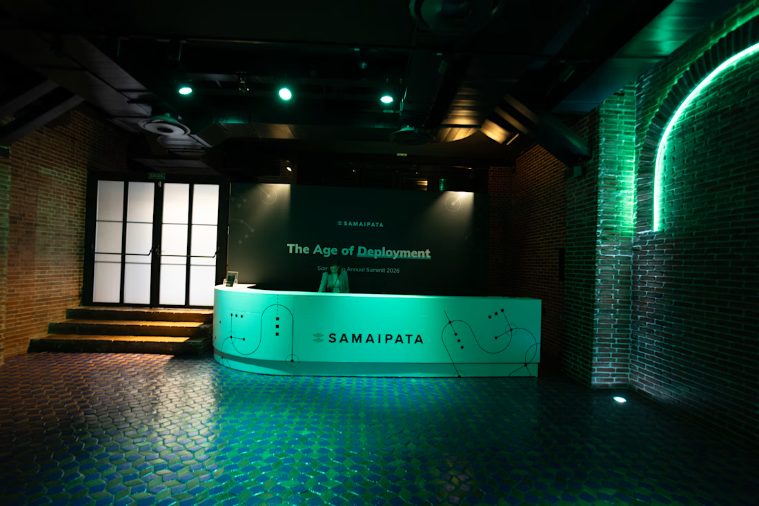
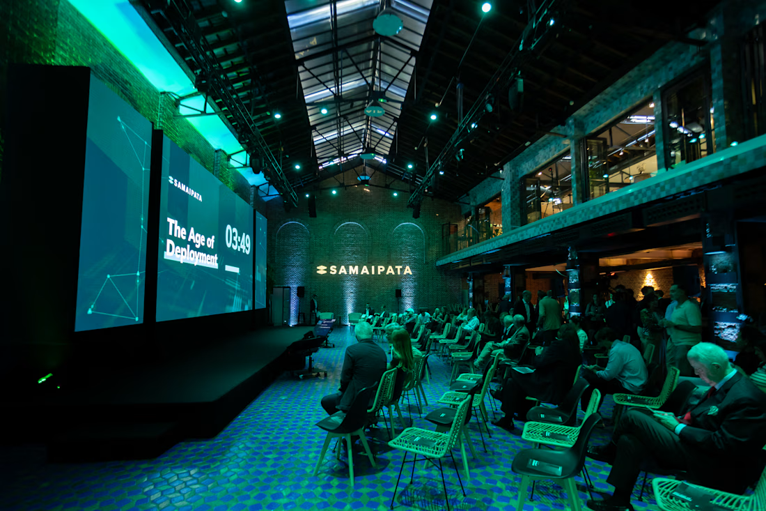
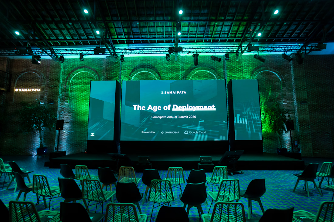

Year four of the same brand is such a rare gift, you get to refine instead of reinvent. The Sam Aipata identity at that scale on the stage screens looks electric, the green lighting sells the whole mood.

Title: Proper Form — Brand Identity & Visual Language
A brand identity for Proper Form built around a more modern, movement-driven take on recovery and healthcare.
The visual system extends the logo into a complete language through color, typography, imagery and layout, creating a consistent identity across different brand touchpoints.
Created by Lepisov Branding in collaboration with @Creative Mints
Logo design: Ilya Gorchanyuk
Creative direction: Dmitry Lepisov
Brand identity: Lepisov Branding × Creative Mints


Using the logo mark as the big graphic across the layouts is smart. The purple to pink gradient gives recovery a more energetic feel.