The network for creativity
Join 1.25M professional creatives like you
Connect with clients, get discovered, and run your business 100% commission-free
Creatives on Contra have earned over $150M and we are just getting started
Back to feedPost

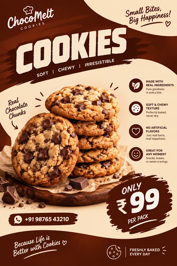
There is nothing quite like the warm, gooey magic of a fresh-baked cookie…and the visual should make you taste it before you even take a bite. 🍪✨
For my latest cookies poster design, I wanted to capture that irresistible, mouth-watering feeling. From the rich, warm color palette and playful typography to the clean composition that highlights every delicious detail, every element was crafted to stop people mid-scroll and trigger an instant craving.
As a hybrid designer and SMM, I live for projects where aesthetic design meets consumer psychology. A great food ad doesn't just display a product; it creates a sensory experience that drives real foot traffic and sales.
Looking to give your bakery, brand, or product the visual upgrade it deserves? I am currently taking on new clients and would love to help you bring your vision to life!
💼 Want to work together? Send me a DM or drop a comment below, and let’s talk about how we can make your brand stand out! 👇
#GraphicDesign #CookiePoster #FoodDesign #BakeryBranding #PosterDesign #VisualStorytelling #SocialMediaManagement #BrandStrategy #SweetCravings
The network for creativity
Join 1.25M professional creatives like you
Connect with clients, get discovered, and run your business 100% commission-free
Creatives on Contra have earned over $150M and we are just getting started




Related posts

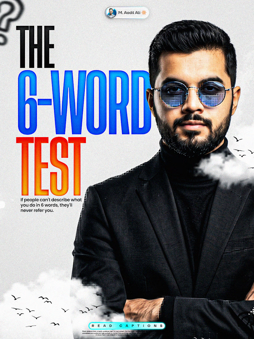
If people can't describe what you do in 6 words,
they'll never refer you.
They like you. They just can't repeat you.
That's a positioning problem, not a talent problem.
Here's why the number matters:
Referrals happen inside a 10-second gap in someone else's
conversation.
"Do you know anyone who...?"
Whoever comes to mind in that gap gets the work.
Usually that's the person with the simplest sentence
attached to their name.
Not the best portfolio in the city.
So try it right now.
Say what you do out loud. Count the words.
If you needed 20, cut with these 3 rules:
1. Name the person, not the industry
"I work with brands" becomes "I write for
dental clinics"
2. Name the outcome they'd brag about
Skip your process. Keep the result they'd repeat to a
friend.
3. Delete every word that could describe 400 other people
Strategic. Data-driven. Storytelling. Solutions. Nobody
passes those along.
The template:
I help [who] [get specific outcome].
Six words. Boring on purpose.
"I help dentists fill empty Tuesdays."
"I write SEO pages that rank."
(Six words is brutal. That's the point.)
If you can't compress it, nobody else can either.
Impressive sentences get compliments. Repeatable ones get
referrals.
What are your 6 words?
Drop them below and I'll tell you which one to cut.



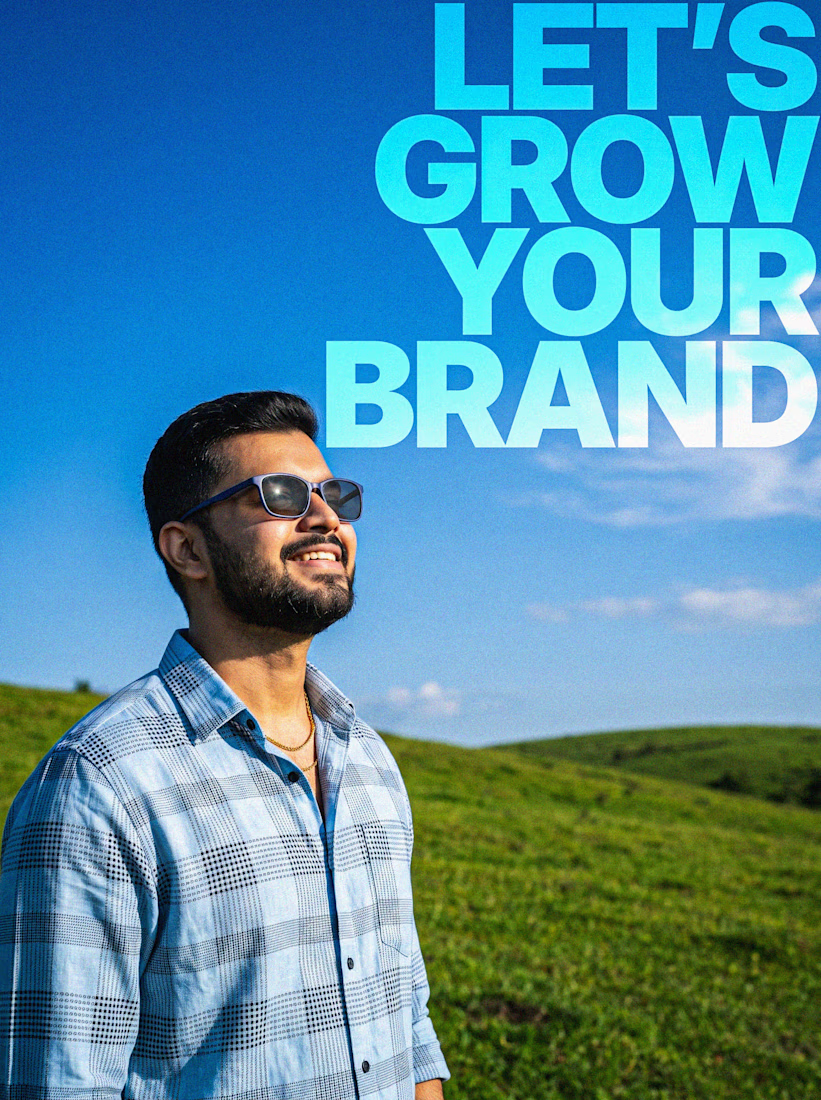

“Repeatable beats impressive” is the real takeaway here. 🔥
Simple positioning is underrated.


B

Most furniture websites try to help you buy faster. This concept for SÖDER ATELIER explores a different idea:
What if the experience helped you choose better?
The design is built around the values shown throughout the concept craftsmanship, natural materials, longevity, repairability, and thoughtful living. So instead of treating the homepage like a catalogue, the experience gives space to:
→ The story behind the pieces
→ Curated collections
→ Craft and material details
→ Long-term value
→ Customer perspectives
→ Clear product discovery
The visual language stays quiet and editorial, letting the furniture carry the attention. Because when a product is made to live with for years, the website shouldn't make it feel disposable.
SÖDER ATELIER — a responsive furniture e-commerce exploration.
🏀 Full Design Showcase – Better View on Dribbble.
↗ Furniture E-commerce Product Website


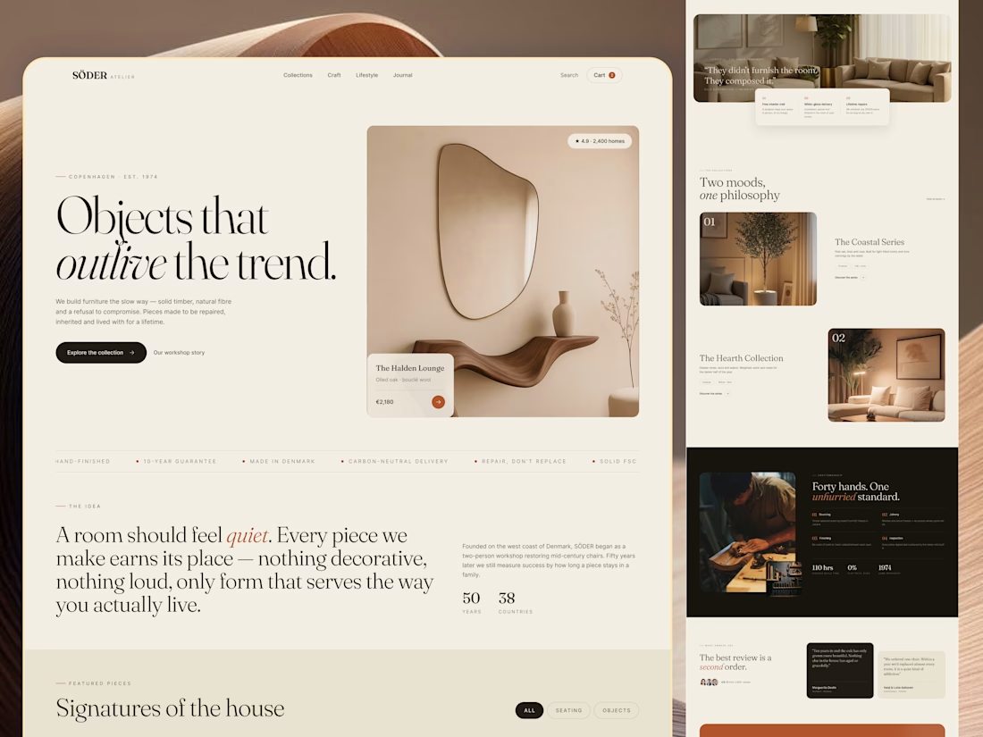

The homepage sells longevity, and Signatures of the house still gives you category chips to browse by. Curious whether the product page carries the craft and repairability fields too.