The network for creativity
Join 1.25M professional creatives like you
Connect with clients, get discovered, and run your business 100% commission-free
Creatives on Contra have earned over $150M and we are just getting started
Back to feedPost

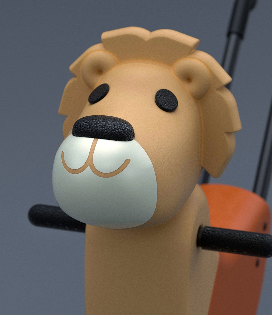
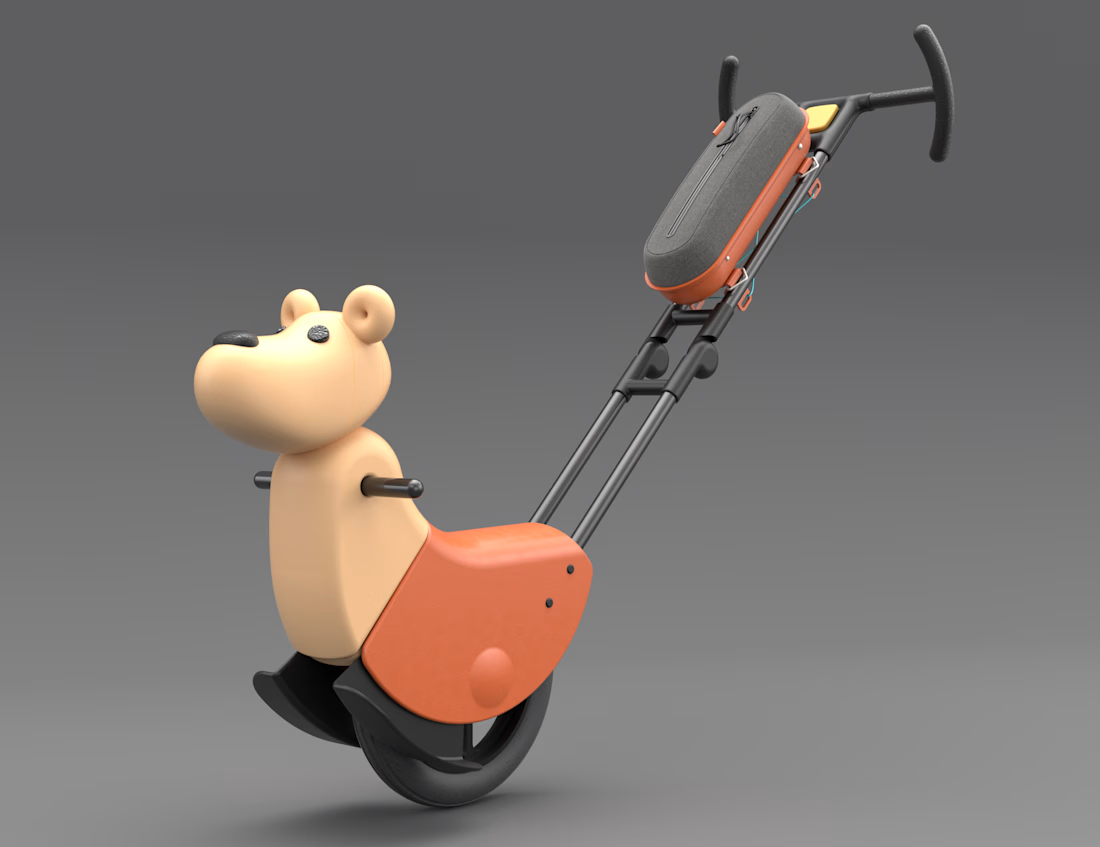
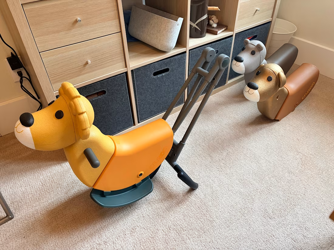
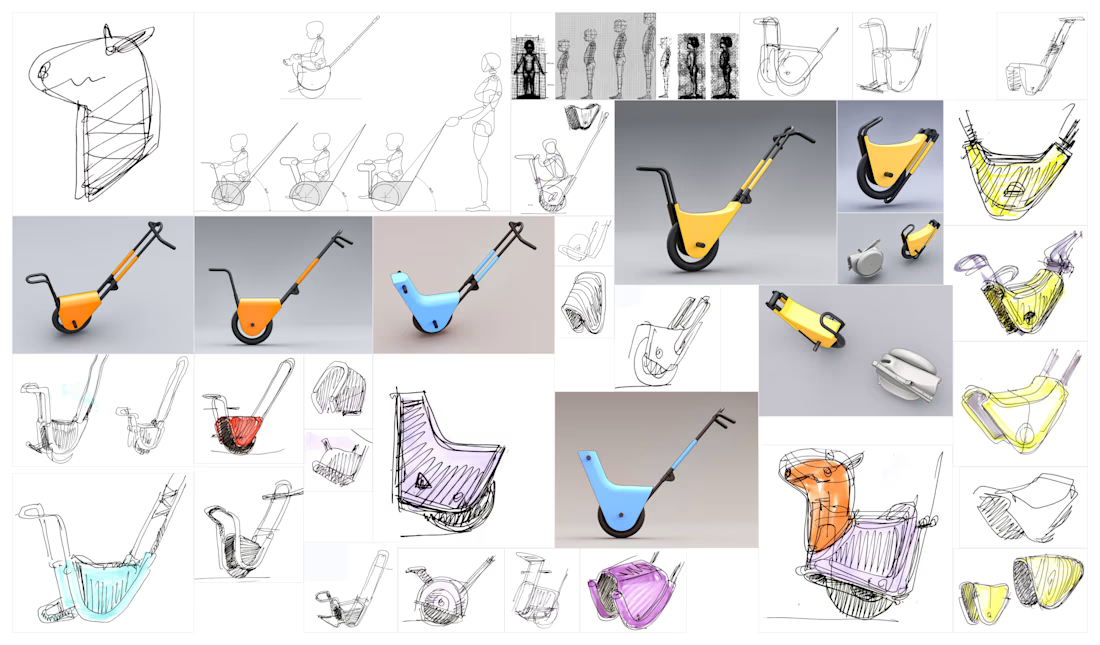
Cruzoo makes it easy to walk anywhere with your toddler


The network for creativity
Join 1.25M professional creatives like you
Connect with clients, get discovered, and run your business 100% commission-free
Creatives on Contra have earned over $150M and we are just getting started





Related posts

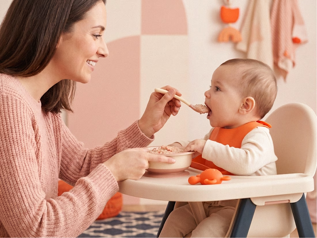
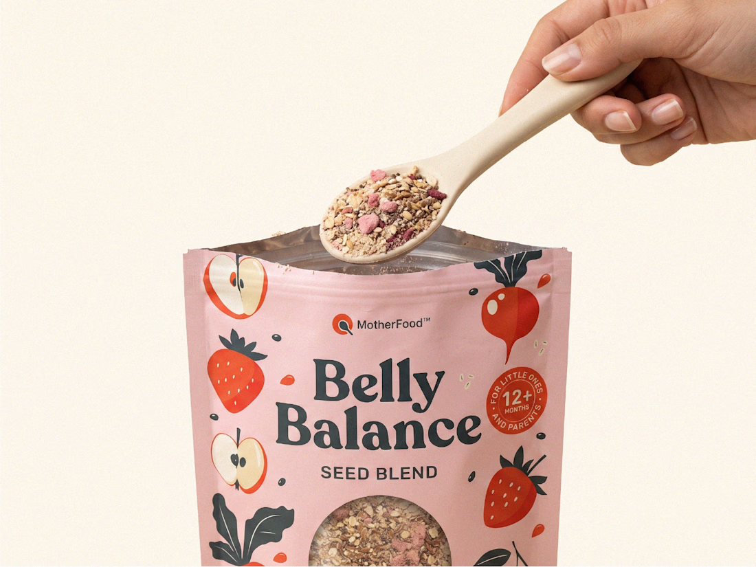
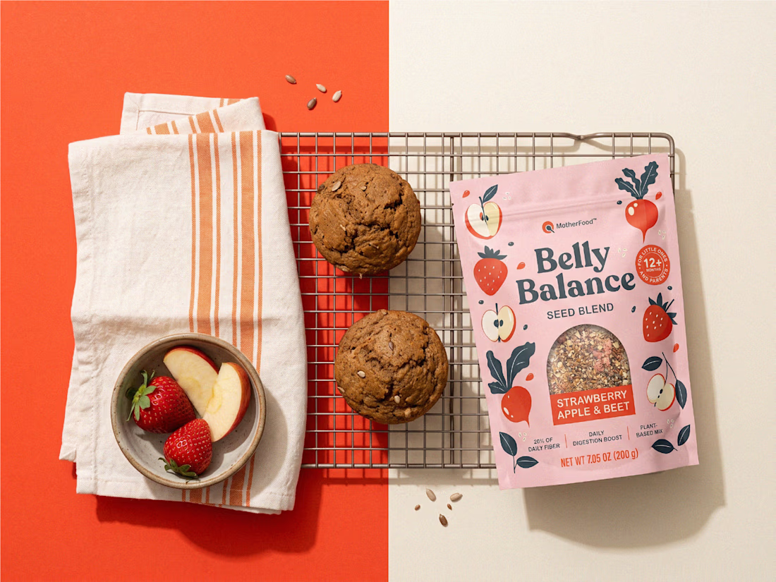
Digestive health for little ones doesn’t need to look clinical to feel credible.
For Belly Balance, I took the brand in a more joyful, approachable direction — using soft colors, playful illustrations, and a clean packaging system to make the product feel friendly without losing clarity.
The goal was simple: turn a functional product for babies and toddlers into something parents would feel good choosing every day.


premium work

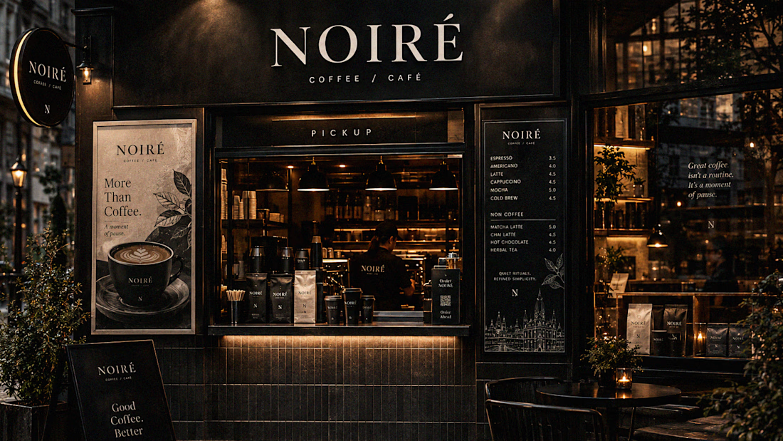
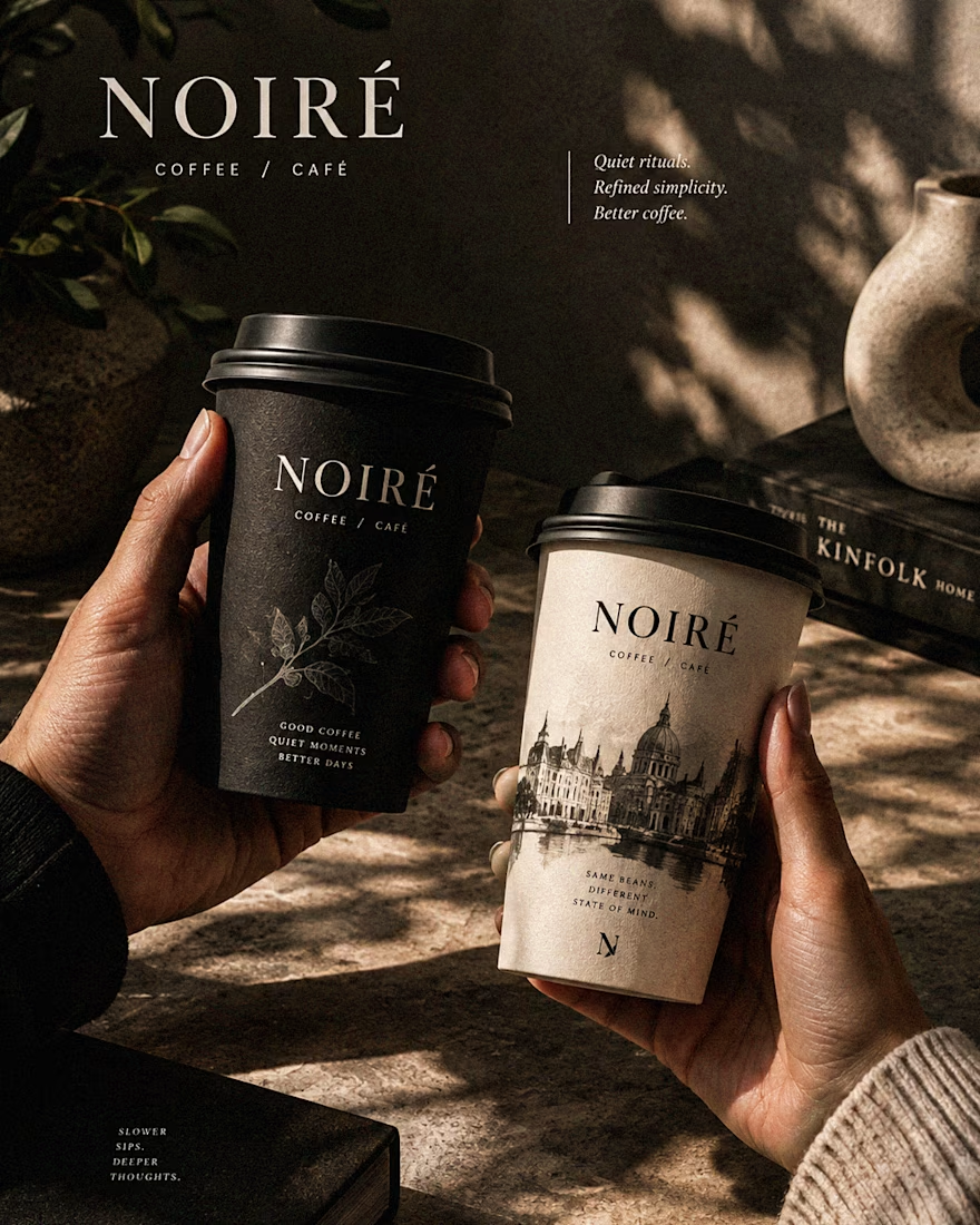
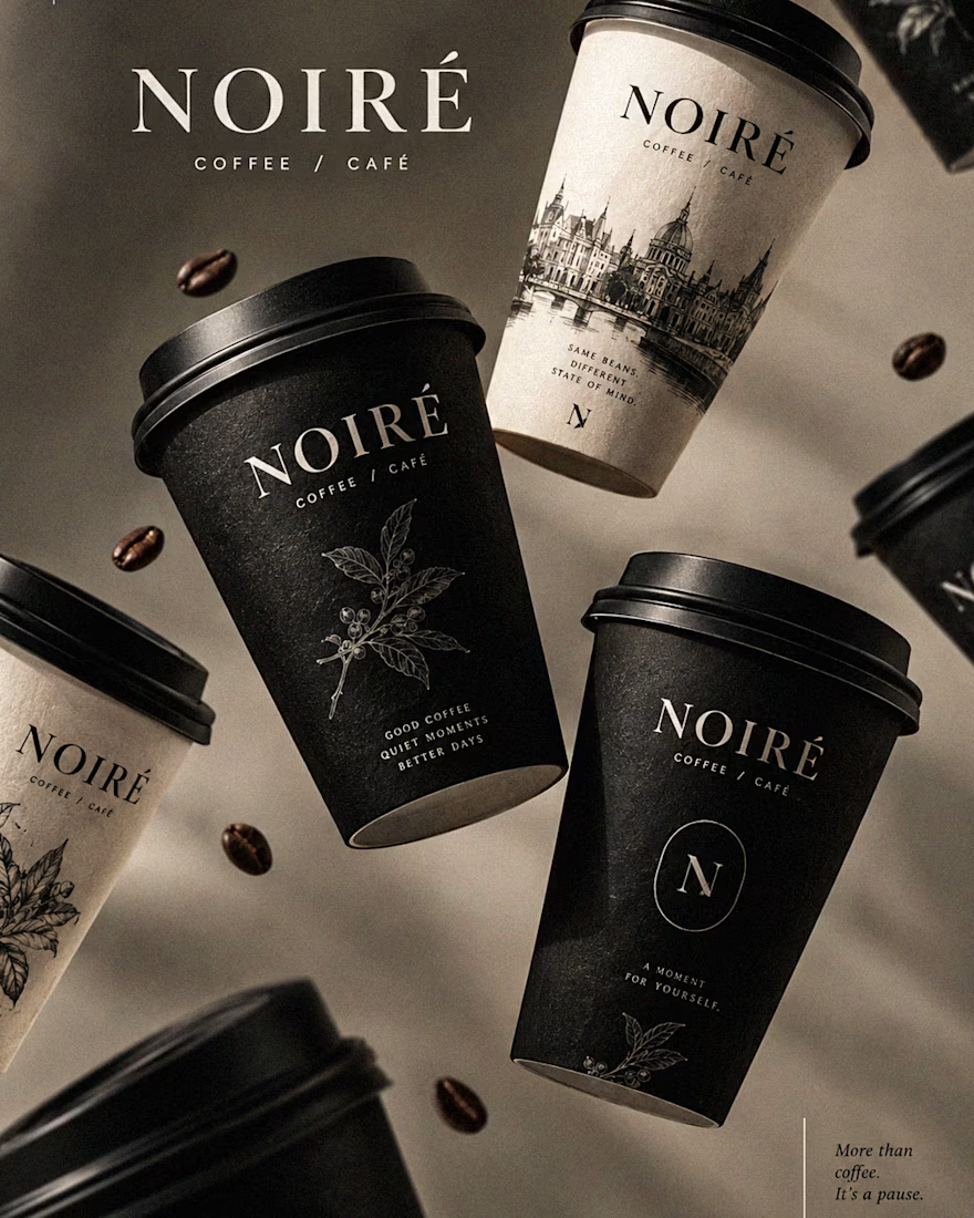
I Just Created NOIRÉ 🔥
A Coffee Brand Built Around the Pause.
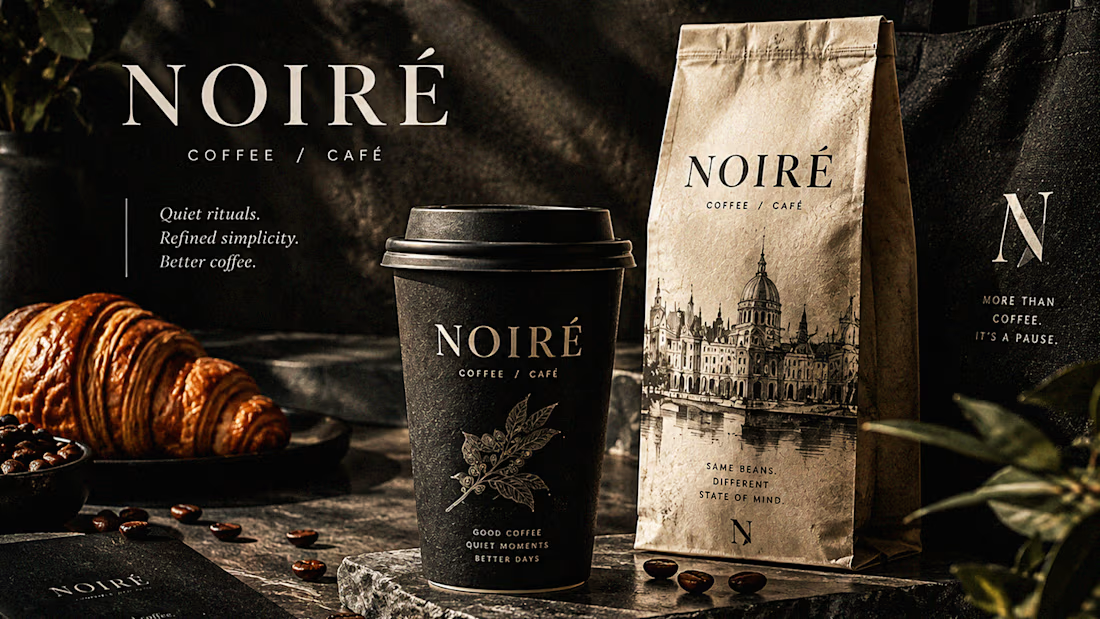
NOIRÉ is a premium café brand built around a simple idea:
Great coffee should feel like a moment of pause, not another part of the
routine.
The project explores a complete visual identity, packaging
system, takeaway cups, coffee bags, tote bags, menu design, café applications and lifestyle campaign direction.
Instead of relying on the usual loud coffee aesthetics, I
built NOIRÉ around deep charcoal, warm ivory, soft graphite, refined
typography, subtle botanical illustrations and quiet editorial compositions.
The visual language is intentionally dark, tactile, and understated - giving every touchpoint the feeling of a slow morning, a quiet table, and coffee worth taking your time with.
From the cup in your hand to the café around you, every detail was designed to make the brand feel like a ritual.
Waiting for your thoughts in the comments 🙌🔥
branddesignertastetestBrand DesignGraphic DesignPackaging DesignAdobe IllustratorAdobe InDesignAdobe Photoshop




Okay, I finally joined the typography trend too. 👀
Had to try one myself - so here’s a little typography experiment I’ve been playing with.
Sometimes you just see a trend everywhere and think, okay… my turn. 😂
What do you think - should I make more of these?
Graphic DesignMotion DesignTypographyAdobe After EffectsAdobe Illustratortypographykinetictypographymotiongraphics


TOP!!