The network for creativity
Join 1.25M professional creatives like you
Connect with clients, get discovered, and run your business 100% commission-free
Creatives on Contra have earned over $150M and we are just getting started
Back to feedPost
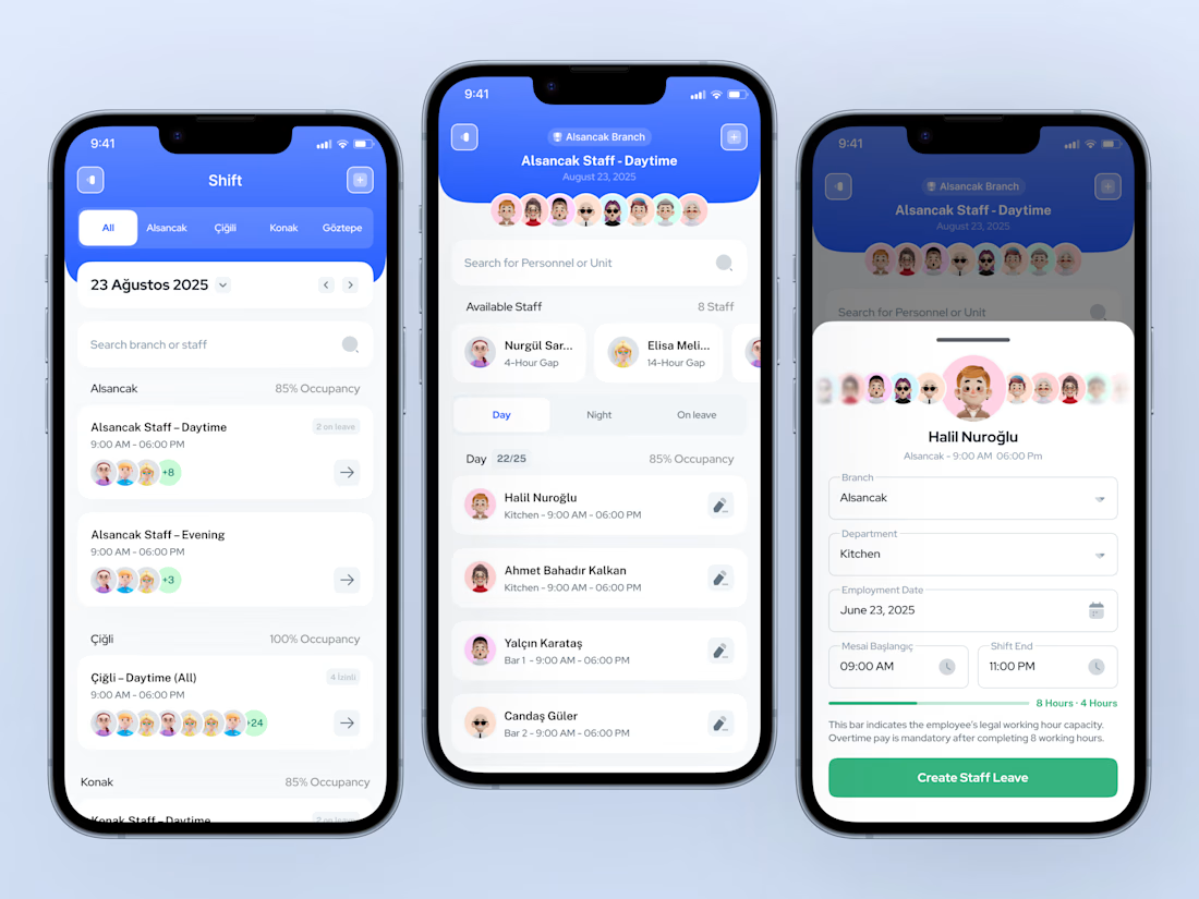
Workforce management apps look simple—until you try to make them readable in 5 seconds.
In this mobile flow, I focused on helping managers answer three questions instantly: – Who is working today? – Where are they assigned? – How full is the shift capacity?
Instead of adding more controls, I designed a progressive flow: • Overview by branch and occupancy • Shift-level staff visibility • Individual staff detail with legal working hour awareness
The goal was not “more features,” but faster understanding under pressure.
Curious how you approach similar screens: When designing operational dashboards, do you prioritize 👉 maximum control or 👉 minimum cognitive load?
Would love to hear how you balance this in your own work.


nice design

Thank you 🙌
The network for creativity
Join 1.25M professional creatives like you
Connect with clients, get discovered, and run your business 100% commission-free
Creatives on Contra have earned over $150M and we are just getting started







