The network for creativity
Join 1.25M professional creatives like you
Connect with clients, get discovered, and run your business 100% commission-free
Creatives on Contra have earned over $150M and we are just getting started
Back to feedPost
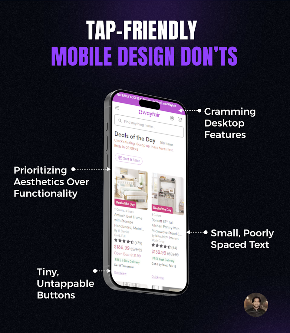
Do not optimize your Store Design for smaller screens like this!
→ Cramming all desktop features into mobile view
→ Using tiny, untappable buttons to keep minimalistic design
→ Small, poorly spaced text
→ Using same complex menus like desktop
WHAT IT GIVES?
It frustrates users, creates clutter, confusion and makes it hard for users to read comfortably!
Pro Tip: Prioritizing aesthetics over functionality sacrifices mobile user experience.
@Anoos Sohotra, most importantly, your website needs to accommodate every kind of person. While many people can use this, we must not ignore those who may have difficulties.
@Anoos Sohotra So true! Mobile needs its own thoughtful design, not just a shrunken desktop version. Tiny buttons and cramped text might look clean but they frustrate users
@Anoos Sohotra - i agree
@Anoos Sohotra Amazing !!!!!!!!!
The network for creativity
Join 1.25M professional creatives like you
Connect with clients, get discovered, and run your business 100% commission-free
Creatives on Contra have earned over $150M and we are just getting started
Trending
Claude
Claude has entered the design space. How are you using Claude Design?
Contra University
Learn from expert creatives how to earn more using next-gen AI tools.
fifaworldcup2026
The World Cup is here and the whole world's watching. How are you designing for the world stage?
creativeaiflow
Creative AI workflows are evolving. What tools do you use, and what are their strengths and weaknesses?
freelancerlife
Freelancer life is wins, pivots, and everything in between. What’s yours right now?