The network for creativity
Join 1.25M professional creatives like you
Connect with clients, get discovered, and run your business 100% commission-free
Creatives on Contra have earned over $150M and we are just getting started
Back to feedPost

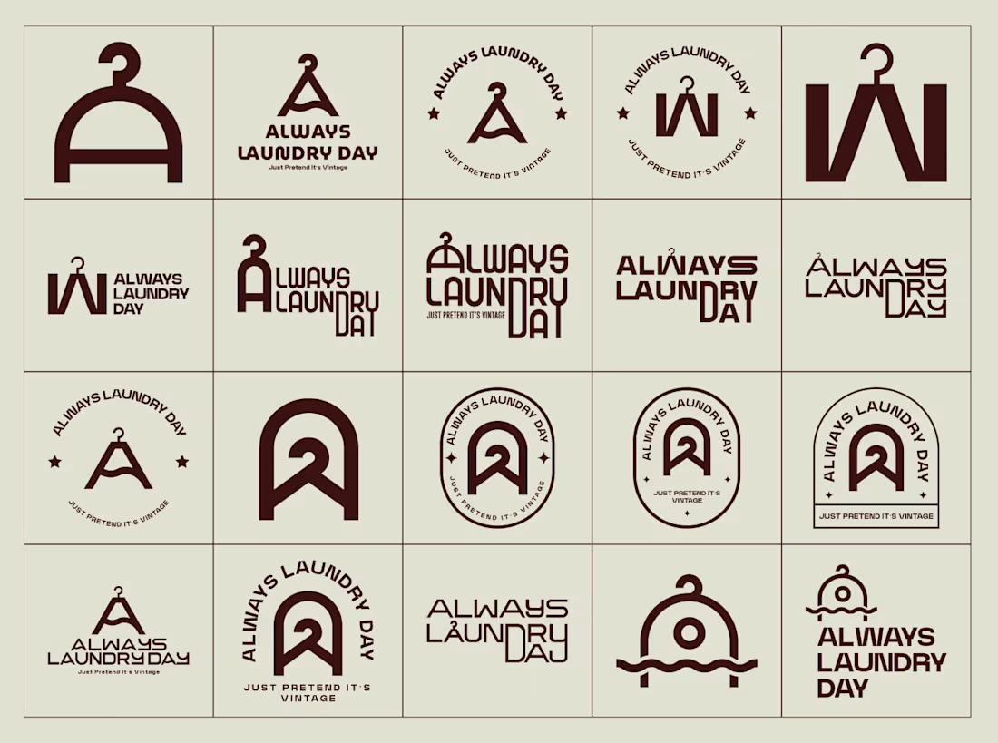
Logo Variation- Always Laundry Day
Full Project- https://bit.ly/3Z5I0Ip
Story behind the Logo Development
The logo identity for Always Laundry Day was developed through an extensive, iterative exploration that embraced the brand's core spirit of ironic authenticity and everyday chaos. Starting from the symbolic hanger as a central motif — representing the never-ending laundry cycle — we created dozens of variations, playing with typographic treatments, vintage-inspired distressing, circular badge formats, subtle diacritic twists, and minimalist monogram combinations. This rigorous process of sketching, refining, and testing allowed us to distill the perfect balance of wit, wearability, and visual personality, ultimately arriving at a final mark that feels both timeless and unapologetically real.
The network for creativity
Join 1.25M professional creatives like you
Connect with clients, get discovered, and run your business 100% commission-free
Creatives on Contra have earned over $150M and we are just getting started











