The network for creativity
Join 1.25M professional creatives like you
Connect with clients, get discovered, and run your business 100% commission-free
Creatives on Contra have earned over $150M and we are just getting started
Back to feedPost
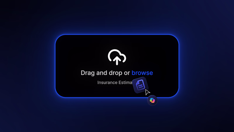
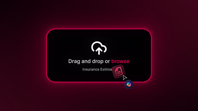
Taste Test
Taste test 👀
Was just choosing between red and blue for another scene…
Now facing the same decision again.
Funny how context changes everything.
Which one fits better this time?
48 votes
Ends in 1d
Nice!
red feels like you're about to do something critical
Hello !, both looks cool, but red usually stands for "error" "warning" or any kind of action that we can consider a destructive action
ofc, it is blue
Clean work 🔥 Everything feels consistent and intentional.”
I'd say "blue" because red is too overwhelming, but I'd improve the contrast ratio of the blue color to make it more accessible.
Blue
Definitely blue, red feels critical or dangerous
Nice vary nice work
The network for creativity
Join 1.25M professional creatives like you
Connect with clients, get discovered, and run your business 100% commission-free
Creatives on Contra have earned over $150M and we are just getting started
Related posts
Taste test ⚡
Same scene. Two different treatments.
One is clean and controlled.
The other adds glow, depth, more intensity.
Still deciding which direction to push.
A or B?
19 voted
37%
32 voted
63%

51 votes
Closed
FX On
Practising gradient animation in After Effects, with a focus on smooth transitions, colour flow, and timing that captures attention.
Woahhh this is mesmerizing!
Sharing a before and after of Vangwe.
Beyond the visual update, there was a deeper issue: the brand felt too broad, and that made it harder to connect with the fintech niche they were aiming for.
That’s why I like this kind of comparison.
Sometimes the before and after says everything about what a rebrand can do at the right moment.
Nicely done!
Trending
Runway
AI video generation is exploding. What are you dreaming up in Runway?
Contra University
Learn from expert creatives how to earn more using next-gen AI tools.
creativeaiflow
Creative AI workflows are evolving. What tools do you use, and what are their strengths and weaknesses?
portfolioreview
The best portfolios tell a story, not just show a grid. Share yours for feedback.
freelancerlife
Freelancer life is wins, pivots, and everything in between. What’s yours right now?