The network for creativity
Join 1.25M professional creatives like you
Connect with clients, get discovered, and run your business 100% commission-free
Creatives on Contra have earned over $150M and we are just getting started
Back to feedPost
Case Study-05. Advanced drawing workflow. I turned this AI-generated image into a ready-to-rig vector drawing—Useable in Rive, AE, or Spline.


impressive work

Thanks!

If we get the chance to work together, I think we could be really good collaborators.
You have amazing skills!
Thanks!

Great work
Thanks!

gorgeous
Thanks!

Mind bending!
The network for creativity
Join 1.25M professional creatives like you
Connect with clients, get discovered, and run your business 100% commission-free
Creatives on Contra have earned over $150M and we are just getting started





Related posts


Crocs
Campaign and brand content for a global footwear icon built on self-expression, comfort and bold color.
Creative direction for Crocs across campaign, social and retail touchpoints, translating the brand's playful attitude into a consistent visual language for the local market.
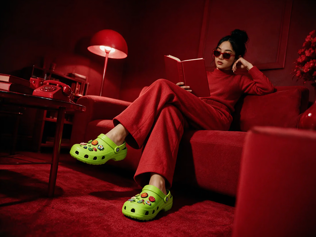

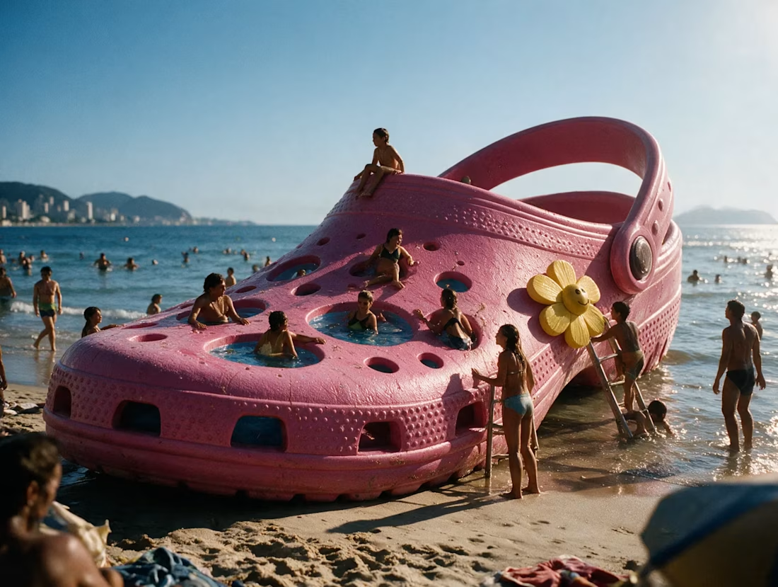
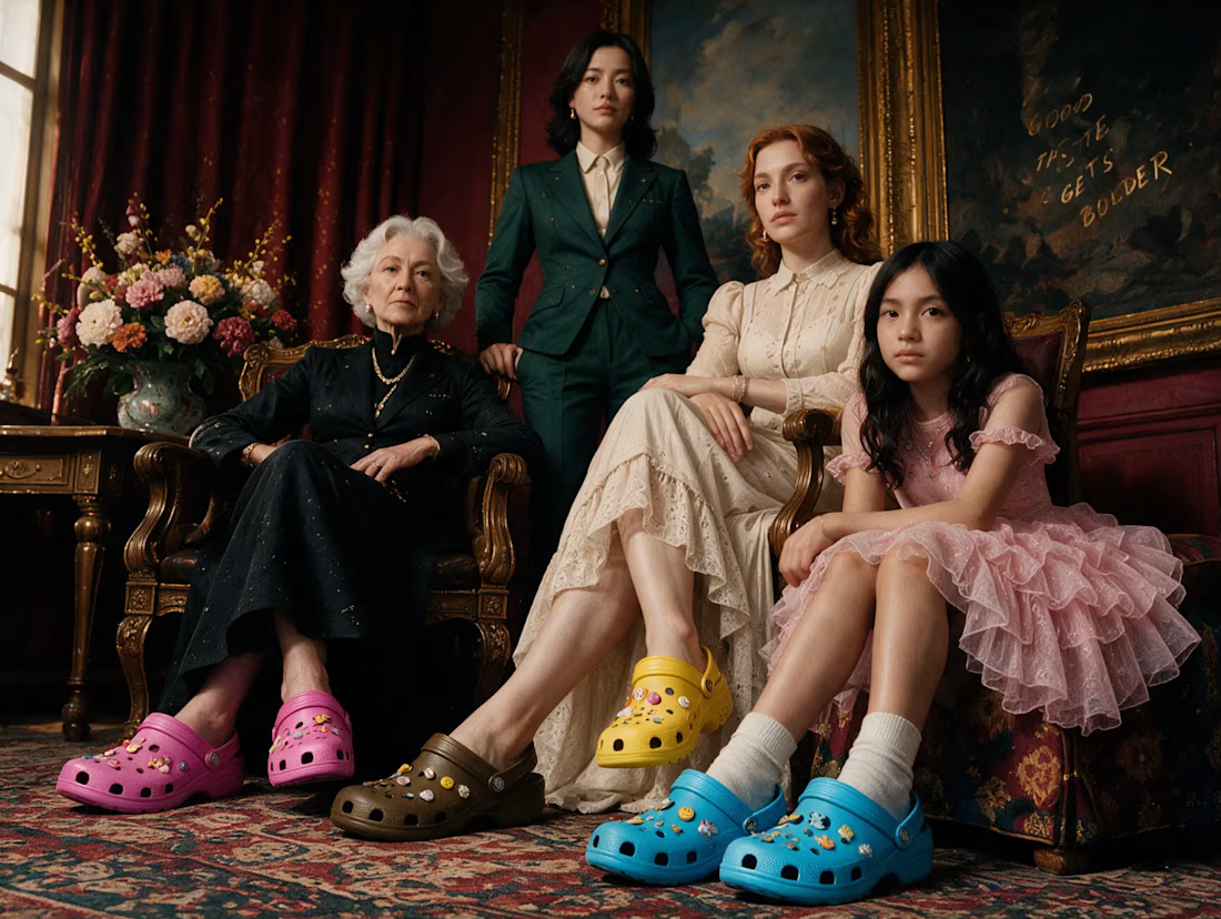

Crocs is a brand that wins by being unapologetically itself, and this direction leans in without turning into chaos, the cloud-white clog floating in the sky next to the hot pink beach shot is exactly the right amount of absurd. Self-expression, comfort and bold color all read in one scroll. Fun, confident work.

With all the hype about Opus 5.5 and it's seemingly amazing design skills I gave it the task to redesign the UI in my game. Mainly the upgrade screens, the count down screen and the main screen.
Very basic prompt and I'm not a fan of the final result, but it was worth a try.
It gave me a few style choices to pick between and I chose the cartoon style, so it's probably my own fault. 😃
Gameplay wise, I have made a few changes too. I've made the arenas 20% larger, upped the enemy count and a few other tweaks.
Now I want to try the new Rive CLI to create all the UI and implement it into the game using the Rive unity plugin.
