The network for creativity
Join 1.25M professional creatives like you
Connect with clients, get discovered, and run your business 100% commission-free
Creatives on Contra have earned over $150M and we are just getting started
Back to feedPost

This brand gets ~2.8M visitors a month.
They're doing an estimated ~$10.5K in sales a day.
But the estimated AOV is ~$5.
That's very low.
So I dug into their product page to find out why.
And I found a few mistakes that are leaving a lot of money on the table.
As a CRO, I couldn't just scroll past them.
So I redesigned it.
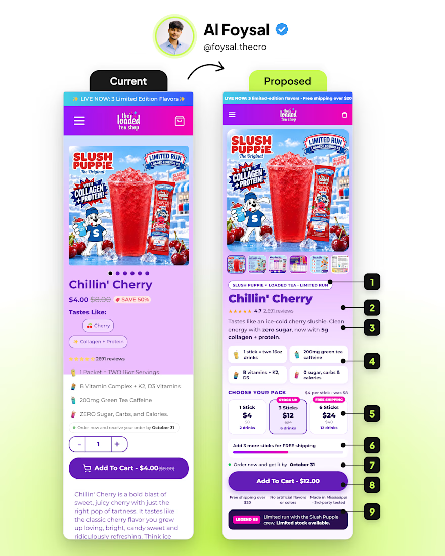
Here's what I fixed (numbers match the banner):
Collab pill → "Slush Puppie × Loaded Tea · Limited Run" before the title
Stars under the title → 4.7 from 2,691 reviews where the eye lands
One taste line → cherry slushie taste, zero sugar, 5g collagen
Benefit tiles → 4 icons you can scan in 2 seconds
Pack picker → 1 / 3 / 6 sticks, 3 pre-selected (the cart starts at $12, not $4)
Free-shipping bar → "Add 3 more sticks for FREE shipping"
Delivery date → moved right above the CTA
CTA with total → "Add To Cart · $12.00"
Legend #5 strip → limited-run reminder under the trust row
With this much traffic, even a small AOV lift adds up fast.
Which would you test first: the pack picker or the free-shipping bar?
P.S. If you'd want me to audit + re-design your PDP, DM or comment "PDP" and I'll show you what I'd change first.
#conversionrateoptimization

A ~$5 AOV on 2.8M monthly visitors is a huge gap, nice catch. Numbering the fixes to match the banner makes the breakdown really easy to follow.
The network for creativity
Join 1.25M professional creatives like you
Connect with clients, get discovered, and run your business 100% commission-free
Creatives on Contra have earned over $150M and we are just getting started



Related posts

Bad website UX is the invisible tax on your marketing budget.
If your site is confusing, slow, or outdated, you are actively paying to drive customers straight to your competitors.
Invest in design. Frictionless journeys = effortless growth.

Need a website that looks good, is easy to use, and actually explains your product well? That’s what I do.
Check out my designs, research, and case studies at riteshh.com
Got a project in mind? Let’s work together!
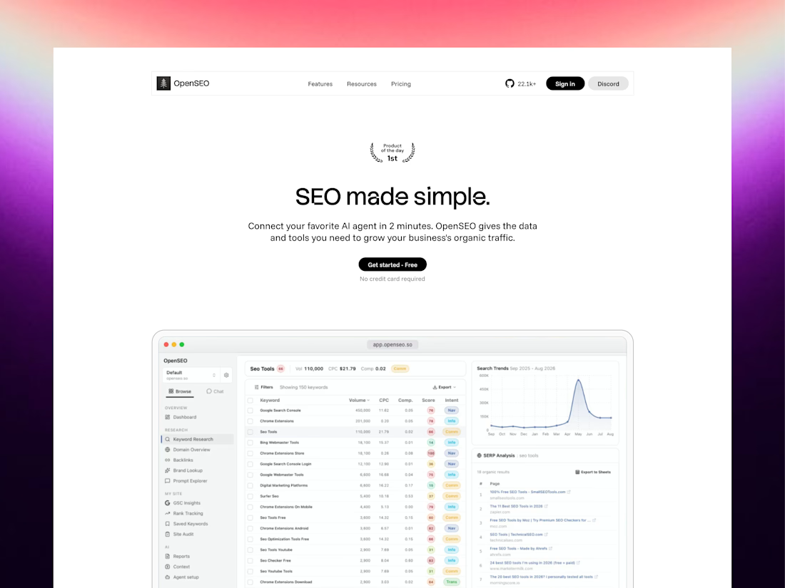

A useful way to prioritise the fixes is to separate page views, CTA clicks and completed actions. If people click through but never finish the form or checkout, the first screen may not be the main problem. Pairing those signals with a manual mobile test gives the redesign a clearer starting point.

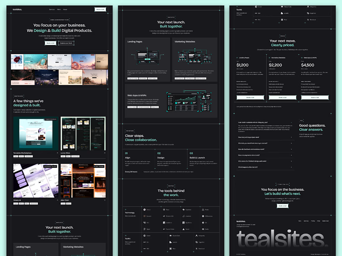
The full landing page design is complete.
I designed this website for a web design and development agency, with founders and growing businesses in mind.
Clear services, selected work, straightforward pricing and answers to common questions. Each section helps visitors understand the offer and take the next step.
Visually, I kept it consistent with teal accents, structured grids and corner details throughout.
Good to see all the sections come together.


Love how you’ve focused on clarity and consistency! The clear services and pricing make it easier for visitors to understand the offer and take the next step. 👏✨

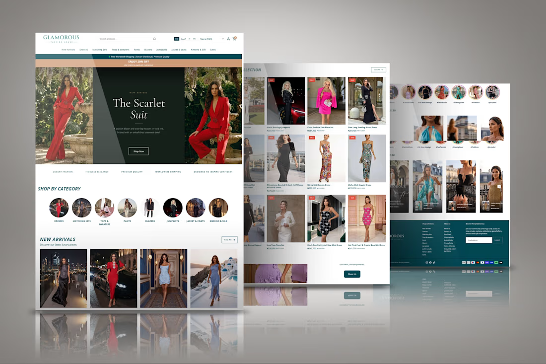
Designed a modern Shopify fashion ecommerce website focused on luxury women's clothing, product discovery, and a smooth shopping experience. The storefront features a bold promotional hero, shop-by-category navigation, new arrivals, curated clothing collections, product grids, sale sections, shoppable social content, and brand storytelling.
The goal was to create an elegant and easy-to-navigate online store that showcases statement outfits, helps customers explore different styles, and guides shoppers from discovering new arrivals to selecting products and completing their purchases.