The network for creativity
Join 1.25M professional creatives like you
Connect with clients, get discovered, and run your business 100% commission-free
Creatives on Contra have earned over $150M and we are just getting started
Back to feedPost

Impossible Food #06 — Raviolo
Sometimes you need to wait before eating a raviolo.
It could be really hot.
This one might be a little hotter than expected.
Another experiment in making impossible food physics feel real.
Make the impossible feel real.
#ImpossibleFood #GenerativeAI #AIVideo #FoodCinematography #VFX #AIArt #CreativeR&D
The network for creativity
Join 1.25M professional creatives like you
Connect with clients, get discovered, and run your business 100% commission-free
Creatives on Contra have earned over $150M and we are just getting started





Related posts


You cooked and left no crumbs! 🧑🍳🧹


My Top Featured Projects on @Contra Labs 🔥
⚡| NEXVOLU
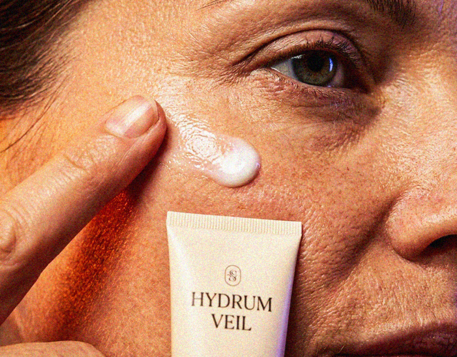
⚡| HYDRUM VEIL
⚡| NOIRÉ
Each project explores a different direction, but the goal stays the same: build brands that stand out.
Which project is your favorite?
Drop the name below 👇



A little scene i where i was testing different Lighting Scenarios.