The network for creativity
Join 1.25M professional creatives like you
Connect with clients, get discovered, and run your business 100% commission-free
Creatives on Contra have earned over $150M and we are just getting started
Back to feedPost

Featured Case Studies: Impact in Action
Basingstoke Hockey Club: Developed a dynamic, high-end sports brand identity. Engineered versatile logo variants optimized for light/dark backgrounds, maximizing merchandising value and fan engagement.
Vivere Londra: Crafted a magnetic geometric monogram for a premium community brand. Integrated iconic visual texturing to instantly connect with the target audience and command market attention.
Corporate Type & Style System: Structured a clean typography framework featuring Sinkin Sans regular. Built a seamless visual hierarchy that ensures absolute brand consistency across digital assets and physical media.
Transform your business visuals today. Click 'Work with me' to start.


The network for creativity
Join 1.25M professional creatives like you
Connect with clients, get discovered, and run your business 100% commission-free
Creatives on Contra have earned over $150M and we are just getting started



Related posts

Brand work for HauntChain
I'm loving building this brand and the results so far
A deFi platform with some gamification


That's cute ❤️

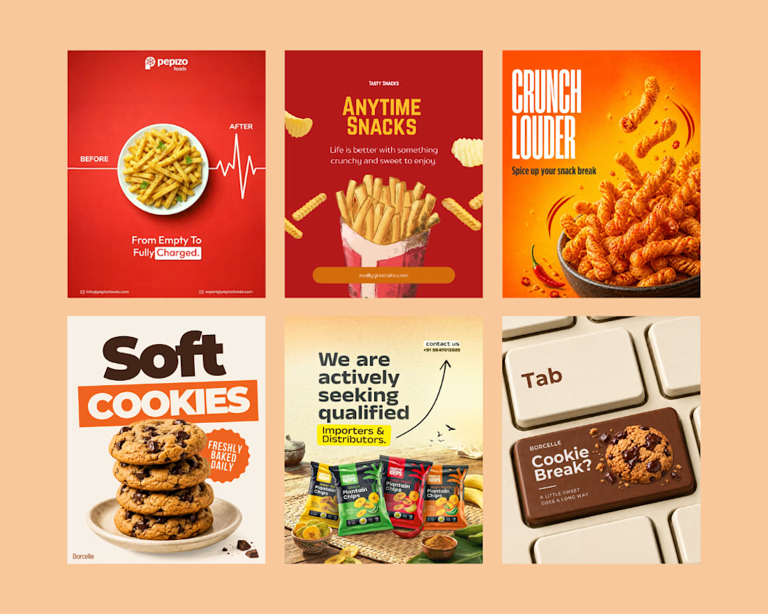
Created eye-catching social media creatives for a snack brand, focusing on mouth-watering visuals, bold typography, and engaging layouts.
The designs highlight product appeal, grab audience attention, and help the brand promote its snacks, offers, and new launches effectively across social media.
Social Content DesignphotoshopposterdesignSocial Media MarketingTypographyAdobe PhotoshopCanvaChatGPT



great job🙌

In geology, strata are layers laid down over time, each one holding the rest. That’s exactly what an enterprise platform should feel like.
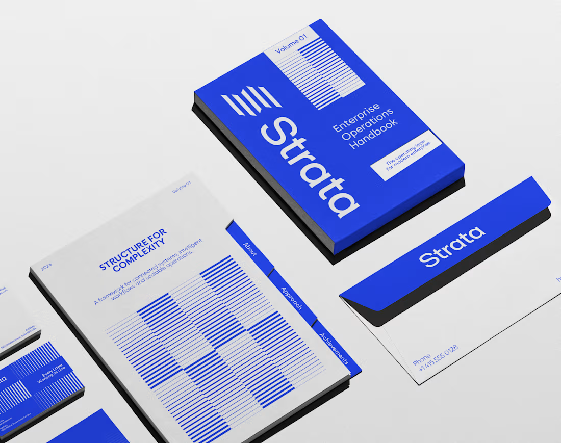
I designed the brand identity for Strata, a SaaS platform that connects fragmented systems, data, workflows and teams. The name already carried the idea, so the identity makes it visible: “Every layer, working as one.”
Logo: Five stacked layers forming a subtle S, solid like rock and arranged for motion.
Principle: “Complexity, organized into movement” turns a dense product story into something calm.
Palette: Strata Blue #2447F9, near-black #02040C and white. Flat colour only, so every layer stays distinct.
Layout: Modular grids and architectural spacing that build pages the way strata build ground, in order.
Imagery: Portraits washed in Strata Blue, with light streaming through, putting people at the centre of the system.
A good name sets up the brand. The identity has to prove it.
If your SaaS or B2B platform needs a brand as solid as its infrastructure, let’s talk.
#BrandIdentity #SaaSBranding #TechBranding #LogoDesign