The network for creativity
Join 1.25M professional creatives like you
Connect with clients, get discovered, and run your business 100% commission-free
Creatives on Contra have earned over $150M and we are just getting started
Back to feedPost

Client: I just want something simple.
Me: Of course, let's make it happen. :)
Proceeds to spend hours choosing the perfect shade, typography, imagery, and spacing.
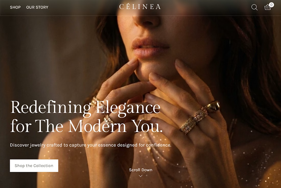
CÉLINEA — Luxury Jewelry Website
What if a jewelry website was designed around the feeling of owning something timeless, rather than simply displaying products?
The idea was to create an online experience that feels as elegant and distinctive as the jewelry itself.
I wanted the website to communicate luxury from the very first impression, without relying on excessive decoration or complicated layouts.
Instead of filling the website with unnecessary details, I wanted every element to have a purpose.
The visual direction brings together warm, luxurious imagery and elegant typography to establish the brand's identity.
I kept the colour palette soft and earthy, allowing the gold tones of the jewelry to stand out naturally.
The layout follows the same thinking — clean navigation, carefully arranged sections, and an effortless path from discovering a piece to exploring the collection.
The idea was to create a website that feels luxurious without trying too hard, giving the jewelry the attention it deserves.
Sometimes, simple takes a little more thought than it seems.

The network for creativity
Join 1.25M professional creatives like you
Connect with clients, get discovered, and run your business 100% commission-free
Creatives on Contra have earned over $150M and we are just getting started





Related posts

Good Company, from top to bottom 👀
Concept, design and Framer development, including custom code components for the interactions


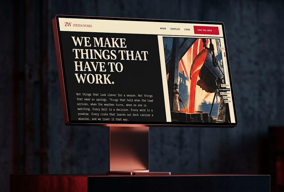
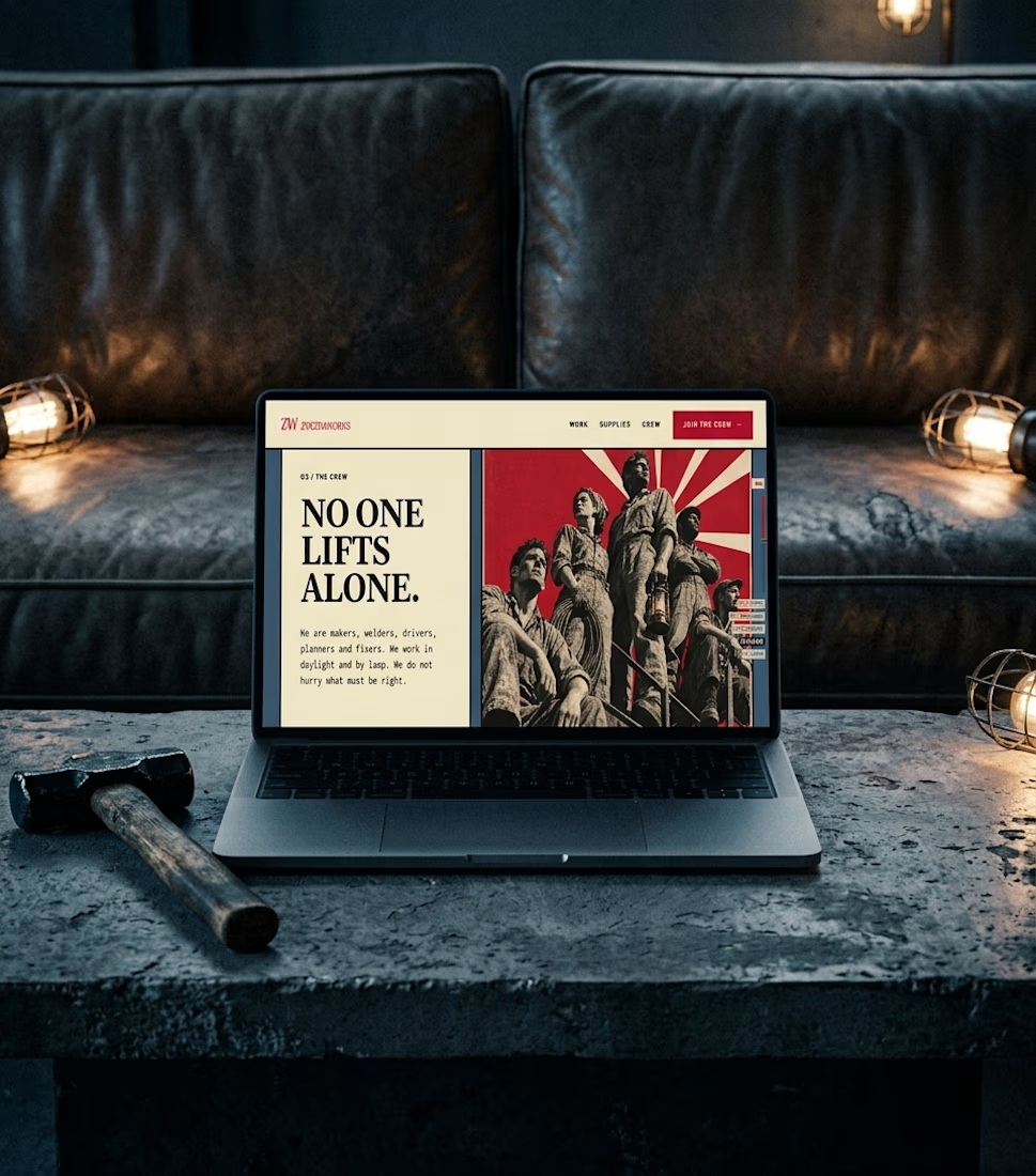
Ever wondered what a space-race poster would sell if it sold hammers?
The Zvezda Works case study answers that, and it’s nearly here.
Watch this space.


A little creative experiment I'm working on ✳️
Playing with bold typography, playful motion, and unexpected interactions for a UGC creator portfolio.
Still a work in progress, but having way too much fun with this one.

The big stacked WORK / RESULTS / RATES menu next to the loose purple stickers keeps the portfolio playful while the navigation stays easy to scan. Do the stickers react on hover, or are they tied to scroll?