The network for creativity
Join 1.25M professional creatives like you
Connect with clients, get discovered, and run your business 100% commission-free
Creatives on Contra have earned over $150M and we are just getting started
Back to feedPost

Containerized a React app with a multi-stage Docker build (~93MB), set up GitHub Actions CI/CD, and deployed on a local Kubernetes cluster.


The network for creativity
Join 1.25M professional creatives like you
Connect with clients, get discovered, and run your business 100% commission-free
Creatives on Contra have earned over $150M and we are just getting started
Related posts

13:40: a finished Figma frame. 15:48: this, live on Vercel
Claude wrote every line of the code. I spent those two hours on the part clients actually pay for: looking at each version and saying what's off
17 commits, each one deployed. My notes went in as screenshots with red circles:
→ make the button edges look like ticket cutouts
→ replay the story chips every time you scroll past them
→ spacing 156, then 92, then back to 156
What made it fast was one Figma frame called "Ready for Dev". Every size, color and gap came from there, so nobody had to guess what the mockup meant
For a founder this means a real link on day one, and a fix you ask for at lunch is live by the afternoon


This is the workflow! From Figma to live in 2 hours - love that you spent time on what actually matters: having taste and directing. 17 deploys is wild! 🚀

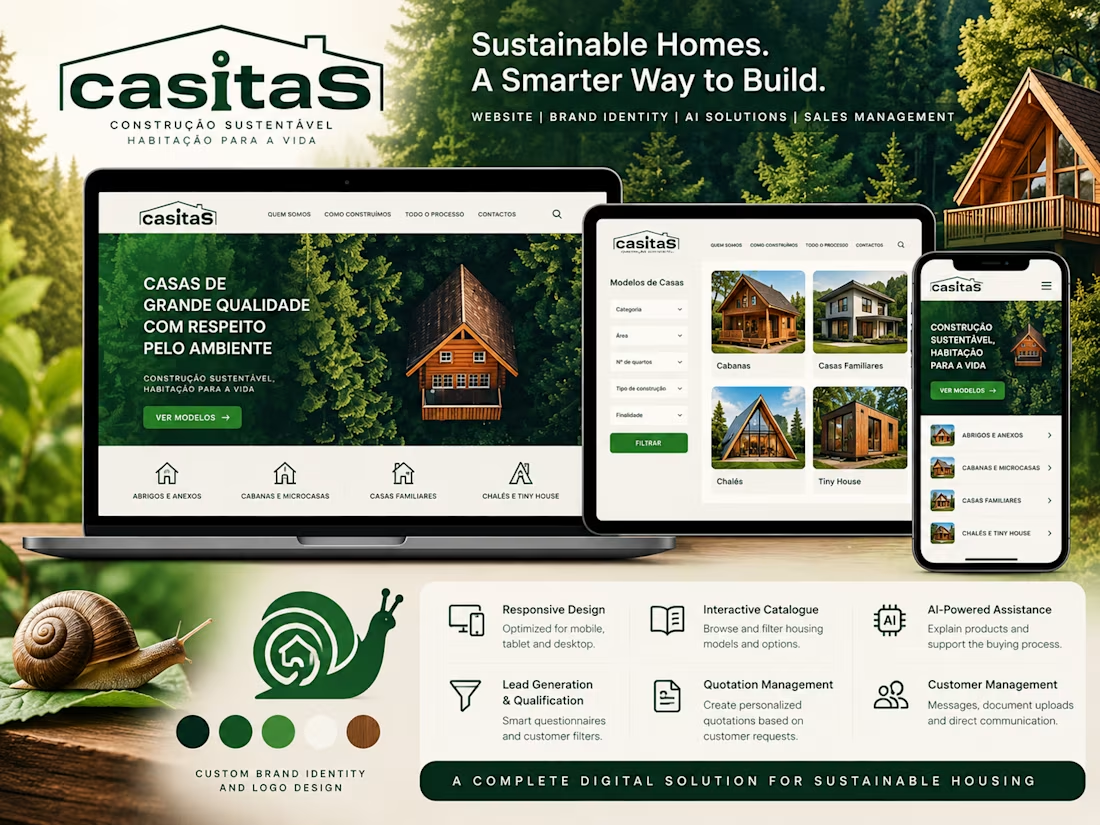
Casitas.pt | Brand Identity, AI-Powered Website & Sales Management Platform
A comprehensive digital platform for the sustainable housing sector, combining custom brand identity, architectural design, artificial intelligence and business management solutions.
My Role — Creative Direction & Visual Identity
I was responsible for creating the visual identity of the project, carefully considering the client’s objectives, preferred colour palette and the image they wanted their brand to communicate.
I personally designed the logo and developed the snail-inspired brand symbol, reflecting the client’s vision and creating a distinctive visual identity.
The website’s visual language, colours and overall design were developed to ensure consistency between the brand’s personality and its digital presence.
Digital Platform Features
Responsive website for desktop, tablet and mobile
Interactive housing catalogue with advanced product filtering
AI-powered product explanations and sales assistance
Lead generation, qualification and customer segmentation
Customer management dashboard
Personalised quotation management based on customer requests
Document uploads and two-way customer communication
Mobile notifications and digital workflow automation
Project Scope
Brand Identity • Logo Design • Creative Direction • UX/UI Design • Responsive Web Development • AI Integration • Digital Catalogue • Lead Management • Quotation Systems • Business Automation
Live Website: https://casitas.pt/



Two small details from my site, in 22 seconds. The dot after "AS." takes each project's colour from one CSS variable, and the name on the home page is 178 shipping containers you can knock over. They put themselves back, like a Kubernetes cluster.
Which one should I break down first?

