The network for creativity
Join 1.25M professional creatives like you
Connect with clients, get discovered, and run your business 100% commission-free
Creatives on Contra have earned over $150M and we are just getting started
Back to feedPost

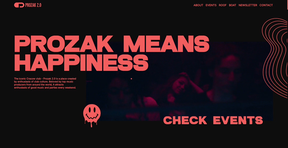
Prozak 2.0 Website for Kraków's iconic nightclub — home to world-class DJs and legendary parties. Bold, immersive design that captures the energy of the club experience. Prozak 2.0 is an iconic Kraków nightclub, beloved by electronic music enthusiasts and world-renowned DJs alike. The venue needed a digital presence that would match the energy and reputation of their legendary parties — from intimate club nights to their signature Roof Party and Boat Party summer events.


The network for creativity
Join 1.25M professional creatives like you
Connect with clients, get discovered, and run your business 100% commission-free
Creatives on Contra have earned over $150M and we are just getting started

Challenges
View all


Related posts


I’ve been razzmatazzing and flibbertigibbeting with Claude Code and somehow ended up with a new yels.dev.
It finally feels like me: simple on the surface, slightly complicated underneath, and very much alive.
You can see who I am, what I do, the work behind Herodot, RaptorLabs, CyberLink Security and Solmint, plus a selection of projects I’ve built across AI, cybersecurity, Web3, product systems, education, archives, and experimental digital spaces.
Built to be explored


The simple-on-the-surface, layered-underneath idea comes through so clearly in the presentation. I especially like how the project archive turns the site into something to explore rather than just a résumé of links.

A fresh take on file sharing & storage.
Designing a modern, simple, and user-friendly platform where users can upload, store, organize, and share files effortlessly. From secure storage to seamless file sharing, every interaction is designed to feel fast, intuitive, and reliable.
More details coming soon. Stay tuned!
#WebDesign #UXDesign #UIDesign #FileSharing #CloudStorage #Artificial Intelligence #InteractionDesign #ModernUI #ProductDesign #Figma #GeeksInDesign

The gradient blob doing double duty as both brand texture and a visual metaphor for data flow is a nice touch. Curious how Securitan differentiates on the security side once the full site lands.

Polishing this website right now, I will make this live today, SaaS website for Startups. Shower your love and feedback. 😁😊

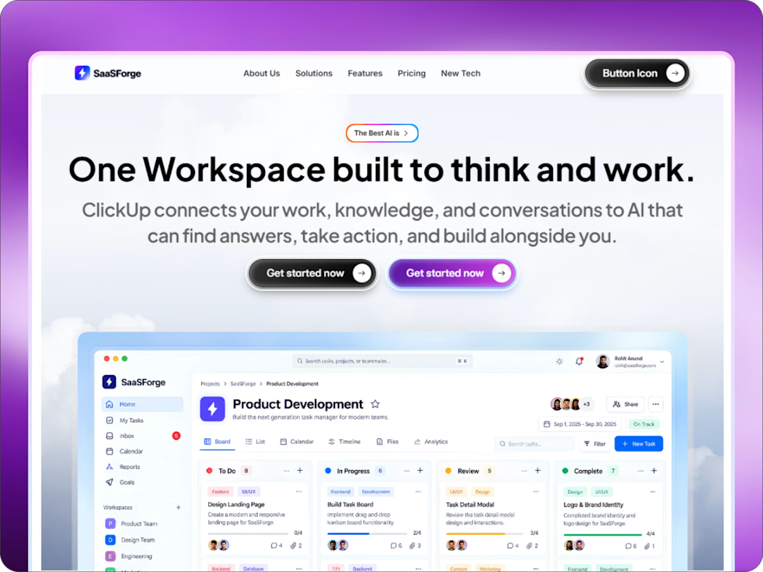
The purple frame gives the SaaS dashboard a confident launch moment, and the split between headline and product UI reads clearly. I’d love to see the button hover states carry a touch of that same contrast.