The network for creativity
Join 1.25M professional creatives like you
Connect with clients, get discovered, and run your business 100% commission-free
Creatives on Contra have earned over $150M and we are just getting started
Back to feedPost
Not every energy drink needs to look aggressive to stand out.
With KUNE, I explored a different energy: bold typography, liquid gradients, and a can design that feels as good on the shelf as it does in motion.
Packaging with its own personality.
#PackagingDesign #BrandIdentity #GraphicDesign #packagedesigner #packaging #branding #branddesigner #opentowork


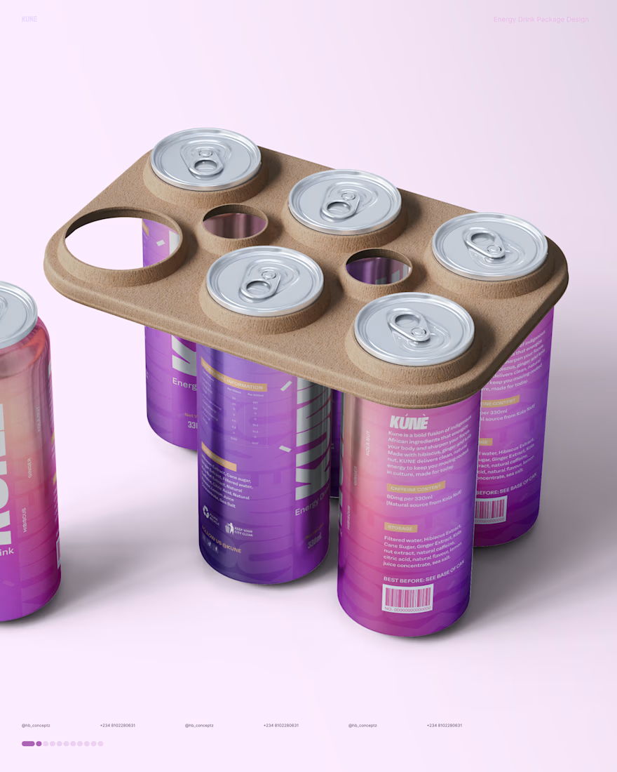
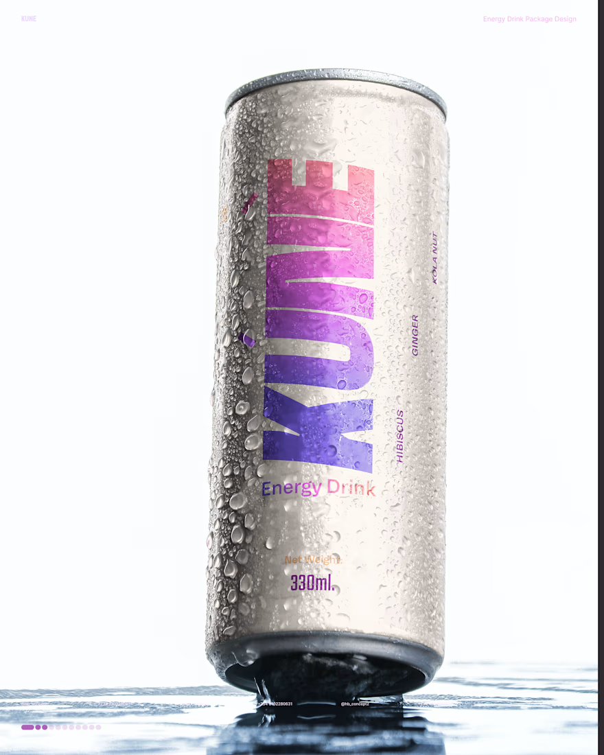
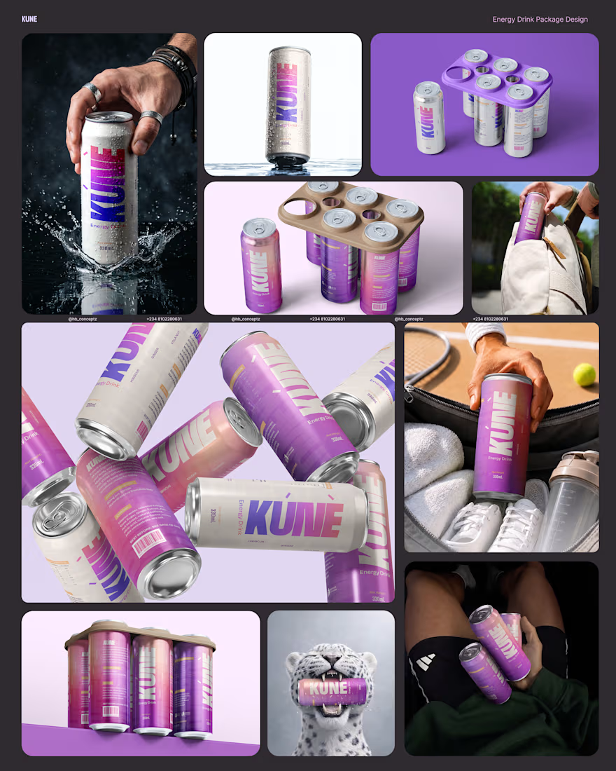
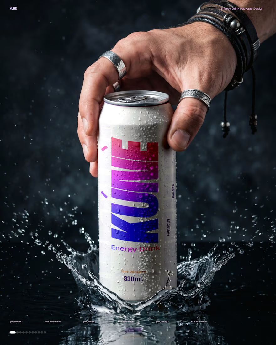

Stepping away from the aggressive energy-drink look leaves a lot of shelf space open. On the can itself, did you keep the wordmark contrast fixed as the gradient shifts, or adjust it per flavor?

Thank you. I adjusted it per flavor by simply switching the background color and the gradient.
The network for creativity
Join 1.25M professional creatives like you
Connect with clients, get discovered, and run your business 100% commission-free
Creatives on Contra have earned over $150M and we are just getting started



Related posts



Amazing work

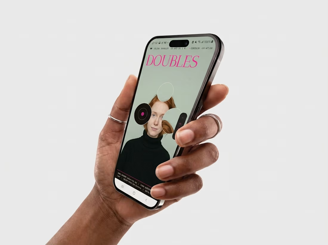
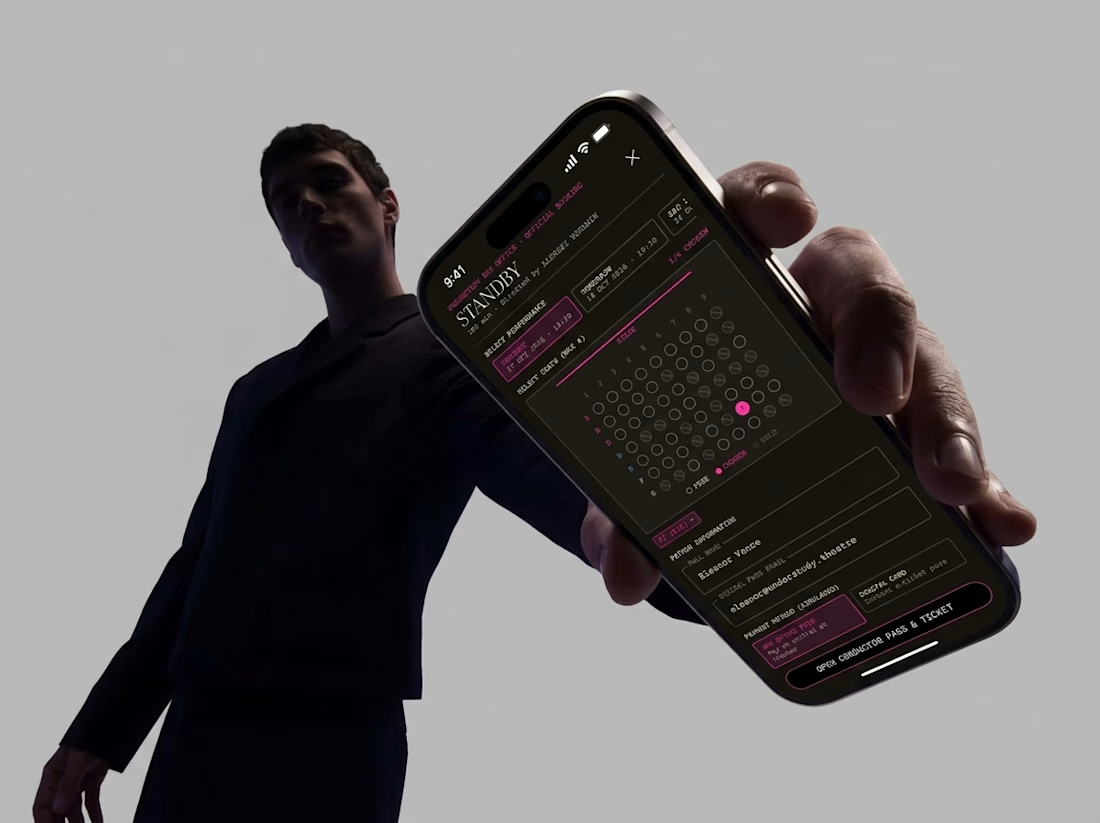
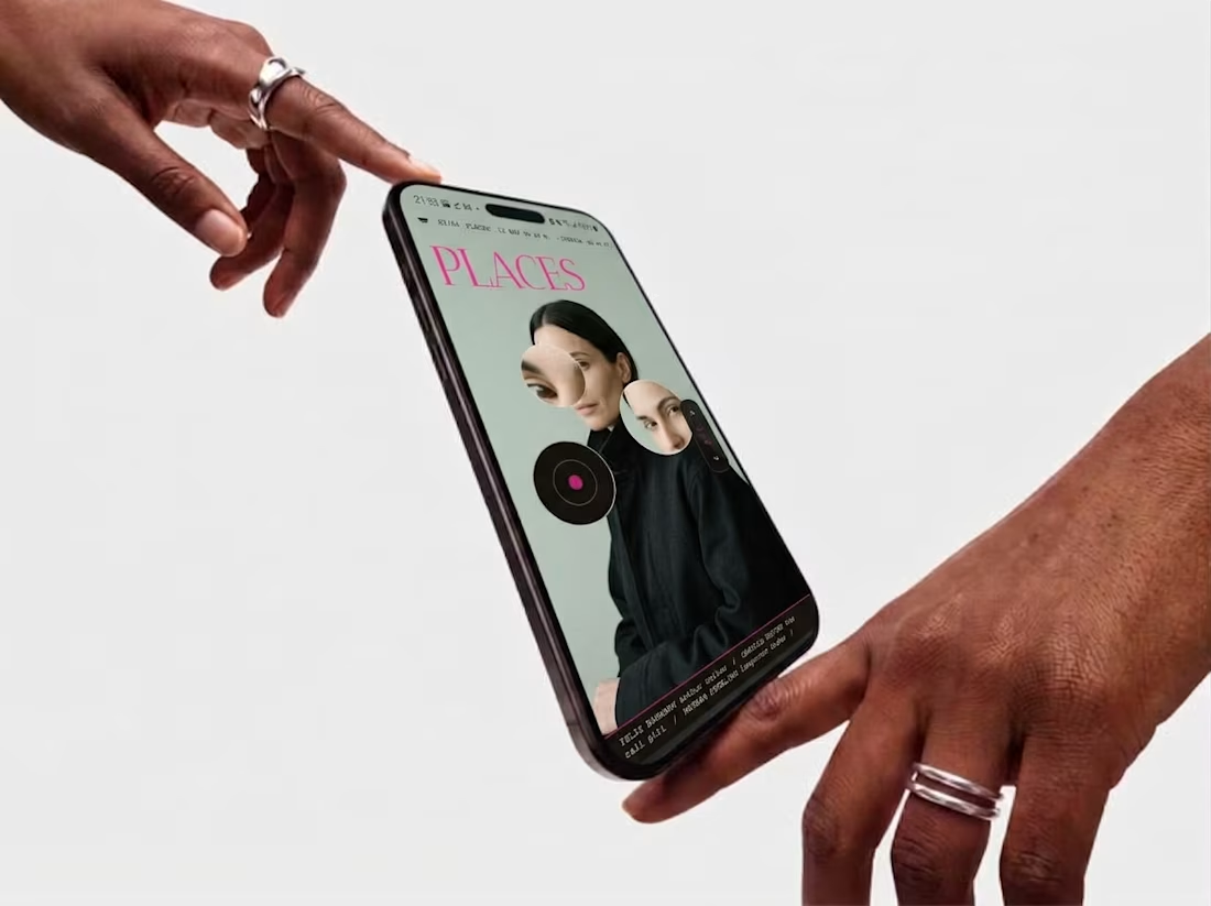
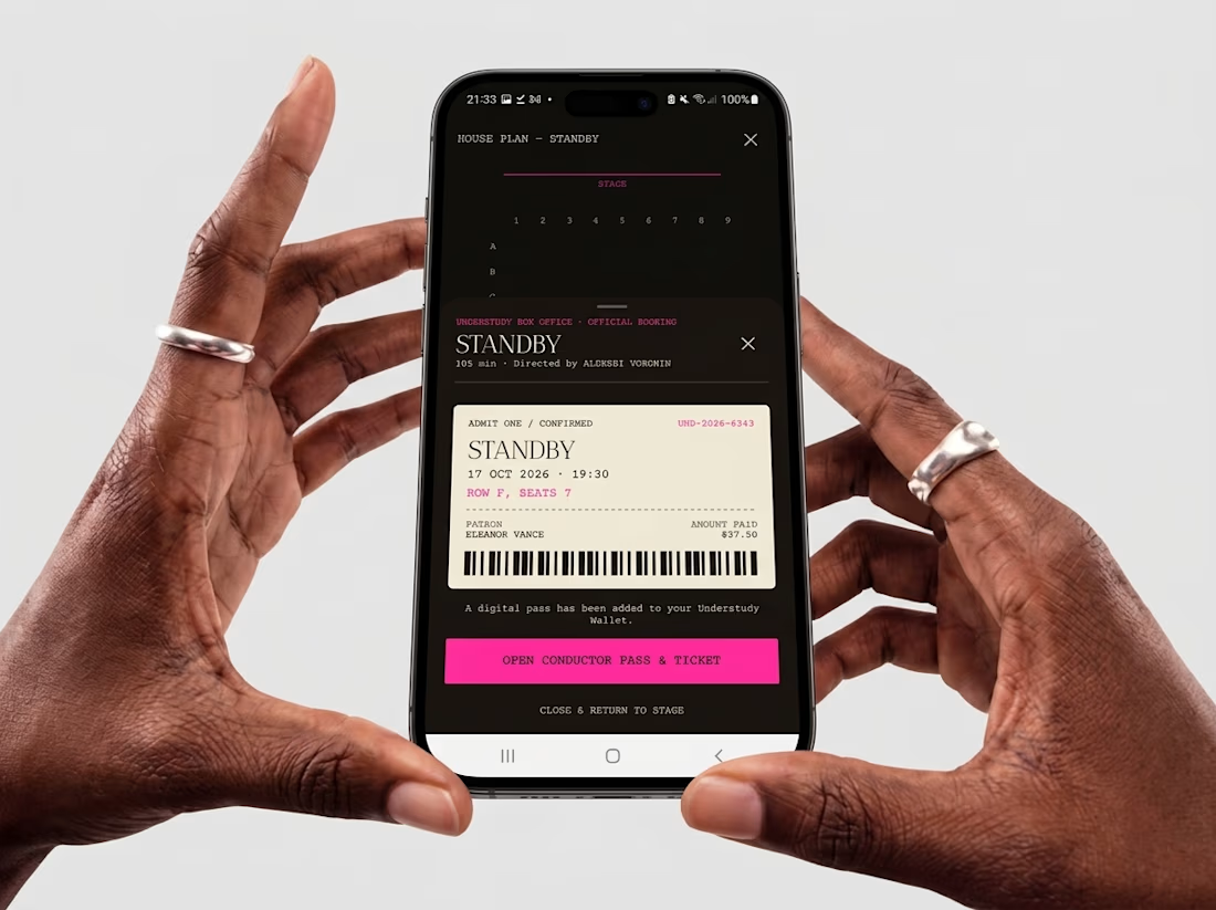
Friday app: Understudy
What if an app’s menu was a hole in a face?
UNDERSTUDY turns one circle into the interface: eyes open shows, voids open seat plans, and a typewriter clock counts down to curtain.


The full landing page design is complete.
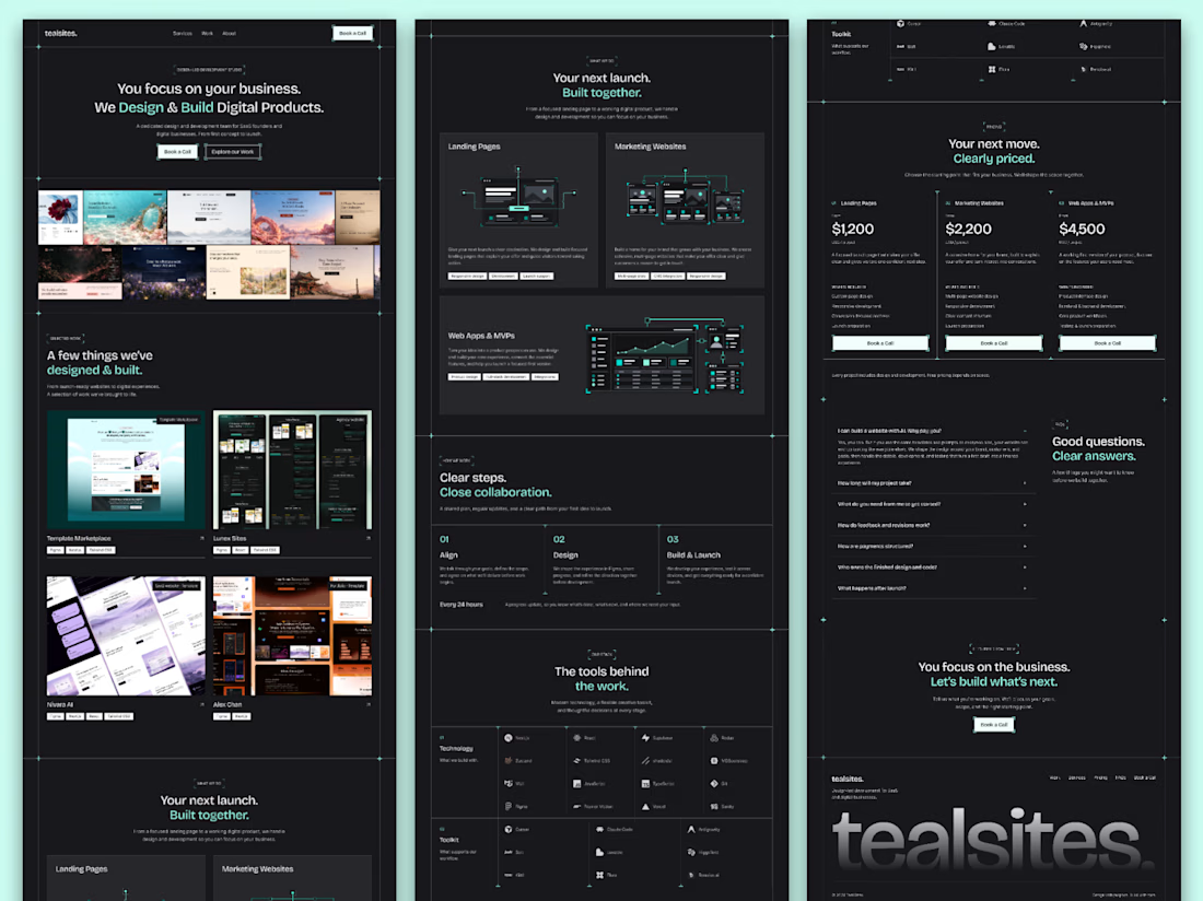
I designed this website for a web design and development agency, with founders and growing businesses in mind.
Clear services, selected work, straightforward pricing and answers to common questions. Each section helps visitors understand the offer and take the next step.
Visually, I kept it consistent with teal accents, structured grids and corner details throughout.
Good to see all the sections come together.

Love how you’ve focused on clarity and consistency! The clear services and pricing make it easier for visitors to understand the offer and take the next step. 👏✨