The network for creativity
Join 1.25M professional creatives like you
Connect with clients, get discovered, and run your business 100% commission-free
Creatives on Contra have earned over $150M and we are just getting started
Back to feedPost


The dark-to-electric gradient gives the AI product a confident tech tone, and the feature grid makes the offer easy to scan. The clear CTA hierarchy keeps a dense product story from feeling overwhelming.
The network for creativity
Join 1.25M professional creatives like you
Connect with clients, get discovered, and run your business 100% commission-free
Creatives on Contra have earned over $150M and we are just getting started

Challenges
View all


Related posts


Love this concept 🧡

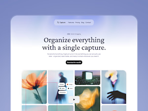


New case study!
Artist portfolio website design and Webflow development for Teri Sanders, a New York-based artist.

The way the editorial grid lets Teri’s work lead while the oversized name anchors the page feels beautifully restrained. Nice balance of art direction and a usable Webflow portfolio structure.