The network for creativity
Join 1.25M professional creatives like you
Connect with clients, get discovered, and run your business 100% commission-free
Creatives on Contra have earned over $150M and we are just getting started
Back to feedPost

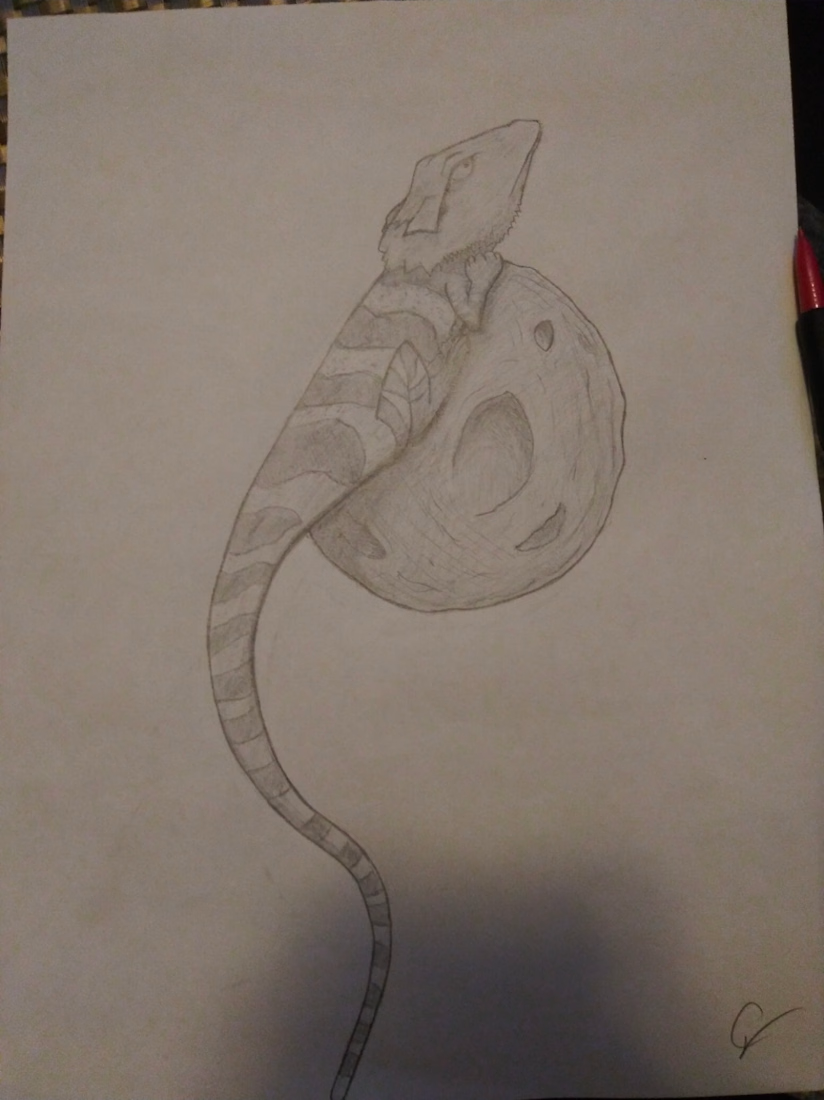
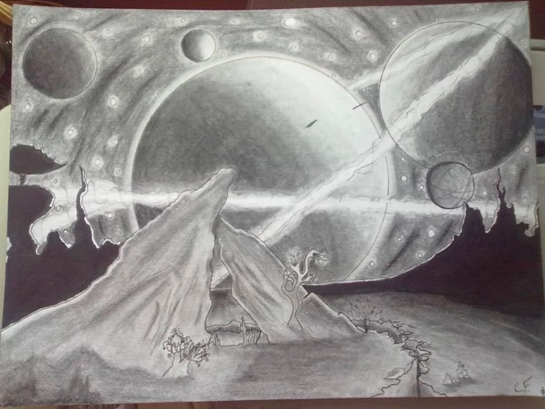
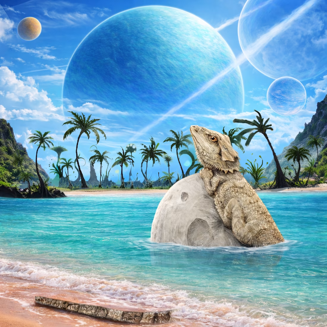
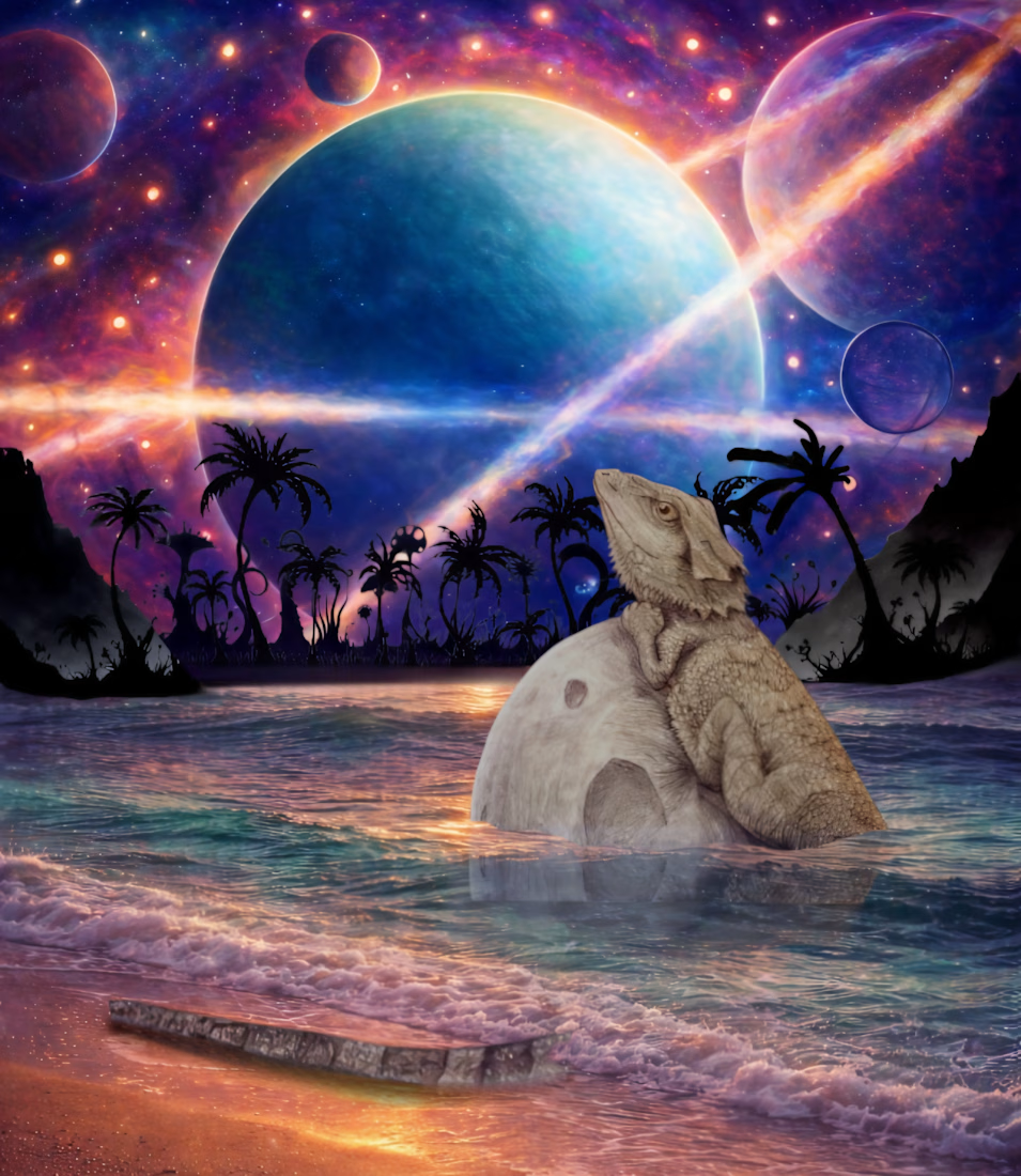
Mrs. Stargazer- combined two sketch ideas one of my brothers bearded dragon sitting atop the moon in empty space, and a space it self from the perspective of the surface of a desolate planet looking outward.


The network for creativity
Join 1.25M professional creatives like you
Connect with clients, get discovered, and run your business 100% commission-free
Creatives on Contra have earned over $150M and we are just getting started





Related posts

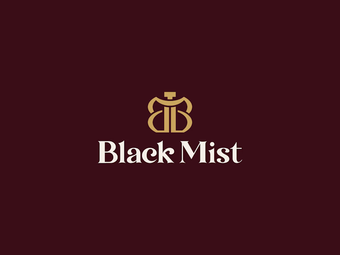
Black Mist — Luxury Perfume Brand Identity
A refined visual identity created for Black Mist, a modern perfume brand built around mystery, elegance, and timeless sophistication.
The identity combines a bold BM monogram with an elegant high-contrast wordmark, creating a distinctive and premium presence across perfume packaging and brand applications.
For the packaging direction, I explored a burgundy + champagne gold palette to reinforce the luxurious and mysterious character of the fragrance.


Superb work, like it

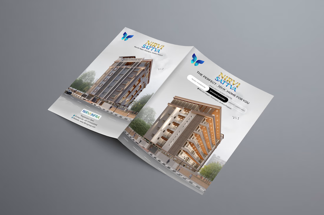
Brochure design for Nirvi Sattva, a residential project.
I designed the spread, logo lockup, and print layout, then presented it as an open-brochure mockup so the building, headline, and butterfly mark read together. The goal was a clean real-estate piece: strong first impression, easy to scan, ready for print.
Open to brochure, flyer, and brand work for builders and agencies.


Typography on point! Really inspiring work.

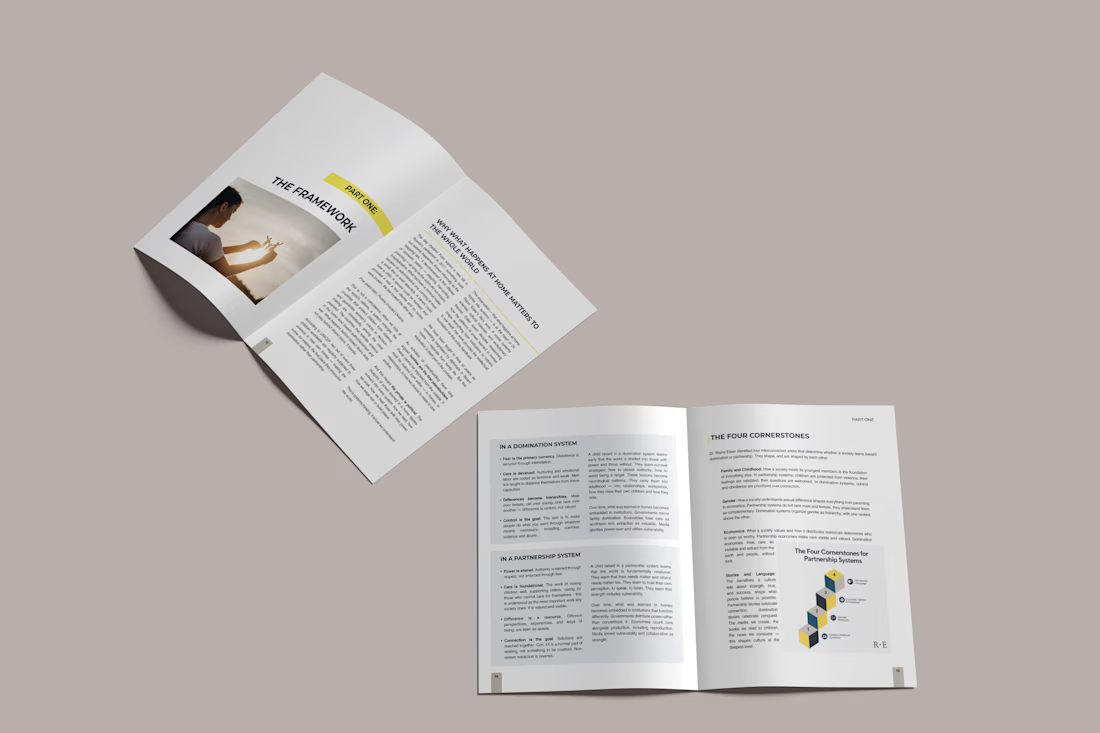
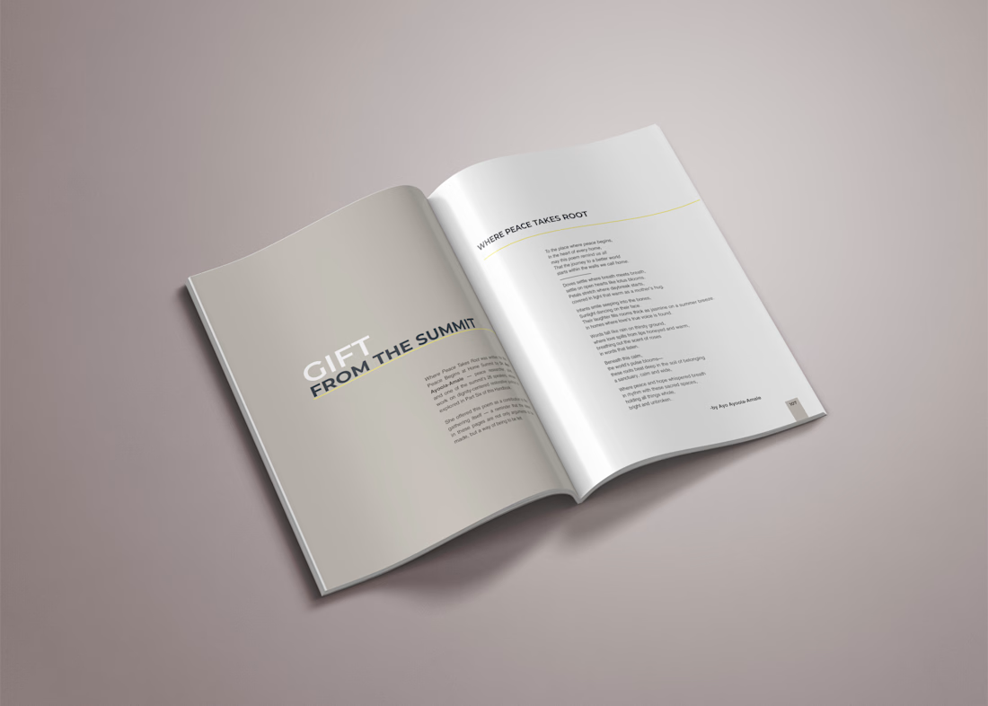
Peace Begins at Home — Editorial Handbook Design

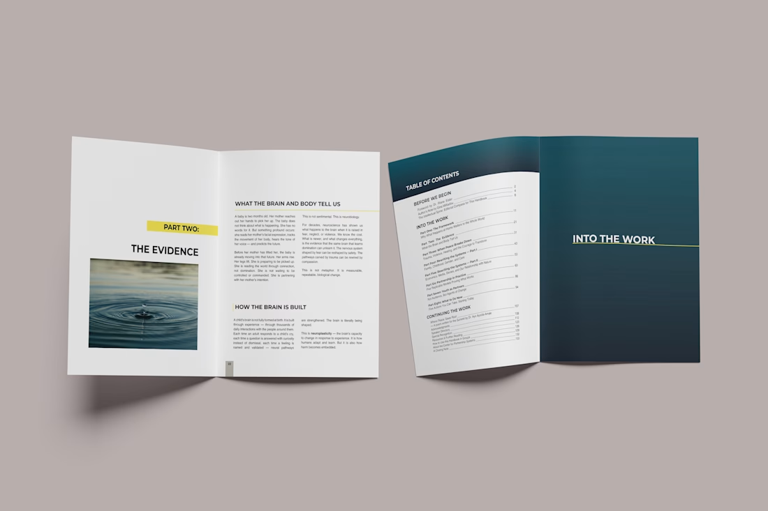
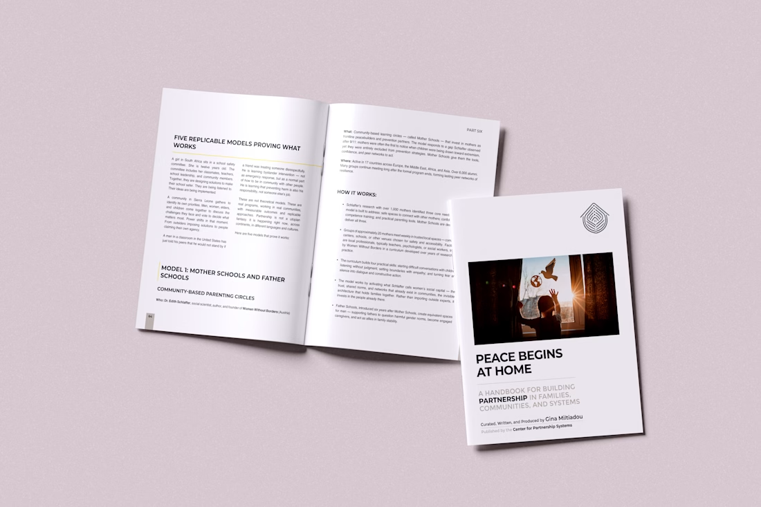
This is so visually satisfying! Great job.