The network for creativity
Join 1.25M professional creatives like you
Connect with clients, get discovered, and run your business 100% commission-free
Creatives on Contra have earned over $150M and we are just getting started
Back to feedPost


Just completed this Nexora UI/UX project 🚀
I explored a modern SaaS direction with a bold purple visual system, clean typography, performance-focused dashboard elements, and a landing page designed around clarity and conversion.
The goal was to make a complex affiliate...


The purple system carries straight from the marketing landing page into the dashboard itself - a partner clicking through sees the same visual language, not a jarring hand-off into a generic admin panel.

What else can be changed in this to make it more attractive?
The network for creativity
Join 1.25M professional creatives like you
Connect with clients, get discovered, and run your business 100% commission-free
Creatives on Contra have earned over $150M and we are just getting started



Related posts





cool
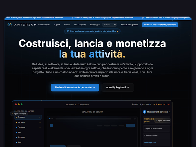
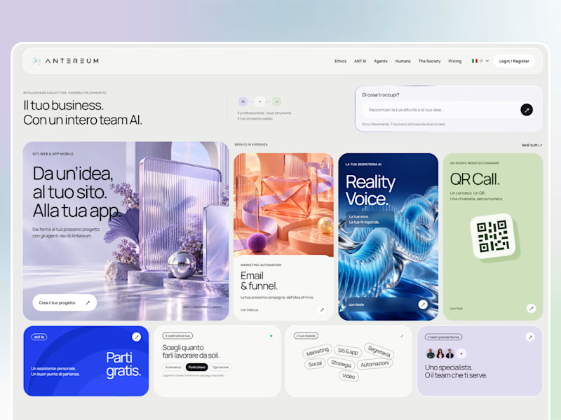
Webiste redesign for Saas company


2 voted
4%
44 voted
96%
46 votes
Closed
